Exploring Delores IIII

by Gary Winnick
Jul 02, 2015

Ok, so we're getting into the home stretch of designing the Delores Edmund character development process. If you haven't read the previous installments on the blog you might want to check them out before proceeding. We started with a text description for the character, then went through the process of gathering reference material, our thanks to everyone who participated, then went on to the character sketching stage.

Now we've proceeded to take three of the most likely sketches to the current in-game character style pixel render stage. These three were chosen through a combination of backer feedback, friend and team preference and because Ron and I said so.

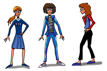
When I was originally designing the characters for Maniac Mansion I went through this same basic process, sketching the characters as felt pen renders and then trying to take those over  to pixelcentric game characters. In those days, a lot of technical issues drove how I'd render them on the C64. They could only be a limited width and palette. The main thing that drove their big-headed-ness was Ron and I really wanted unique/recognizable characters, trying to make a unique looking face 5 or 6 pixels wide using 3 colors (one of which needed to be black) really drove their now iconic appearance. Today, basing Thimbleweed Park's characters on this approach is definitely a choice. We still want to evoke that iconic feel, however updated with additional palette and a broader range of animations.

Conversely, adapting Thimbleweed Park characters into big headed pixel versions at this stage is now fairly straight forward for me, as I'm pretty familiar with how most of the characters need to look in that style, it's mainly an exercise in taking one stereotypical set of parameters and shoehorning them into the next. What I mean by that is having simplified a set of characters into felt pen sketches- it's relatively straight forward to adapt those characteristics into a similar set of pixel constraints. Additionally, there's a simplicity and iconic nature to this step. The characters need to be mainly composed of basic color components with some rendering and be easy to tell apart and identify.

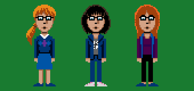
One of the things about these pixel rendered characters that's deceptive at this stage, is we're still looking at them in a very stiff cardboard cutout style stance. This is so we can see what they look like from purely an almost graphic design perspective, are the colors and shapes of a character aesthetically pleasing, does it mesh with the others? Once a character is actually in the game and animating, you're never really going to (hopefully) see them in this boring of a stance, there will be a ponderation and attitude to they way they stand and balance their non-existent weight (even for this style of character) which should make them seem much more interesting and alive.

The next and pretty much final step will be to take our selected pixel version and do a little bit of additional fine tuning of colors, skin tone, shading, and a few other details. Once we've decided on a final we'll create a number of reference angles (front, side, back, three-quarters) and a variety of poses. This will be the guide we'll use to create her final animations in the game bringing her to life as yet another memorable Thimbleweed character.

- Gary


skarsson - Jul 02, 2015 at 21:05
Far right is the one.

Jammet - Jul 02, 2015 at 21:11
My personal favourite is surely the one in the middle, though I would give her a little edge to hairstyle. Like a strand of hair dyed in a bright color. Or one side of her hair put up against her head. She looks absolutely like a character!

Mikie - Jul 02, 2015 at 21:11
The Middle one!

Mattias Cedervall - Jul 02, 2015 at 21:32
Gary, I still think Delores.hot should wear a Star Trek-insignia and classic 3D-glasses (red and blue) instead of ordinary glasses!

Gary Winnick - Jul 03, 2015 at 12:33
We are considering giving her some costume change(s) for Thimblecon...

Arto - Jul 03, 2015 at 15:37
That's good. The pants especially could have some color. Maybe even some psychedelic texture.

Mattias Cedervall - Jul 03, 2015 at 17:42
I hope you do! The Klingon is strong with her... Thank you for your reply, Gary! :-)

jfrisby - Jul 02, 2015 at 22:39
Left!

Malc - Jul 02, 2015 at 23:37
I like the middle one, but I prefer the left hand ones hair.  

I think a pony tail would be interesting moving about in this pixelated style.

Joe - Jul 03, 2015 at 00:35
Somehow to me it looks like they're all making a duck face, or maybe saying "oooooooh"

Nor Treblig - Jul 03, 2015 at 05:20
I agree. I like this Maniac Mansion art style but the mouth looks strangely o-shaped. Maybe three pixels of height are too much for mouth/lips.

Jammet - Jul 03, 2015 at 02:33
I know what you mean, it's because there are pixels above and below the mouthline, and quite dark pixels too. It is supposed to be the lips, heh.

Sebastien - Jul 03, 2015 at 02:43
The first one is the one for me. Second is nice too, but I don't like the third one.

hihp - Jul 03, 2015 at 02:56
I choose middle one as well - and just like Malc, I would give her a pony tail.

Gary, just for the three of us, could you try tendering Delores no. 2 with avpony tail? Pretty please with sugar on top? :-D

Dan - Jul 03, 2015 at 03:00
The middle one is my favourite.
The other two ones appear a little bit strictly. In addition the left one seems a little bit too girlish to me and the right one a bit too well-behaved (because of the smooth haircut and the bulky eyebrows).

Zak Phoenix McKracken - Jul 03, 2015 at 03:17
The middle one. With the head of the left one!

Natalija - Jul 03, 2015 at 03:30
The middle one with the head of the first one... or just the middle one

Marco Lizza - Jul 03, 2015 at 03:31
The middle one looks to much like Dave Miller..

I like the leftmost one very much, but although very "geeky" she does not seem like one who likes nerdy-and-geeky stuff such as Star Trek.

Perhaps the most realistic is the rightmost one. With a bit of different hair-styling.

Nice work!

inexile - Jul 03, 2015 at 04:20
I like the middle one best, although her hairstyle looks a bit stiff and dusty compared to the respective drawing.

Vilinthril - Jul 03, 2015 at 04:44
I like the middle one, but the hair needs to be a bit more edgy, as someone said before.

hippy dave - Jul 03, 2015 at 04:45
The ponytail definitely draws me to the left one, tho now others have suggested a bodyswap, I could go along with that.

Chris - Jul 03, 2015 at 04:45
The middle

Soong - Jul 03, 2015 at 04:47
I like the one on the right best - the face, the hair, the body all look kind of like I though of Delores.  But maybe she could wear the middle ones top and jacket?

DZ-Jay - Jul 03, 2015 at 05:22
To me, it's the one on either corner.  If I had to choose (go ahead, make me! MAKE MEEEE!!!), I'd pick the one on the left.  I think the pony tail gives it a charming naiveté, like any young and fashion-deaf nerd would appear to have.  Plus, it goes with the "preppy" look. :)

    -dZ.

Marco Lizza - Jul 03, 2015 at 05:30
A head/body swap like this seems good to me... :)

http://it.tinypic.com/r/2e0pqa0/8

tcmsurfer - Jul 03, 2015 at 06:05
I don't think Gary really asked for an opinion here. I love the post tough and agree with the middle one... however the red hair on it as a ponytail would be cool. And the mouth is a bit small...

Anyways what really gets me is your typo: "...Thimblewed characters..."

Now who is a couple or getting married in this game? :)

Peter - Jul 03, 2015 at 06:09
I like the left one. She looks very "geeky", like Bernadette vom Big Bang Theory:

http://tinyurl.com/p5upjlp

The girl in the middle has dark hair, which could be a problem with the background colors, the right one has dark trousers, which also can be a problem with the background. I don't like the hair of the right one, the middle is ok. The most "nerdy" girl is probably the left one, which could fit very well to thimbleweed, because it is some kind of a "nerdy" game. Compare:

https://youtu.be/YCpr_QHAqks

mabo - Jul 03, 2015 at 06:53
I prefer the one on the left. But i hope the rejected designs somehow will end up in the game. For example as background folk.

DanVzare - Jul 03, 2015 at 07:31
The head from the first one, shoes from the second, and the body and legs from the third.
That would be my personal favourite.

What ever you choose though, I think mixing and matching is going to be the best choice.

Zuckerberg - Jul 03, 2015 at 07:49
In an interview with Matt Barbon (Matt Chat #138 on YouTube, I think) David Fox mentioned that back in Lucasfilm Games days the actual development (code, at least) was done on SUN machines hopping over to the C64 from time to time. And all other ports stemming from that.

Can you shed some light on the process/pipeline back then? Which machines were coders using? Was it the same for the art dept.? Did you use C64 "native" tools to draw your stuff, or something else? Did you use more powerful workstations to prepare stuff before loading it into the C64?

Gary Winnick - Jul 03, 2015 at 12:31
We tended to do graphics on the target machine which in turn had a connection to our
vax server- In the case of maniac I believe I worked locally on a C64, utilizing software that
both Ron and Charlie Kellner wrote specifically for development- Ron wrote the background
and character set editor, and Charlie wrote the animation program. After we went over to IBM
development we started using dpaint

Zuckerberg - Jul 03, 2015 at 14:11
Ok, so I'd have to imagine the LFG setup back then as a number of machines all hooked up to a central VAX server, via Ethernet or whatever it was called in the 80s, with some of you rocking SUNs, and others working on beefed up C64s - C64s with networking (!)... strangely impressive.

Zuckerberg - Jul 07, 2015 at 15:52
I've just discovered: Chip Morningstar gave a bit of insight into the process at GDC2014 Lucasfilm Classic Studio Postmortem: Summarizing: They did a lot of cross-compilation / cross-development on UNIX for all the target platforms, with a VAX server as host. But also employed a number of custom hardware to reach into the target platform's memory, for example, they had a cartridge that could re-write the C64's memory on the fly, so the development could happen originating from the much more powerful SUNs. Similar to how console games used to be developed, for example: http://devkits.handheldmuseum.com/

Thiezn - Jul 03, 2015 at 09:06
Hi Gary, great to see the whole process around character design. I was assuming the characters all where created directly in glorious 8bit so nice to see their "high-res" versions. In ten years from now those original sketches can be used in the Thimbleweed Park Enhanced Edition (tm) :)

Sorry if this has been answered before but I was wondering what tool you use to create the pixel versions of the characters? An old copy of deluxe paint lying around perhaps?

Gary Winnick - Jul 03, 2015 at 12:26
Actually Mark and I are both using photoshop.

Dan - Jul 04, 2015 at 14:43
I suppose that Photoshop is extremely different from Deluxe Paint.
Is Photoshop really a sufficient replacement for Deluxe Paint in terms of retro artwork? Or would you still prefer D-Paint since Photoshop is designed for too modern purposes?

Badde - Jul 03, 2015 at 13:58
I am not sure about the mouth? Looks like oooohh. I choose the left one.

Mattias Cedervall - Jul 03, 2015 at 17:46
Gary, Mark, Ron and David, have you ever considered creating your own graphics tool? It could be like Dpaint but upgraded and then you could sell a license to other game developers in need of a great tool.

Tomimt - Jul 03, 2015 at 18:46
Middle one, but with a bit lighter hair color, or with a neon color streak.

peterszky - Jul 05, 2015 at 03:42
Left.

Leandro - Jul 05, 2015 at 03:47
I really like the one in the middle.

Roberto Cano - Jul 06, 2015 at 05:08
I love the one in the middle, although I would change her clothes so they are more colorful! Far right is my second best.

masosan - Jul 06, 2015 at 13:56
I prefer the left one!

Christian - Jul 07, 2015 at 07:13
I like the one in the middle most. Second is the one on the left. (I find the one on the right extremely boring.)

Greg - Jul 07, 2015 at 07:50
middle one, maybe give it a try with the left ones head.

Nacho Fernandez - Jul 07, 2015 at 17:56
I was in doubt when I first saw the three final candidates fully drawn (I guess part of it was they don't look a bit like what I proposed).

Anyway, when I scrolled down to the pixel art they took life and I really like all three of them, with some tuning in tones and tiny details you will certainly polish. They are awesome, although the one on the right is a bit too plain, not that memorable.