QuickiePal

by Ron Gilbert
Jul 16, 2015

W00t! Time for a video. It's been a while and I enjoy making them just about as much as your enjoy watching them.

We got one of the first final rooms from Mark Ferrari™ in the game a few days ago and we're dying to show people. We've also been doing some work on lighting using shaders and magic. It's first pass, so there will be a lot of tweaks and changes, but it's looking really promising.

All the inventory icons are still temp art, so ignore them. I SAID IGNORE THEM!

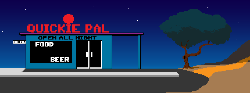
We started out with a quick wireframe version of the QuickiePal, just so we could get a sense of how the room fit into the overall game, how wide it should be and other very basic layout issues. It's not worth spending too much time on the wireframes since we want to have the freedom to cut or completely redo the room without any loss of work. As soon as you've invested time in something, it's hard to throw it out, even if it's the right thing to do.

One of the changes we made as the move the building over the right so when you entered from the left, you weren't immediately at the building. It feels less cramped with a small parking lot.

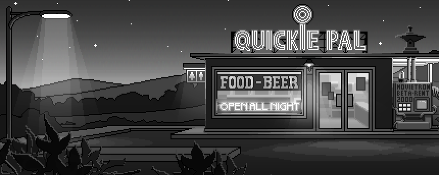
After it had been in the game for a couple of months, Mark took a quick pass at a tight layout in black and white. He likes to work in black and white so he doesn't spend valuable time on trying to figure out colors. Hopefully we can get Mark to do a post on his process. It's all bla-bla-pixel-bla-bla-vanishing point-bla-bla to me.

After the black and white had been in the game for around a month, Mark went on to the final stage seen in the video. We take these small steps so we're sure of everything before too much time in invested. Mark spends a lot of time on color and light, so making changes to the black and white version is quicker.

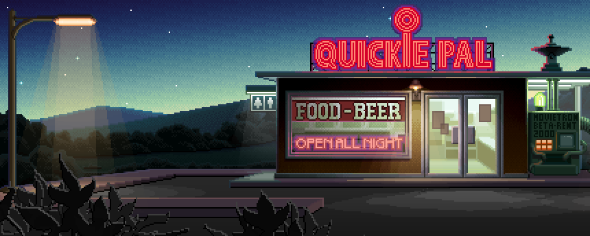
There will be a polish pass on all of the final rooms, but that won't happen until everything is in the game, probably around January.

- Ron

Why are you still looking at the temp inventory icons?


RCM - Jul 16, 2015 at 20:07
Wow! That looks superb!

Lennart - Jul 16, 2015 at 20:09
Aaaaaaaaahhhhhh! It's beautiful!
I want to walk down that path right now.
Having said that, the style looks like Fm-Towns Zak. So that's how Mark's art fits the MM style characters....

Peter - Jul 17, 2015 at 05:38
100 % agree: The game is not looking like "Monkey Island" or "Loom": It looks exactly like the VGA Version of Zak McKracken and the Alien Mindbenders.

Guy Banister - Jul 16, 2015 at 20:11
Man..... it was a great idea to hire Mark Ferrari. That looks so great. That is just pure art.

The only negative feeling I have right now is as though the backgrounds are in a 16-bit quality, while the character are in 8-bit. If that makes sense.

I know this is all temporary art.So in the end it will not look like this. I just want to say that one needs to have this gut feeling that the characters need to fit into the beautiful backgrounds that Mark Created, while also having the link to Maniac Mansion. But that can hopefully be done by shading or some subtle graphic thing.

Guy Banister - Jul 16, 2015 at 20:16
By shading I mean on the playable characters (and not the shading Mark so beautiful did on the backgrounds)..... but done in a subtle way, so it fits this world, but also seems as if this game was found in a drawer, as if it was an abandoned Lucasarts-game from 1987 or 1988.

Guy Banister - Jul 16, 2015 at 20:49
And a third thing I come to think of.

Both the 16 bit feel of Mark and the 8-bit feeling of Maniac Mansion (that made us support the project) are important.

What I am saying is that it would be great if the things could be combined.

But if the only solution is a sort of "switch" between 8-bit and 16-bit that would also be great (like the switch between classic and updated monkey island 1 and 2 in the updated versions.). I know this is a lot more work than you have budget for. But Now I have drinked 3 beers, so I am honest and such. But the best thing of course would be if there is only the real version. Maybe it could be explained in FMV-intro (yeah, I know I am the only one who could think that would be cool. Because it breaks the style of 8-bit retro... and most stuff. Man, my brain is messy when beer)

Guy Banister - Jul 17, 2015 at 06:58
After having watched this on a different screen (and now that I am sober), it actually looks okay, here on my laptop. It had a different feel to it on my other computer. Must be the old screen i am using, or some color balance or contrast stuff that made the characters stick out from the background. Because now I could actually see the lighting effect on the character much better.
And i know the final characters and backgrounds will blend very well together.

Christian - Jul 17, 2015 at 01:28
I think the character looks good on this background!

Norman - Jul 16, 2015 at 20:12
I really like be artwork so far. And I love the attention to detail on the lighting. The overall art style brings be back to what I remember, but I'm sure it looks better than reality did back then. Fond memories enhancing the overall experience, I'm sure.

Patrik Spacek - Jul 16, 2015 at 20:19
Great job Mark! Nice and smooth feeling in such a low resolution. Characters needs more animation frames to keep the quality with Mark.
Paralax is smooth and I dont like the shadow underneath the text. Black outline is enough. Character would deserve shadow spot as well.
I also like the animated parts of the background, which keeps it alive.
Not sure If you are going to make two versions with daylight as well...  good job!

Ron Gilbert - Jul 16, 2015 at 21:32
Problem is the black outline isn't enough, so I added the background. Not totally sold on it, but there needs to be something. We'll probably have it as an option to fit peoples taste and needs.

Augusto - Jul 17, 2015 at 02:57
I would try a black outline and a white-ish glow around the letters. The glow would be semi-transparent, and really small (one or two pixels). That should be enough to make the letters stand-out against a light (with the black outline) and dark (with the glow) background...

Jammet - Jul 17, 2015 at 10:26
I'd simply go with taking the text color and setting the outline to be a darker version of it. Same hue, less light.

Zarbulonian - Jul 17, 2015 at 12:46
You could alternatively make the text brighter.

Rick - Jul 16, 2015 at 20:21
That scene looks incredible!

Talking about bla-bla-vanishing points though, does the interior of the Quickie Pal have a different one from the rest of the scene, or am I looking at it wrong?

vs - Jul 16, 2015 at 20:26
it looks like that to me too!

ashley b - Jul 19, 2015 at 01:37
AAAargh.   I hadnt noticed that.  Now I have....  Its going to bug me if it remains in the game.   Of course, it could become like the Storm Trooper banging his head in Star Wars and end up cool.

Mattias Cedervall - Jul 16, 2015 at 20:31
The graphics are too advanced so it doesn't look like Maniac Mansion. :-( I know it's not final, but still...

Brian Ruff - Jul 16, 2015 at 20:33
This made my day. Great work!

Rum Rogers - Jul 16, 2015 at 20:34
This location's incredibly mouthwatering but... those are really bad inventory icons.

Ron Gilbert - Jul 16, 2015 at 20:37
One more comment on the inventory icons and we're canceling the project.

Rum Rogers - Jul 16, 2015 at 20:39
Did I write "bad"? I meant RAD. Rad icons, Ron!

Marc - Jul 17, 2015 at 02:48
Oh, just great. Thanks for having it cancelled! ;)

Iron Curtain - Jul 16, 2015 at 21:43
Yes, dad. I'll go to my room and think about what I've done.

Floris - Jul 17, 2015 at 10:50
You're letting the fate of the project get into the hands of a man called rum rogers? :)

Rum Rogers - Jul 17, 2015 at 14:21
Tee hee. To be honest, if I had the fate of TP into my hands, you could all rest assured. I would really give Ron & co. unlimited money (if I had it) just to see what degree of awesomeness this game can reach. Alas, I could only donate 150$.

A man with a tape recorder up his nose - Jul 16, 2015 at 21:14
To be honest that stop-watch with a wire looks so stupid that it is sooo cool. Seriously: why would one need a stop-watch to put into the electrical outlet? And that is why it needs to be a permanent object in this game. There more i thought about it the cooler it was.

Brian S - Jul 16, 2015 at 20:44
Wow.  I didn't think I could get more excited for this game, especially at this point.  But that did it.

The art is amazing.  The lighting is a great touch, but not overdone.  

The flashing lights really add to the scene.  Is the Quickie-Pal sign an animation?  Do you expect most rooms to include some level of background animation like this?

Thundercato - Jul 16, 2015 at 20:57
Those black and white shots are amazing! Can you do a Kickstarter for a sci-fi 1950's point and click adventure in black in white next please Ron...... PleeeeeaseRon, go on..... It will be fun. And you can program it in COBOL or assembly just to be extra retro!!!

Man with the golden gun - Jul 16, 2015 at 21:27
An adventure game only in black and white? Sounds intriguing. Especially if you take some of the 1950s propaganda that made the fallout stuff so great. Or at least that is a future project for Ron, Gary and David. Could be fun

mr. T - Jul 17, 2015 at 02:47
I have to say that a 50s scifi point n' click adventure sounds awesome! But a whole game in black and white? That would be a challenge to pull off. I hope some people would try it :)

Ben Henson - Jul 16, 2015 at 21:08
Fantastic stuff. I am loving watching this game come together!

On question though, are locations going to have different versions for different times of day? Or will it be like most adventure games where, say, Scabb Island is always night but Booty Island is always day?

For the record I don't care if there is only one version of each location. I'm more curious about how the team feels about the logic and trying to handle this in a way that doesn't jarr with audiences.

Brian Baker - Jul 16, 2015 at 21:17
Looks gorgeous! Definitely getting excited to play this one. It seems like it would be a shame to use all this tech for just a single game... :)

Bobe - Jul 16, 2015 at 21:29
Reminds me of the sunset in the EGA version of Monkey Island:  http://i.imgur.com/94S0kGM.png

It truly warms my heart.

Iron Curtain - Jul 16, 2015 at 21:35
It looks really good! But therein lies the problem: it looks *too* good. These graphics are more advanced than 1987, even more so than 1991! It looks even better than Sam & Max and Day of the Tentacle, let alone Monkey Island 1 & 2; it's even more colorful than the Dig! How are you ever gonna convince people that the graphics look like they came from 1987 when this looks like it could be from 1996?

Bobe - Jul 16, 2015 at 22:53
Complaining a game looks too good.  I've seen it all now!

Jammet - Jul 17, 2015 at 10:24
It's the style. I think you mean that the background clashes with the Maniac Mansion sprites.

To be honest, it would have probably been a good idea to settle on the style for the game much earlier on, but that is a bit tricky when you haven't done anything of the sort in so many years.

I could very well imagine that, in the event another game like this is born from the success of Thimbleweed Park, they'll settle on *and* stick with one design style all throughout.

I quite like the blend. It is the brainchild of all the experiences of the past, combined with the desire to do something new, but well loved.
It might take some getting used to, and they obviously already have :). So can we.

Ron Gilbert - Jul 17, 2015 at 11:53
This is the way game development works. It took a long time to find the style of Monkey Island, Putt-Putt, The Cave and just about everything else I've done. It takes time. We're being very open and showing you all the revs, iterations and temp art. I might look like we don't know what we're doing, but that just because everyone else hides things until they have figured it out. We're not. Crappy stuff stays in a game for months and months. It's just not worth our time right now to figure out the characters, so we're not. If we had unlimited money, maybe we would, but we don't. I've never had unlimited money for a game.

Iron Curtain - Jul 17, 2015 at 12:43
Ron -

First of all, I'm *SO* glad I was able to make your day with my comment. Me making your day made mine. :-)

Second of all, when I said it looked "too good", I meant that the color scheme and non-flickering resolution looks to be beyond any hardware's capability at the time of the classic LucasFilm/-Arts graphic adventures. I don't see it as any sort of flaw–quite the contrary, I've been sharing Mr. Ferrari's art with my Pixel Artist buddies–I just see it as anachronistic.

Then again, considering what Rare and Nintendo were doing with Donkey Kong Country in 1994, maybe *I'M* the one who needs a lesson on what came out when.

DZ-Jay - Jul 18, 2015 at 08:31
No, it's not only you.  This is what I was afraid of when I mentioned the art style in previous posts.  I am absolutely in agreement with you:  Mr. Ferrari's artwork is fantastic and gorgeous, but it is too exceptional and intricate for the stylistic and technological notions of the time in which it is supposed to have taken place.

The same with the lighting tricks: they are great and beautiful, and seem to work perfectly -- but that sort of thing was just not available then.  The burgeoning stylistic notions and technological limitations forced artists and programmers to focus their efforts in the real important points, resulting in a very economic (in use of technique not cost) yet effective style.  It looks like a very interesting technological challenge to solve, and you've done so very effectively; but engineering play and technique should not be the driving force of the game.

Ron, please do not take this as any slight against the work or the progress so far, I cannot stress how beautiful it looks.  It just does not fit with the early/mid 1980s style you were aiming for and that we were lead to expect.  Your goals and your tastes may have changed, I can appreciate that; but then you can't really describe it as a "new game from the 1980s that you just discovered" (or however you phrased it in the past).

To me, right now, it looks like any other "retro-looking" modern game.  Perhaps better looking that the typical ones, since Mr. Ferrari's talent are legendary; but the *feel* I get watching the video is of a "retro-chic" modern style, which is a shame.

I still hold hope that you can reign in Mr. Ferrari's talents and modern styles a little bit, and return to the roots from which you always intended this game to spring. :)

     -dZ.

longuist - Jul 19, 2015 at 09:01
I can admit like Ron its a slight departure of the direction which was communicated in the beginning.
I'm too addicted to the nostalgia of the early games, was blown away by the first animated gif, heck, i even begged to not completely get rid of the blocky verb font. I was a bit baffled at first to see the changes, like you.
But lets be fair. In the old days one was blown away when the VGA or FMtowns versions of the games were released. In one update Ron made clear to make use of advanced techniques which were not present back in the days. Think of it as the FMtowns version of the game.
The more i think about what to expect from the game it is not a direct copy of the games i love, its something new, shiny, unique, what haven't be done before.
While staying true to the roots of the genre. As an example, early screenshots showed a smooth gradient in the sky, its now dithered (ugly/glorious), which is a resemblance to the palette restrictions of the past.
It was advertised as a "true spiritual successor to Maniac Mansion and Monkey Island." Graphic wise its the the big heads of MM and the backgrounds of MI.
A successor (hopefully) also implies to make improvements on the technical side. This is the case now. Im happy :)

In short, while there are changes in style, its not even close to a complete change of direction. And it definitely does not look like "any other "retro-looking" modern game"!!

(And thank you all for sharing the whole process!)

Jammet - Jul 17, 2015 at 13:12
And just like Monkey Island, and all the other games, Thimbleweed Park now has a style of it's own. People who feel in love in the past, want to see their baby again -- to put it in a metaphor -- but naturally, the way these things progress, she's changed, and you just fall in love all over again.

I guess what I'm really saying is: It's a new game, it is exactly where it's gotta be. It's everything I'm hoping for, so far!

DZ-Jay - Jul 18, 2015 at 08:37
But that's not what it was intended to be.  Take a look again at the Kickstarter page.  What does it say in large, bold letter at the very top:

https://www.kickstarter.com/projects/thimbleweedpark/thimbleweed-park-a-new-classic-point-and-click-adv
"It’s like opening a dusty old desk drawer and finding an undiscovered LucasArts adventure game you’ve never played before.

Here's another piece:
"We like big pixels. Huge ones. Pixels that have their own Zip Codes. Pixels a family of six could live inside of and still have room for Uncle Pete when he drops in unexpectedly on his way to the coast.

We had a lot of fun building Maniac Mansion, there was a charm and simplicity to the art that let the game design shine and your imagination run wild."

I don't see that in the video.

Jammet - Jul 19, 2015 at 11:22
Well, I've said it before. We're in agreement about a lot of things, here. You are correct that this is different from what it was going to be, at first.

I fell in love with the old Lucasfilm games, and I just adore what I'd today call "simplicity" in them. Today you'll need willpower and the strong desire to "settle for less" before realisation hits you, that sometimes "less is more".

That being said, the path taken is less so much about retreading old steps. We deviate early, and so, this game now looks like like it was released in 1991 to 1992 instead of the eights. Personally I adore the look all the same. But I've also said that, since it's been a while since Ron and Dave have been doing this, it's an evolutionary process, and we're seeing mutations, the best of the best "interbreeding" and producing a new result. So if another game is going to be made after this, the decision to stick to a very specific style from the get-go will be much easier.

Mattias Cedervall - Jul 17, 2015 at 11:46
I agree!

Assaf - Jul 16, 2015 at 21:50
Really pretty. I love Mark's art so much. Thanks for sharing.

Lainer - Jul 16, 2015 at 22:09
This honestly looks better than I was expecting.

Giskarrrd - Jul 16, 2015 at 23:27
That looks sensational, even more excited about your choice for Mark now :)

Arto - Jul 16, 2015 at 23:34
Looks great! And I don't think it looks "too good" at all. This has the feel of a classic Lucasfilm game.

Mattias Cedervall - Jul 17, 2015 at 00:06
Ron, I will now tattoo the inventory icons on my body so I can always look great when I'm naked! <3

Joe - Jul 17, 2015 at 00:12
Were the neon signs casting light as well? It was a little hard to tell.

David Fox - Jul 17, 2015 at 01:34
The neon signs weren't actually casting light. That's just how Mark drew them and the highlights off of the nearby objects. Cool, huh?

Joe - Jul 17, 2015 at 21:48
That is neat! Although I was more referring to the lighting on the character. Ron demonstrated how the static lights in the background affected character lighting, but I wasnt sure if the "dynamic lights" were affecting the character as well. She walks past the signs to fast to get a look look.

Mattias Cedervall - Jul 17, 2015 at 00:22
The lightning looks wonderful! :-) The lightning also look like it does in real life... I always knew this game was based on a true story!

crmbl - Jul 17, 2015 at 01:45
Wow, I didn't know that!

Orcan Ogetbil - Jul 17, 2015 at 01:00
Honestly, I like the black&white version better. The colors took away the cartoon feel and made the room look more realistic (but maybe that's what the artist wants). The black&white is just more Maniac Mansion to me. Especially those bushes and the mountains in the background enjoy the simplicity in the black&white version.

Since Mark is doing all the rooms in black&white initially, can we have a black&white version of the game?

Mattias Cedervall - Jul 17, 2015 at 01:05
I agree with you even though I wish we could have a simpler color version.

Mattias Cedervall - Jul 17, 2015 at 01:04
Ron, what would your name as a Sith Lord be? Darth Scumm?

Orcan Ogetbil - Jul 17, 2015 at 01:06
Another quick note, should the stars be parallaxing? To me, it feels like they should remain  fixed since they are basically too far away, almost at an infinite distance compared to the distance the camera moves horizontally.

Ron Gilbert - Jul 17, 2015 at 01:13
Technically they shouldn't (or so little you wouldn't notice), but it just looks better when they do. It's one of those things that looks like a mistake when they don't move.

David Fox - Jul 17, 2015 at 01:36
Yeah, kind of like hearing (not hearing) explosions in space in a Star Wars movie.

Jammet - Jul 17, 2015 at 10:34
I cannot see it in a video, but I'm sure in the actual game I'd notice ...

Do the stars glimmer? A lot of beauty of a scene can be had with stars that aren't static. Having that pixel just ....pulse slowly ... I've seen it in other games. It is a very simple, yet a very beautiful effect. It could be one of those things where Marks experience with color cycling could really come in handy. It could be very simple to pull off, for him.

Dominik - Jul 17, 2015 at 01:22
DUUUUUDE!
THAT IS AMAZING!
.
.
.
Sorry, just felt like an all-caps moment! I really LOVE how this is coming together. But what a tease! Ron stopping and not going through any door! Arg! I want to explore the rest of the game world so badly!

The lightning is a really nice touch ans helps to blend it all together. I wonder how the character and background art fits together in bright daylight, where no lightning merges them?!

Dominik - Jul 17, 2015 at 01:29
Regarding the Text shadow: Why not render it as a drop shadow: A slight Offset and a little blur and you are good to go and still improve the background-foreground-contrast a lot.

The black Box of horror needs to go ;-)

agent069 - Jul 17, 2015 at 01:42
That scene looks really nice in black and white, I wonder if it wouldn't be nice to have a bonus or an option to play the whole game like that.

dr snaut - Jul 17, 2015 at 01:52
You forgot to pick up the twig-like thing next to the renting machine!

MarcusG - Jul 17, 2015 at 01:59
WOW! This art style simply oozes charm!
The relatively basic shapes combined with Mark's phenomenal colour work, creates this very distinct modern-retro look - quite like nothing else I've seen before. I'm loving it!

Darkstorm - Jul 17, 2015 at 02:35
Background looks fantastic!  Love the quickie pal sign (especially the way the i lights up) and the sunset.

Note me down as another fan of having an option not to have the shadowbox behind the text.  Looks rather odd.

Augusto - Jul 17, 2015 at 02:47
Oh. My. God. Awesome!!!!

I love the light effects, how subtle yet powerful they are!

But, in comparison to those backgrounds, doesn't the character feel a bit... flat?

Ernst - Jul 17, 2015 at 02:47
Looks absolutely awesome guys.. I'm so excited.
It looks and feels 10 times better than I ever could have hoped for.

Thanks for all the hard work and for letting us mortals have this great insight in the process

Rob Carlson - Jul 17, 2015 at 02:49
That sunset is indeed wonderful. So glad that Mark could join the project!

Also sorry if this question has been asked before, but what resolution do you anticipate the final game will run in? I've never been a huge fan of mixed-resolution assets (think the Windows versions of DOS Humongous Entertainment games, where the artwork is scaled from 320x200 but the mouse is 640x480), and I think the scaling for the character when she moves further into the background is awkward. What are your thoughts on running the game at the same resolution as implied by the background art? Is this way more complicated than I realize?

Dan - Jul 17, 2015 at 06:13
Ron has taken a stand here: http://blog.thimbleweedpark.com/parallaxing

I think the higher resolution increases the smoothness of all movements. In 320x200 animations and scrolling are far away from being smooth. But the character scaling should not go along with smaller pixels, I think.

Nacho Fernandez - Jul 17, 2015 at 02:57
Darn beautiful!!!

Sebastien Frippiat - Jul 17, 2015 at 03:01
This is quite gorgeous ! I really like that.

Peter Brodersen - Jul 17, 2015 at 03:09
How connected to the code is the animation of the scenery? Eg. the blinking neon lights in this scene? Are "Open all night"  and "Quickie Pal"  (and perhaps even the expanding circles on top) just a couple of independent animations?

David Fox - Jul 17, 2015 at 14:44
All background animation is currently being run by scipts... They just loop through the different states of the pre-drawn images. In the case of the OPEN ALL NIGHT, there's just an ON and OFF state I cycle between. In the case of the Quickie Pal, there Mark drew 8 separate fames:
Q
QU
QUI
QUIC
QUICK
QUICKI
QUICKIE
QUICKIE PAL

The circles were built into the above 8 states. To animate, I turn each state on/off as needed in a loop:

script flashQuickiePal() {
while (TRUE) {
for (local x = 1; x <= 8; x += 1) {
objectState(quickiePalOutsideMainSign, x)
breaktime(1)
}
for (local x = 1; x < 3; x += 1) {
objectState(quickiePalOutsideMainSign, 0)
breaktime(1)
objectState(quickiePalOutsideMainSign, 8)
breaktime(1)
}
breaktime(2)
objectState(quickiePalOutsideMainSign, 0)
breaktime(2)
}
}

David Fox - Jul 17, 2015 at 14:45
(pretty indented formatting was lost while pasting this in...)

Rum Rogers - Jul 17, 2015 at 15:18
Thanks David for this wonderful post.

Ricardo Marichal - Jul 17, 2015 at 03:10
Ohh, wow. What a beautiful icons !!!
I ignore the temp background...

Natalija - Jul 17, 2015 at 03:39
Wow,these inventory icons look awesome.I can't stop looking them!

LichiMan - Jul 17, 2015 at 03:57
Beautiful!! I mean beautiful!! Beautiful background, beautiful light over the character, beautiful girl, beautiful macho voice over... ouch! what's that... invent... that... black box behind the text!! Yes, have it as an option would be great. Thank you!
Mmmmm, beautiful sunset.

LichiMan - Jul 17, 2015 at 06:27
Btw... beautiful WC icons!!

Boss - Jul 17, 2015 at 04:02
First time I checked what's happening with this project, since I backed it.
Fantastic! Did not expect the use of lightning and shaders and this kind of fancy stuff from old a guy like you. :)
I really like it!

mr. T - Jul 17, 2015 at 04:08
Mark! You son of a b *hands smashing together, biceps bulging* You did it! That was the first thought that came to my mind. Just effin gorgeous...and those colors, oh man...I'm already loving the atmosphere! The character style and backgrounds fit well together in my opinion, actually in a charming way. I would have gone just a bit rougher route for this game, but I can't really complain when my eyes keep melting looking at the stuff.

The video seems to blend the dithering effects away when not viewing in HD mode, which made the look feel slicker at first for me. Small laptop screen maybe adds to the effect... The last screenshot and HD version reveals the true look, fortunately.  

P.S. I swear I ignored all the inventory items...mostly.

mr. T - Jul 17, 2015 at 04:20
I wish Mark would do a post on his process at some point. Would be nice to see how the B&W -> color transition is done.

Ashley B - Jul 18, 2015 at 18:12
Hear, hear.  I really would love to see a guest post by Mark

longuist - Jul 17, 2015 at 07:04
Yes the scaling of the video f'ed it up a bit. First i thought, yikes, this gibberish looks like hires sierra with smoothing :)
I guess there will be an option in the game to restrict the screen to original resolution (or multiples). And scaling options like in scummVM, as tastes differ. In this respect (and only in this!) i miss CRTs.

And why are there inventory icons at all, this spoils my imagination :P

As for the text background box, i too dislike it. I second the idea with black outline and transparent white glow. Maybe something like this: http://i.stack.imgur.com/ZGah8.png
..but better..

Mario - Jul 17, 2015 at 04:22
YOU ARE ON THE RIGHT TRACK, DUDES!

pikomi - Jul 17, 2015 at 04:32
Beautyful artwork. The game will look great.

Robert Megone - Jul 17, 2015 at 04:33
Wow, really nice.

I love the lighting system,  you've absolutely nailed it!

I've said it before, I'll say it again..

This guy needs to make an appearance... Who doesn't like to pause their game..

http://robertmegone.com/public/scummvm/snail/c64.png
http://robertmegone.com/public/scummvm/snail/atari.png

I'd even settle for this guy...

http://robertmegone.com/public/scummvm/snail/amiga.png

Jammet - Jul 17, 2015 at 10:40
Yeah! :D The loading snail was epic! I wish that was thrown somewhere in there, even if it's just sitting on a plant or even a silly picture in a frame on an office desk, or something XD.

Nor Treblig - Jul 17, 2015 at 15:24
I'd vote for the C64 version :-)

Estranged2 - Jul 17, 2015 at 04:53
With everything looking good and final, it becomes more obvious that the characters need idle animations (even simple blinking with the eyes, something many games don't do), but I remember that in the podcast you mentioned you're working on that.

Overpainting simple blocky backgrounds and rendering light and other effects on top is a good way to go. To me, one of the reasons the NPC characters in MM and Zak looked as if they really do what they do (as if they even used the same verbs that you used) was that the backgrounds and the objects were simply defined and looked "usable" and not part of a complex background painting.

Alien426 - Jul 17, 2015 at 05:09
Where does the dithering of the sky comes from?
The PNG file has 3524 colors, but that could just come from the way it was saved.
Will you limit your palette to 256 colors? I'm not really that much of a purist. If going with a compromise between old and new (less/bigger pixels, not limiting yourself to a color depth) makes the dev's life easier, I'm all for that. I just wonder if the dithering is an artistic joice.

Alien426 - Jul 17, 2015 at 05:10
*"comes"=>"come"

Paulup - Jul 17, 2015 at 14:53
To me, dithering is really important to give it the proper look of the classic games...
I'm really glad they added it to these new shots, as I felt it was the one thing missing from the previous Mark pieces...

LONG LIVE DITHERING!!!

Giulio - Jul 17, 2015 at 05:24
This is simply UNBELIEVABLE.... WOW! Fantastic work from all of you! And even though it does look a bit more modern than MM (and MI too actually) I believe it is a wonderful compromise. The game should have a retro spirit but adding this modern touch only helps to its depth in terms of atmosphere. This is truly amazing!

Solarstorm - Jul 17, 2015 at 05:27
Already looks better and more fun than Broken Age. :/
That looks like the game i awaited when backing BA.

Jammet - Jul 17, 2015 at 10:43
Broken Age is a wonderful game in it's own right, but I must agree. This is what I wanted. This is my home.

Peter - Jul 17, 2015 at 05:34
Finally, it looks like something close to Monkey Island 1 or Loom. I'm personally very happy with the art. It looks like a retro-game, something that I haven't played in the past and just discovered. I would also say, it looks even better like the Monkey Island 1 Art. When I first saw it, I thought: It looks very much "Photoshop" like. So my only critics would be, that it would be better to use dPaint, instead of Photoshop, because you know the "Photoshop" Filters so much from everything, that surrounds you in you're daily life, like commercial things, etc. So it is a little bit confusing for me, because it looks like: Try to repaint Monkey Island 1 with Photoshop instead of dPaint. But finally, I doesn't care: It's a game, 90 % authentic with the look and feel of the old games, and the Art-Style is just awesome (especially the mountain in the right part of the screen looks like the old games). It's very beautiful, and I hope that Mark will do the backgrounds for every room. It would be very strange, if Mark is doing only the Background for some, but not all rooms, that would destroy the homogenic approach. For example: Take the VGA Version of Zak Mc Kracken and the Alien Mindbenders: If you take the passage with the squirrel, you have the very beautiful mountain Image of Mark. In some passages  (for example the Labyrinths or the Bridge in San Francisco), i feel that there is no background image from Mark, so it switches between complex art Backgrounds and very simple graphics: I hope that Mark will paint the background for every room. Another question would be the question of Music: I tried to put the Music of the Thimbleweed Park Theme as background to it, and than I tried the iMuse Music of Michael Land. I hope that you will tell us more in the future, which Music Style, will be choosed for the whole thing. I think Mark Ferrari is absolutly the right choise for Thimbleweed Park. I absolutly adored the art style of Mark in dPaint, compared to the scanned images of Monkey Island 2, that were done by Peter Chan. So I'm very glad, that the style is more Monkey Island 1 like. I'm very happy about the development of the game, it's a little bit like a childhood dream that comes true. I'm also a Tim Schafer Fan, and I can say (without make to much critic about Tim, because I also love his games): You are doing much more right like Tim in "Broken Age", to make a Adventure Game in a retro Style, because it recalls some great moments of my life, when I was playing this great games and bring back some great memories! And that is what I love about this kind of games... Great Job!

Jammet - Jul 17, 2015 at 10:48
Good points all around. Had the same thoughts on DPaint vs PhotoShop. As for the music ... I'm probably alone in this. I'm hoping that there will be some music in the game that also sounds like iMuse played with a Soundblaster of old. You know. OPL / Adlib sound. I love the old Lucasfilm games music.

Dan - Jul 17, 2015 at 05:38
Awesome! That's not just an artwork, it's art! It inevitably may be rather 1990 than 1987, but it will be a benefit for the game's atmosphere! VGA has never appeared fresher!

Soong - Jul 17, 2015 at 05:42
Wow!  This is absolutely beautiful!

I know it's not exactly 1987 style, but I wouldn't change that.  I was actually hoping for a slightly more modern look than 1987 anyway.  The trailer already looked slightly more modern than 1987.  The early 90s adventures had a lot of details in the hand-drawn back- and foregrounds that really made my imagination go wild.  Currently, Thimbleweed Park looks roughly like those adventures, even though the color depth and the lighting is more advanced.  I think it is still retro enough to not make everything smooth and to still make people feel nostalgic.

Please don't change the game to make it look older than it currently does.  This is as close to the perfect balance between retro look and modern features as I can imagine.

Mario - Jul 17, 2015 at 07:30
i copy that. you are absolutely right!

Eric - Jul 17, 2015 at 05:42
Looks great! :)

Gianni - Jul 17, 2015 at 06:40
Fantastic job by all of you!
I would say that this calls for two other posts: Mark's technique and how you setup lights in Rooms!
Keep us standing in awe!

Dinsdale Piranha - Jul 17, 2015 at 06:44
Looks great! The lighting effects are a very nice touch :)
I want to go to there.

Diduz - Jul 17, 2015 at 06:45
I don't know... the characters remind me of Maniac Mansion, but the backgrounds look they're from Loom/Monkey 1 (VGA versions). Feels kind of weird.

Kai - Jul 17, 2015 at 06:47
This is beautiful. I have to admit, though, that I was also hoping for something that resembles a little more the style of MI1 EGA. So I wrote a converter in Python (it was actually only 4 lines of script) to reduce the palette. Here is the result:

http://imgur.com/5pY4zPm

Of course this is a simple "nearest neighbor" palette reduction - not a fancy process with dithering and all that. But maybe something like this could be implemented as an optional video filter. That way, we could have Mark's fantastic pixel art and still switch to EGA (or even CGA) glory with the push of a button.

Oh, this is the script I wrote:

from PIL import Image
im = Image.open('quickiepal1.png')
im.putdata(map(lambda pixel: tuple(map(lambda x: (x + 32) / 64 * 85, pixel)), im.getdata()))
im.save('quickiepal1_ega.png')

Gv - Jul 17, 2015 at 19:27
There is a simple method for decreasing the palette, you have to use a matrix like this:
https://en.wikipedia.org/wiki/Ordered_dithering

for each pixel(x,y) in the image
color=getPixel(x,y)
if color.red > matrix(x mod 8, y mod 8)
then color.red = 255
else color.red = 0
if color.green > matrix(x mod 8, y mod 8)
then color.green = 255
else color.green = 0
if color.blue > matrix(x mod 8, y mod 8)
then color.blue = 255
else color.blue = 0

It uses the 8x8 matrix, and although not exactly the EGA palette, more like the CZ Spectrum palette of 8 colors.
Try it with that image and see.
In my website I have examples of it.

Gv - Jul 17, 2015 at 19:35
In the case of the 8x8 matrix you should divide the red, green or blue value by 4 before comparing against the matrix, or inversely multiply each value in the matrix by 4, because you have 64 posible values in the matrix, and 256 posible values in each color component.

Kai - Jul 18, 2015 at 03:15
Now that I see it with "real" dithering, I have to say it introduces an awful lot of noise. I still find it beautiful, though. It reminds me of the EGA mode of MI2, where the game would run in 640x350x16 and dithering was used to emulate 256 colors. You can play MI2 in that mode in Dosbox if you set MACHINE=EGA. ScummVM won't let you use this video mode IIRC.

Morphez - Jul 17, 2015 at 07:23
Wow. Just wow!

Mario - Jul 17, 2015 at 07:35
@David :  BTW, shouldn't there be a Toilet-Entrance for Mindbenders too? lol

Peter - Jul 17, 2015 at 08:28
When you go to the right, over the hill: What comes next? Which room? Is this the first room in TP? It looks a little bit like the opening sequence in Monkey Island and "Quickie Pal" is some kind of pendant to the "Scumm Bar". Is the town of TP when you leave the room on the left or on the ride side???

Peter - Jul 17, 2015 at 08:29
One thing that I never saw before: It would be really awesome to have a 360 degree room that ends at the beginning? Any plans or ideas for that?

Roberto Cano - Jul 17, 2015 at 08:38
W. O. W.!!!! Surpasses all my expectations!! Congrats!!!! I wanted to play the game before. When it was released. Now I want it for yesterday!!!! Give it to me!!!

Now onto the comments: the sky background seems a little bit flat/still to me. Would be an idea to add twinkling stars, slow moving clouds, mist or floating dust particles to the scene? Does it make sense? Do I make sense?? Do I????

Keep it up, I already love you!! :)

Arto - Jul 17, 2015 at 08:40
I've now played this some time, and seem to be stuck... I'm in front of Quickie Pal, and I have been walking from left to right and back. I have also tried to look at the sewer grate, but that didn't help. I would love to tell you what is in my inventory, but I honestly have no idea what those things are... No idea what to try next. Is there a walkthrough somewhere?

;)

Dominik - Jul 17, 2015 at 17:21
This has to be one of the best comments I have read so far!
Thank you for making me choke while loughing!

Peter - Jul 17, 2015 at 09:06
Ron, are you doing some kind of presentation at Gamescom, like the presentations in Hannover and Australia, that we can see on YouTube. Just to know, if I should book my train ticket from Berlin to Cologne? If you do a presentation: Do you speek about "Thimbleweed Park" ?

Matthias Gansrigler - Jul 17, 2015 at 09:49
It looks seriously amazing. Enough said. Stunning.

Alessander - Jul 17, 2015 at 09:54
Great art, thanks! My only concern is the bathroom for men and pines. Sorry, but I have no constructive feedback on  how to turn the pine into a woman silhouette. Maybe it's better to cancel the project, Ron!

Pajama Sam - Jul 17, 2015 at 14:46
At first I thought it was a restroom for men and tentacles ;) would be a nice call back to maniac mansion I suppose!

PanamaJAG - Jul 17, 2015 at 09:55
This looks absoluty GREAT!
I'm trying for something else to say, but it's just that: Absolutely GREAT! =)

Matt Tuttle - Jul 17, 2015 at 10:12
Wow, that is gorgeous! I'm getting more and more excited about this game with every update.

I have to say this is some of the best lighting I've seen in a "chunky pixel" game! Thank you for not using blurred lights like several other pixel art games have.

Jammet - Jul 17, 2015 at 10:16
Absolutely amazing! While the mixed breed of very blocky vs not quite so blocky (C64 meets PC) takes a bit getting used to, that just what the doctor ordered! I love this! Wonderful!  It makes me want to start playing!

Just thing --- I hope you don't use the semi-transparent rectangles around dialogue lines in the final game. :) They weren't there in the past, and there weren't needed then ... and they're not needed, now. The letters have a nice outline, and are perfectly readable without these rectangles.

wysiwtf - Jul 17, 2015 at 10:39
I do like the artstyle le very much but I have to agree the "polished realistic pixel look" doesnt look like Maniac Mansion (too colorful and advanced) nor like Monkey Island (not comicy enough). It has something from Indy4 (maybe also The Dig), being realistic and all, but the style reminds me a lot of the later Sierra SCI-Engine games (*gasp!*, he said it!).
Anyway, as said I like it a lot: it takes courage to actually want to make the game look good and unique despite knowing some of the retro 8-bit purists will probably get a bit grumpy. Just give us a C64 demake of the game afterwards and everybody (including my 1541 ultimate) will be happy ;D.

And I have to agree that the black and white art has a whole different atmosphere while also looking very good. Some other commenters suggested to make a follow up game in that style but since you already have all the rooms of this game, why not simply make it an optional b/w-mode feature (think of the MI Special editions with the 2 gfx modes, also it would probably be possible to do this transition with shader postprocessing alone)? Maybe as a little extra after the first playthrough to enhance replay-value.
That and developer commentary.
Of course.

Jeff - Jul 17, 2015 at 10:44
This seriously looks amazing and is making me more excited for this game than I had been. That path! I want to walk down it! Really taking me back to the days of MI 1. You guys are doing awesome work; don't change a thing.

Kristoffer Trolle - Jul 17, 2015 at 10:46
Looks good, keep it up!

Rez - Jul 17, 2015 at 10:50
It's simultaneously exactly what I dreamed of and way better than I could have imagined.

Mattias Cedervall - Jul 17, 2015 at 10:52
Gary, regarding the QUICKIE PAL-sign, why not add a circle over the other letter "I" as well? Then it will look like hypnotic eyes staring at you. :-)

Magnus - Jul 17, 2015 at 10:59
Superb grafics! Really looking forward to play this game. Doesn't matter that the look it a bit more advanced than Maniac.

Derrick Reisdorf - Jul 17, 2015 at 11:06
I don't know how I feel.  I LOVE Mark's art, but it's definitely not feeling like the original vision of making a C64-style point-and-click.
And, that kind of derails other aspects of the original concept...
Is this still going to be set in 1987 (or thereabouts)?  I know it certainly could be set in that year, but I really liked the thought that this was really going to be designed to be some "lost" game that not only is representative of popular culture from those specific later years of the 80's but also mimics the fidelity of videogames of that time.  I definitely still want and expect to see a lot of jokes and references to pop culture and tech and what was going on at that time.
I think that's what Ron originally had in mind (making a C64 game from 1987), graphics-wise; The exception would be that he wanted a "real" soundtrack.  Though a lot of people still praise and use the SID chip, I think Ron thinks that being able to completely emote through sound design and music is best; instead of having to limit that ability by emulating the audio restrictions of that time.

Don't get me wrong, I LOVE what I'm seeing, but I now think that it's not an old 5 1/4" floppy we're finding in a drawer, but a CD-ROM.  Maybe move the story out from that bubblegum pop punk era of the 80's, and into the burgeoning grunge era of the 90's?

In any case, I can't wait to see (I mean, hear) sound added to this scene.  The bug-zappy sounds of the neon light.  The hushed sounds of cars occasionally passing by on a nearby road or highway.  The chirps of crickets, eerily similar to those outside the Edison's "maniac" mansion.

EdoBvd - Jul 17, 2015 at 11:07
Well done; love it; want to play.
Very good balance between retro-big-pixels compatibility and not-too-boring for our 2015 eyes.
This puts the bar high for the animation and characters and text, but I'm sure you'll find something.

Only problem is: this is going to take a lot of floppy disks.

Derrick Reisdorf - Jul 17, 2015 at 11:13
Oh, and, Ron, since we have transparent doors/windows here...That brings up an issue you brought up a little while ago.
Are you guys going to somehow handle displaying characters that may be inside the store, if there can be any other characters that can walk into and around the Quickie Pal?

Helge Frisenette - Jul 17, 2015 at 11:17
Guy, guys, guys..!
Something like this would be *easily* doable on consumer equipment in 1987 or even 85. Just because your cheapskate parents wouldn't give you more than 8 bit 2nd gen home computers, doesn't mean that was the de facto standard.
Mindset and Amiga for example had specs that would allow this, not to speak of the many exotic Japanese computers and consoles.

Ron and co: Maybe it would be a good idea, and I know this might sound strange at first, to agree on a hypothetical mid 80's machine that you are doing this game on. A machine whose specs are detailed enough to give you clear and certain bounds within to roam and bask.
You could even do a hypothetical cabinet, company and back history. And maybe even include it in the game?
This is after all to a large degree a retro game, where you are taking on restrictions and limitations willingly.
I think it would give a greater sense of direction and purpose. And also you would completely avoid feature creep.

Derrick Reisdorf - Jul 17, 2015 at 11:34
Yes, and I was also thinking that Ron also create some fake back story on the development of this game (which was in 1987; the project was eventually abandoned).  What went wrong?  Why was it not released?  Ron could devote only as much time as he wanted to make this stuff up.  It could be as simple as a little blog, or as extensive as you suggested (with the fake computer) or making a short documentary about the (initial) failed development of Thimbleweed Park.

Maybe because of the "war on drugs" at that time, no one wanted to put out a game with the word "weed" on it.  Ron was too stubborn to change the name.  I know it would be difficult for Ron to do (and maybe he really wouldn't be able to convincingly pull it off), but it would be hilarious if he created a rockstar alter ego to do something like this.  Okay, rockstar make come off a bit cheesy if not done right.  Maybe just total asshole instead.

Derrick Reisdorf - Jul 17, 2015 at 11:48
Regardless on whether something like this could have been done on a consumer machine in the late 80's, I just felt like Ron was specifically wanting it to look like a C64 game.  This certainly doesn't.
I think this would be possibly the best-looking Amiga game, if it existed as such.

Really, graphics like this were more indicative of the mid-90's.

Ron Gilbert - Jul 17, 2015 at 12:01
You're right, this is a departure from what we showed on the KS. The KS art was more C64, but we didn't have Mark back then. When Mark showed us what he could do, we changed the style. Mark is an amazing artist and we wanted to take advantage of his talent. It's still important to us that we do a classing point&click with verbs and nice retro art and we're sticking to that. Things change in a project, they always do.

Derrick Reisdorf - Jul 17, 2015 at 13:15
I know EXACTLY where you're coming from.  When I first saw the art Mark put up, I was like, "Yes! That!".

But, then I thought back to the photo of your Thimbleweed 5 1/4" floppy.  And, I got a little sad.  I had visions of video game critics praising this game- That not only was it simply a great game in itself but also a powerful homage to the C64 and the heyday of point-and-click adventurers.  The direction we're going is feeling more like an indie game with a retro aesthetic, rather than a true retro game.

And, I'm cool with that.

With Mark on board we HAVE to let him work his magic.  I'm just wondering if you are also thinking that because of the new not-so-retro look that the time the story takes place should be taken out of 1987 and pushed further into the 90's.

I KNOW I am going to LOVE this game.  I just have to get over the idea that you put in my head of some great C64 game out there of yours- its last existence remaining on a sole floppy disk of some forgotten desk drawer.  Okay, I'm over it.  Carry on.  :)

Mario - Jul 18, 2015 at 04:54
i followed all your comments and always shaked my head.
did you back 1K or more or just 10$ or even nothin? just sayin, some people have ridicilous imaginations which don't match the majority and i could understand your doubts if you had backed 1k or increased value and you worry about your invested money.

But hey, nerds are all around. i am sure you ain't the only one.

who cares if its 1987, 1984 or 1990 styled?
it is what it is: a classic click and point adventure on a higher level than it could have been done in the 80s.
all these games kept you addicted due to it's puzzles, not because of the pixeled gfx.
the addiction to finish the game kept us playin over and over again and not because of a floppy disc, mc or the gfx on a C64.

@RON: BTW, Dead Ends in MM were kinda useful , cause u had to play again and again and knew the puzzles better and better and brought you deeper into the game.

Estranged2 - Jul 18, 2015 at 10:16
I liked the dead ends and death because they showed real consequence, you could actually damage your progress and had to care about the outcome of your actions, which made everything more engaging and dramatic, but it is very unlikely that Ron Gilbert will ever go this way - his design philosophy is totally against that. David Fox might be more OK with that, but he's not the project lead. I'll enjoy whatever they make, as a backer I don't want to be entitled - if I wanted a game that satisfies all of my personal preferences, I'd had to make one myself.

Peter Campbell - Jul 18, 2015 at 17:27
Dead ends absolutely suck, they do nothing to improve the quality of a game at all imo.  In a point and click puzzle adventure game that takes place throughout an entire town with multiple playable characters, it would be the worst design decision in the history of video games to include dead ends.

Jammet - Jul 19, 2015 at 11:29
Please don't tread on the sensitivities of other people, who really do care about the style :).

Dan - Jul 17, 2015 at 13:48
You are on the right path. Maniac Mansion may be a great game but your artwork above could not look better! It's the perfect choice for an atmospheric retro point'n'click adventure and it reminds you of the best adventure games of all time, which Maniac Mansion was rather a trailblazer for.

I wouldn't say that anyone of you had broken his word, because on the one hand you had made clear very early that the final art style was still not determined and on the other hand the KS video featured a Quickie Pal that also looked much more detailed than the C64 style.

And maybe you will still find enough time to implement an additional 8 bit mode as an accommodation for C64-retroists. It simply would mean to drastically reduce the color palette, which would be quite easy to do once you have done the highly detailed version, I think.

Derrick Reisdorf - Jul 17, 2015 at 16:30
I don't think they should put any extra resources into making some kind of C64-mode.  Unless, there's already some kind of existing tool  that can render (or convert) sprites and images to a specific color palate and resolution while not making things look too funky.
Maybe Ron could/would do some other game in the future that looks like it's on a C64; I think the C64 look could just stay out of this game at this point.

Dan - Jul 17, 2015 at 17:46
I agree that there are much more important things to work on. But I doubt that there would ever be a majority of those who would prefer the C64 style, for different reasons. So it would only make sense as a special option in addition to a 16 bit art style like this. Since the characters are looking very MM like, it could be an opportunity to implement such a special graphics mode. But only if both the schedule and the budget would allow that, of course. I'm sure a large majority would be very pleased with the above style.

Dominik - Jul 17, 2015 at 17:19
Also: The graphic mockups shown in the kickstarter were (at least partly) waaay beycond C64 capabilities. A lot of them had used gradients und an enhanced color palette. Heck! Even the banner image on top of this page shows that. With the horrible C64 color palette everything would be a mish-mash of browns and greys! (I really like the C64, but the color choice was ... shudder... quite something).

DZ-Jay - Jul 18, 2015 at 08:55
I know I'm going to be very unpopular for saying this, but I am disappointed with your newfound direction.

Is there any chance that you can reign in Mark and go back to a style a bit more close to the mid-to-late 80s?  I really wanted to experience the nostalgia of opening an old game for the very first time.  Now it's a point-and-click game, and maybe even a great point-and-click game, but the feel is gone.

Good luck to you and your crew.

      -dZ.

Derrick Reisdorf - Jul 17, 2015 at 11:21
Hmmm...What's the story about the Movietron Beta-Rent 2000?
Is this a Betamax version of Redbox?
Maybe name it Beta-Rent 3000?  People could maybe think Beta-Rent 2000 means the game's set the year 2000, maybe?  Unless, you explicitly establish the year prior to that.

Dang, and since this no longer seems like it will be a C64-style game, I guess my idea for a initial splash screen that says "cracked by Edison Bros." (to make it seem like it's a pirated copy from 1987) is out the window.

Fulvio - Jul 17, 2015 at 11:23
While I think the artwork looks really good, I have to agree with some of the commenters here and say that it also looks kinda off.
It seems like the resolution of the character, the background and the verbs are all different, just compare the pixel size of the dithering used in the sky to the pixel size used on the verbs.
Also, not sure if the colors on the character are final, but again the art style looks completely different to the one used on the background - it seems like the sprites from Maniac Mansion were moved to a more recent SNES game.

Derrick Reisdorf - Jul 17, 2015 at 11:38
I think they just wanted to show off Mark's backgrounds and the lighting effects they have in there.
I imagine they'll continue to work on and re-work character art, text, verbs, inventory icons, etc... to eventually make it all cohesive.

Fulvio - Jul 17, 2015 at 11:45
I really hope so. I don't mind about what resolution or art style it's used in the game, but I believe consistency is very important.
Having multiple resolutions in a game, from my point of view, is a no-no.
Same with color palettes.
There are games (like Sword and Sworcery, for example) that successfully manage to mix a retro-look with modern shader and special effects - it can be done.

Chris - Jul 17, 2015 at 11:28
It looks absolutely awesome, particularly with all the new effects, please don't change a thing!

peterszky - Jul 17, 2015 at 11:39
Oh boy, oh boy!!!

Muki - Jul 17, 2015 at 12:18
This game is going to be a huge win. Beyond my expectations so far.

Stefano E. - Jul 17, 2015 at 12:20
It looks ridiculously good! The more I follow this dev blog, the more I get excited!
One question- now the font and the verbs really look too simple against the background, are there plans to anti-alias them or use a higher res font?

RandomGuy - Jul 17, 2015 at 12:29
I really like the lighting effects.
One question:
In the video at 1:29 when Delores walks to left, she gets light reflected from the toilet-lights in the background. That seems a little odd.
Is that something that can be fixed or is that really complex?
I'd love to see more details of the lighting system.

Ron Gilbert - Jul 17, 2015 at 12:31
That's Agent Ray, not Delores. Yes, currently the "z" position of the actor is not being taken into account. That is something we plan on addressing. The lighting has been in for 3 days. It's very first pass.

RandomGuy - Jul 18, 2015 at 10:51
Oops. My mistake. So much talk about Delores that I almost forgot there are other characters...
But thanks for the answer! Keep up the good work!

Paulup - Jul 17, 2015 at 12:38
It looks amazing!
The animation on the signs is really awesome and I love the pixel shading patterns used in the sky and throughout, real nice touches.

I was worried that the characters wouldn't match the background, but I think they fit well (the character seems smaller in this scene than previous ones we've seen, and I think that works really well, as it means the head doesn't take up loads of space and seems more manageable).

I would be very happy if the whole game is like this, but if I want to be nit-picky, here are a few things maybe consider doing:

1. I think the characters could use some more detail... no big changes, just give the existing ones a bit more shading, a few extra colors, a little more detail on them. Just Mark Ferrari-ize them a little basically, so they fit the background style a little closer.

2. As others has said, the black box thing seems out of place (how was text done on dark backgrounds in the Monkey Island games? I can't remember...)

3. The parallaxing... it feels a bit too smooth and "movey" to me somehow. It feels like the scene is on rollers and it's all gonna roll off the side of my screen. I don't really know how this would be fixed and it's a minor thing, but at the moment it's making the scene feel a bit "fake" to me.

Nor Treblig - Jul 18, 2015 at 17:13

drluv - Jul 17, 2015 at 13:09
Thanks for the update, this looks amazing.

PrinzJohnny99 - Jul 17, 2015 at 13:28
Phantastic style! I love it much more than the 8bit Maniac Mansion style. I really love every inch of that game so far. What you show and how you show it.
This seems to be the game I hoped Broken Age would be (and for what I backed with $110).

cornholio1980 - Jul 17, 2015 at 13:38
Wow. I was already really excited about this project back when you did your Kickstarter-presentation. Back then it looked much more like Maniac Mansion, which would have been fine. This, however feels more in line with Monkey Island - and I absolutely love it. It looks just absolutely gorgeous, and I love how to make us of modern possibilities (light etc.), but still keep it retro enough to give it a nostalgic feel. I can't wait for the final game!

Badde - Jul 17, 2015 at 14:00
Give Agent Ray a real chance. He deserves to get its own account ; - )

Listening to his ideas...

Iron Curtain - Jul 17, 2015 at 14:24
Just so you know, Ron and Mark, I have taken a screenshot of the vimeo vid and made it my desktop! I really like that Quickie Pal artwork a lot!

Christopher Griffin - Jul 17, 2015 at 14:34
This Kickstarter is like a bicycle with no handlebars--it's fun to ride and I have no idea where it's going next!  I'll be over here eating popcorn waiting for this beautiful game to finish fleshing itself out.

Kudos to the entire Thimbleweed Park Team!

Me - Jul 17, 2015 at 14:41
Wow! Looks gorgeous. I really love the mix between old style 2D art and the modern lighting.

Keep up the good work!

Michael Hoffmann - Jul 17, 2015 at 15:02
Just one comment about this update: The moment we will finally be able to update our pledges, I will at least triple my initial amount!

And many thanks for keeping us informed (and highly entertained) by this awesome blog!

Ron Gilbert - Jul 17, 2015 at 15:08
Coming soon. I know I have been saying this for three months now.  But... COMING SOON.

Dominik - Jul 17, 2015 at 17:23
So.... I have this unused pile of cash lying next to me.... What to do? What to do! ;-)

Peter Campbell - Jul 18, 2015 at 00:35
Mail it to my house, I'll make good use of it =)

Trond - Jul 17, 2015 at 16:26
Amazing video. Can't wait to play the game now :-D

SrKlein - Jul 17, 2015 at 16:34
This video makes me happy. Very happy.

Chuck the Plant - Jul 17, 2015 at 17:27
Will Chuck the Plant be in Thimbleweed Park? Will Chuck the Plant get his own Adventure in the future?

Jammet - Jul 19, 2015 at 11:33
Here's a +1 for Chuck the Plant! :D

Tomimt - Jul 17, 2015 at 17:32
Wow, this looks absolutely fantastic, light years above what I originally expected from this project. Also, it's pretty interesting how well the charcater fits in witht the background art. Also the light effects definetly add to the atmosphere, so well done.

Peter Campbell - Jul 17, 2015 at 18:03
Maybe it's just firefox or my old crappy monitor, but I was initially concerned because the default screen caption of the Vimeo video on this page made the game look very blurry and low-res, but then when I actually played the video the resolution jumped to a more normal standard, and then when I saved the video using FlashGot and played the video via VLC media player it looked even more high-res and sharp looking than the streaming Vimeo video.  I don't know why but anyway, Mr. Ferrari, you da man!

Max - Jul 17, 2015 at 18:19
The art looks absolutely amazing! I wasn't really sold on the Kickstarter mock-up, the ~256 colors and the rough 80s pixel art did not blend that well together for my taste, it looked too much like a modern Indie game. This new art looks absolutely true to form like a an early 90s adventure game! :) Ahh, the nostalgia...

13thgeneral - Jul 17, 2015 at 22:50
Great stuff. I'm really excited about this project. So far seeing these images is bringing back many great memories, and the nostalgia just oozing out of every nuance so far is better than buttercream frosting on a cake.

I got a kick out of the janky icons, and the blocky vector concept art of the Quickie Pal; both are reminiscent of those classic games we all loved. I'm really looking forward to seeing how the art for those progresses.

And the slowness of the Quicky Pal sign just seemed ironically humorous, intended or not.

Keep up the fabulous work!

Steffen - Jul 18, 2015 at 02:18
Looks nice. I'm looking forward to seeing more of this.

Peter Campbell - Jul 18, 2015 at 03:44
I really like how Mark Ferrari is incorporating his tremendous ability to draw lush, beautiful fantasy style landscapes into the game and giving the town a very surreal, very fantasy-ish type of atmosphere.  I'm a big fan of fantasy artists like Noah Bradley,  Rob Alexander, John Avon, etc. etc. and I always love looking at great sprite-based fantasy backgrounds like those seen in Actraiser 1 and 2, recent Vanillaware games, etc. etc. and having a digital artist like Mark Ferrari working on TP and seeing his art running in-game in TP for the first time is a real treat.  

The outside of the Quickie Pal is just so lush, vivid, and full of detail that it's not just visually pleasing to look at but it also makes exploring what's on screen with the mouse cursor a lot more interesting than if the Maniac Mansion type of graphics were used instead since there's so much more to what's on-screen with the Loom style of graphics.

Magnus - Jul 18, 2015 at 05:18
Once this game is done - please consider making even more games with same game engine and style. Would most certainly enjoy backing even more games from the thimbleweedpark team!

Ori - Jul 18, 2015 at 05:33
Looks great!
The "open all night" flickering is just a little too fast for me to read comfortably as a non-native English speaker.

David Fox - Jul 18, 2015 at 16:44
Good catch, @Ori. Actually a bug that happened when I switched to Mark's new graphics. I had it reversed... the sign should stay on longer than it's turned off.

Marco Lizza - Jul 19, 2015 at 16:16
Honestly I'd go with a non-regular flickering neon sign (to some degree a "bugged light", if you know what I mean) that switches off from time to time for a while...

GoodIdea82 - Jul 18, 2015 at 09:39
It's beautiful but it looks technically too advanced in my opinion.

Dan - Jul 18, 2015 at 09:53
What about making the left side of the sky a little bit darker in order to emphasize the light cones and the reflections of the neon lights?

Dan - Jul 18, 2015 at 09:55
I mean it would support the value of the artificial light there.

Arto - Jul 18, 2015 at 10:46
I think the verbs don't fit in the graphics now, and I might like to plunge into it (I'm a professional graphic artist, almost certainly due to Lucasfilm games) to make a suggestion, if that's alright.

I noticed in the video, that the verbs and the character's spoken lines are both blue. As there are multiple playable characters, I was thinking if the verbs and the spoken lines could both differ from character to character?

Ron Gilbert - Jul 18, 2015 at 10:58
They do. Detective Ray is blue, Reyes is grey, Ransome is red, etc.

Gromber - Jul 18, 2015 at 11:18
Love it!  please improve the characters and interface, and forget to do a 80game, you can do a great retro pixel game with nice graphics.

Keith Fleming - Jul 18, 2015 at 15:07
I'd like character sprites more on par with Monkey Island 1 than Maniac Mansion, especially with backgrounds as detailed and excellent as this one.  The super low res character style seems to clash with the highly detailed background.

Dan - Jul 18, 2015 at 16:02
Maybe the characters should have a more complex color palette, because they are looking a little bit too two-dimensional in this environment. But the bobbleheads are still a good idea.

Ron Gilbert - Jul 18, 2015 at 16:10
There is still a lot of work to do on the character, no one panic. You're seeing WIP stuff. We're not sanitizing anything we show. You're see it raw.

skarsson - Jul 18, 2015 at 18:24
Looks absolutely fantastic! A seamless blend of retro aesthetics and modern capabilities :)

Peter Campbell - Jul 18, 2015 at 19:39
It'd be pretty cool if some of the black and white versions of the rooms made it into the game, such as for the flashbacks =)

Arto - Jul 18, 2015 at 20:30
Regarding the verbs, here's something I tried with same pixel size as the game art is: https://goo.gl/photos/kWkRu7Wu88FRgv9k7
I ended up with this narrower type, as it somehow seemed to fit FBI world better, so there's extra space.
Ignore the icons!

longuist - Jul 19, 2015 at 09:08
Still like to have an option for the old font. But its not bad :) Great to have more space for the inventory. When golden ratio is used it doesnt even seems badly balanced...

Marco Lizza - Jul 20, 2015 at 05:51
I agree that the current WIP fonts don't fit in properly.

However, as a matter of personal preference, I always liked the slim Indy3 verb font... maybe just a little more "bolder".

longuist - Jul 20, 2015 at 13:48
afaik the same font, just smaller, because there were more verbs. Even indy4 had this font, but a custom background (and more space for inventory btw)

vocalnick - Jul 18, 2015 at 21:06
I like the style. Definitely reminiscent of the classics, but with some of the coarse edges chiseled away for our 21st century eyeballs. Love the subtle parallaxing, and that camera easing is particularly nice.

This pining for authentic EGA/C64 graphics - I'm genuinely curious as to whether you've played one of those lately? I've loaded up old PC & Amiga games in emulators fairly recently, and I found stuff that blew my socks off in the 80s is actually quite difficult on the eye today.

And at the end of the day,  it's the team who brought you Monkey Island™. Even if you have your misgivings, if anybody deserves the benefit of the doubt when it comes to adventure game creation, it's them.

My $0.02 :)

dada - Jul 19, 2015 at 03:53
That’s so friking awesome it brought tears into my eyes! I wanna play now!

Btw. please don’t limit your expression just to make some super-authentic retro.

dada - Jul 19, 2015 at 04:03
just to clarify i was referring to limiting color palette to c64 and such..

Heinz - Jul 19, 2015 at 04:25
It looks really really fantastic.
Wouldn't it be nice, when the lights from the Quicky Pal and or window also do reflect on the street?

Big Red Button - Jul 19, 2015 at 07:15
Of course it would be, but in that case you would have to add a reflection of the player as well. That would be much too time-consuming, I think. And it's not necessary anyway.

dada - Jul 19, 2015 at 09:27
Now that I think of it, maybe some subtle reflections of the blinking neon lights on the sidewalk could make it even better.

Markus - Jul 19, 2015 at 13:20
Wow, this looks so beautifully awesome! I'd really love to see some kind of "tutorial videos" on this painting/design process. I'd also be interested what painting tools to use - some still use Deluxe Paint in DOSBox or so to create real retro graphics for retro games.

Keep up the good work!

- Markus

Big Red Button - Jul 19, 2015 at 14:24
Gary wrote that they are both using Photoshop. I assume that it's much easier to use these days.

Andreas - Jul 19, 2015 at 18:06
I really love the direction the project is taking. This screen with its subtle lighting effects is truly amazing! Can't wait to have sound and music coming in -- the buzzing of the neon lights, the humming of the air conditioner, the chirping of the crickets on the hillside, a lone guitar in the distance, slowly plucking a melancholic song, chord by chord... This is going to be amazing!

However, the inventory icons do not really fit in! Please tell me those are only temporary!? ;-)

Tim Lammert - Jul 20, 2015 at 03:45
Wow... just wow...
Did I say wow? Ok, I´ll do it: WOW!

Helge Frisenette - Jul 20, 2015 at 08:26
I actually really like the inventory icons. They are very, well, iconic. Or symbol like, for lack of better words.
The characters, if they need anything it is perhaps a few more colours. Else I can't see anything off or wrong with them.

Dan - Jul 20, 2015 at 12:00
I agree, the criticism has been overdrawn.

Dan - Jul 20, 2015 at 12:04
Okay, Ron had provoked it in a way within his blog post. This seems to be the reason. So let's take it easy.

Thomas Oger - Jul 20, 2015 at 10:04
Please consider releasing a book or posters of Mark and Gary's work.
This is one of the finest colouring in pixel art I've seen. I want it on all my walls!

Arto - Jul 20, 2015 at 10:26
Would be cool! I already have these in bedroom, still not hanged properly: https://goo.gl/photos/WVPVD9hcqN6sUX8v5
Next would be Maniac Mansion and Zak McKracken. Then maybe Loom and Indy 4.

Bogdan Barbu - Jul 23, 2015 at 06:29
I expect my suggestion to be a bit controversial but bear with me. I totally understand that you're aiming for a game engine that follows in the tradition of the good ol' SCUMM but I wonder if, after all this time, we can't have a few improvements on the UI side (without dumbing the games down). In particular, the verb list is one thing that has always bothered me, as

(a) almost everything I do feels like it requires an unnecessary extra action,
(b) a lot of the time, many verbs are either useless (e.g., "close sunset") or redundant (same effect)*, and
(c) it takes up a lot of screen space that could otherwise have some more pretty art on it.

* - redundant remark

Usually, there's a super easy solution that feels very natural to the user. Click on an item to select it and then on something else to use it or combine it with another item. If it's a door, just invert its current state. If there's a 3-way lever, use the mouse to drag it to whatever position it needs to be in or, alternatively, click on the appropriate side of the lever. For gazing, use the other mouse button.

In a minority of situations, it might be the case that all those verbs are actually useful on a single thing and a single mouse button just won't cut it. I think these can be approached in the design phase. For example, look at the table to reveal an extra room (downside: extra art, but on average it's probably worth it) where you get to play with the items on that table or whatever.

Cheers,
Bogdan

Bogdan Barbu - Jul 23, 2015 at 06:31
Heh, it seems the asterisk turns *bold* on and off. I didn't know that and was aiming for a footnote.

longuist - Jul 27, 2015 at 10:41
I really would like to "close [the] sunset". Because its not possible in the real world. If its not possible in the game too, there should be a damn good explanation why.

Mister T - Jul 27, 2015 at 17:55
Choosing the right verb is part of the riddle. Some riddles get impossible to design without different options, others are just less fun and also more verbs means: more clues can be discovered. The way you decribe is pretty much the modern way of solving things, just like in Broken Age, which suffers a lot from its inability to communicate with the player. Especially when the riddles get zany, it can reduce the fun significantly if the single clue one would need to understand why one should combine some objects is burried somewhere on the other end of the game, as it is not possible to implement it in the same room.
More communcation with the player means complexer puzzles, more objects and increasing pointlessness of trying every-item-with-every-item, which is what in games like Broken Age has to happen at some point when the silent game failed to give an information to the player and he aimlessly tries to get every unlogical combination to advance. Of course not letting Tim Schafer design the puzzles helps as well...

Also the lack of options creates more distance. As clumsy as the interface appears, in Maniac Mansion the player dives into the game world as if it is real. Things have to be discovered *and* used, as simply finding the right pixel and clicking it without having any idea why won't do it.

Getting rid of the verbs was the worst decision adventure game designers ever made.

Bogdan Barbu - Jul 29, 2015 at 09:58
@longuist a game where you can do anything is not worth playing. It's the (right) constraints that makes stuff good.
@Mister T, I think there are indeed some advantages but I think there are way more disadvantages, as I've described. I don't think some puzzles become impossible to implement but that their design has to be better suited to the new interface, as is the case with every game. I haven't played Broken Age but it may be a case that they just did it wrong. I would trust Ron to do things right (read the following paragraph for more on that).

Anyway, I expected this to be controversial. I see a few of you disagree and I also know many who agree. It might be worth mentioning that, since writing this comment, I read on his blog that Ron Gilbert is actually in favor of removing the verbs from Monkey Island 3a (Ron's sequel to MI2), should he ever get the rights to the franchise from Disney.

Zulu - Aug 25, 2015 at 02:35
Fantastic blog, Thanks!!! Probably too late already but trying to catch up with all the posts here.

Maybe it was already mentioned but, isn't there always one of the neon lights broken, e.g. the "P" in "PAL"?