More Mark Ferrari

by Ron Gilbert
Jun 03, 2015

Here is a interview with Mark about his work and Thimbleweed Park:

Click On Me! Please!

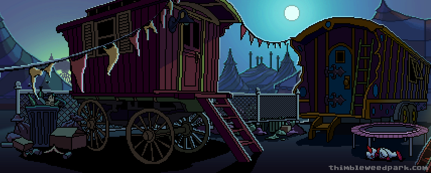
And another one of Mark's test images for Ransome's circus...

We'll be posting for of Marks stuff over the next few weeks. I'll also be posting a bunch of pictures from my drive up to Seattle and you will need to sit quietly and look at them all with me. Every single one!

- Ron


Mike - Jun 03, 2015 at 15:45
Could be the Soundtrack...

https://youtu.be/y7EpSirtf_E

Mattias Cedervall - Jun 03, 2015 at 16:30
Great suggestion! :-)

Marco Lizza - Jun 03, 2015 at 15:48
Simply love the awesome 8-bit bloom effect due to moonlight... great!

Peter Campbell - Jun 04, 2015 at 02:19
I agree, the use of 2-D shadows and lighting to emphasize the full moon up in the sky does a fantastic job of creating a tense, uneasy nighttime atmosphere.  It also especially gives the rundown circus a sense of dread and misery, that for whatever reason the circus was closed down or has fallen apart that it was because of something sinister that happened and that it's a dangerous place to be around.

Marco Lizza - Jun 04, 2015 at 07:02
... not to mention that circuses at night always looks disturbing and ominous...

Sofia Giotidi - Jun 03, 2015 at 15:48
These two new screenshots are equally if not even better than Monkey island art.

Paulup - Jun 03, 2015 at 16:01
I agree... amazing stuff.

If they wanted to include both styles, a possible solution would be to have the main game in this Monkey Island style, but then do the flashbacks in Maniac Mansion style...

RCM - Jun 04, 2015 at 01:54
Not a bad idea- most flashbacks in TV/film have some sort of visual cue (black & white, hazy border, etc), so it could work.

Paulup - Jun 04, 2015 at 07:38
Also it clearly visually shows that time has passed...
i.e. "...two years ago, back when graphics were simpler..."
and then the scene is in an art style that is older.

longuist - Jun 04, 2015 at 04:18
Good idea. make it sepia - esque

Marco Lizza - Jun 04, 2015 at 07:17
I second this proposal. I will definitely look good differentiating the flashbacks with a different style and picking Manic Mansion over Monkey Island could be a very good idea!

Mattias Cedervall - Jun 04, 2015 at 07:20
That's a good idea even though I would like to have the whole game in the Maniac Mansion style because it's simpler and triggers my imagination more!

Dan - Jun 04, 2015 at 10:40
I myself would prefer a button in the options menu and/or a hotkey which allows to switch over throughout the whole game, similar to the Monkey Island Special Editions.

Mattias Cedervall - Jun 04, 2015 at 17:20
Dan, you're right that it would be an even better solution! :-)

Jammet - Jun 05, 2015 at 02:07
Such a thing would very likely be too much work. I get the feeling that you would have preferred this one to be a more Maniac Mansion oriented look. At least I see why that would be.

It might feel a little like Lucasfilm games had skipped Maniac Mansion, Zak and Indy 3, and Monkey Island would have been the first thing. Many of us hope that this will be the first game, and that there will be another. I could understand why you have your hopes that they will sort of "re-enact" times of past and start out with a game that looks a lot more like Maniac Mansion, and later have one that looks like Monkey Island.

It's a bit like that, right? :)

And this is where I think we're all gonna be fine because ... really all of Lucasfilms later games adopted some more specific styles. Ferrari made Monkey Island 1 look quite ... realistic, actually. It wasn't toony, or like a comic. Was it Steve Purcell who did Money Island 2s paintings? That looked quite a bit more like a comic, only Guybrush and Marley and a few other characters not so much :).

Where was I going with this ... I had a point.

Guess what I'm saying is .... all these Lucasfilm games had at distinct style, and that of Maniac Mansion and Zak Mc Kracken in it's first versions was very imaginative, like you say. But I am sure we cannot have both. Maybe Ron, David and Gary were a bit torn about that decision, too.

We can probably all agree that not a single one of these didn't wake our imagination. All if them are in my heart. I never thought I'd see this again. The artists is recognisable just by looking at it. You know who made this, if you're into that kind of thing. Technically the art is crafted with tools that have unlimited undo/redo and the artist has learned a lot since Monkey Island -- and it shows. This is going to be something that I'm sure will be just as fondly remembered in the future! This is going to be timeless.

But of course, we never know what the future holds. Creating a game in the style of Maniac Mansion and never deviating from it... this is going to be so hard! Imagine all these ideas you have for ... new perspectives. New angles. Colorplay. Either you embrace it, and you limit yourself happily, or it'll feel like you've got these old, rusty shackles on. You'll be tempted to break free every time you have an idea that wouldn't be in there if you stick to the style. That's the amazing thing. What Gary did in *just* that style back then, and what he can do with it today, is awe inspiring. Maybe later down the like there will be a spiritual successor to Zak, who knows. Maybe then, the artist will just be Gary, then.

But making this one adventure in two styles, basically ... that is a very expensive undertaking.

Mattias Cedervall - Jun 05, 2015 at 08:52
Well, it's complicated like you say. I still prefer the Maniac Mansion style because it's simpler and it triggers my imagination more.

Jammet - Jun 05, 2015 at 09:17
I absolutely understand.

This might not be much of comfort, but have you played these before?
http://www.maniac-mansion-mania.com/index.php/en/

Mattias Cedervall - Jun 05, 2015 at 10:47
No, but it would nice to try those in English and maybe then translate them into Swedish. Thank you for the link! :-)

Peter - Jun 03, 2015 at 15:49
I wanna know if there is any decent items in that bin or if I can get that clown from under the trampoline...this artwork is perfect

A man with a tape recorder up his nose - Jun 03, 2015 at 15:49
He takes something as creepy as clowns and circuses after dark and makes it more creepy. AWESOME!

delMar - Jun 03, 2015 at 16:00
The circus looks awesome. I absolutely love it.

You should release it as a preview like StarCitizen did with the hangar module: The Thimbleweedpark Circus Module :-)

Just kidding. I'd love it but I know that there's so much more to it than "just" release what's there.

Keep this early stage  artwork coming. I just can't get enough of pixel art.

Thom - Jun 03, 2015 at 21:54
That would actually be hilarious. Just a preview of one room, like a dentist's waiting room where you could look at a magazine and annoy a canary and do nothing else.

Frank - Jun 03, 2015 at 16:05
I absolutly love it! the style is a little bit similar to the style in "Day of the Tentacle", "Full Throotle" or "Sam and Max hit the Road". It's more comic Style than "Monkey Island" or "Loom", but it's brilliant.

BigWhoop - Jun 03, 2015 at 16:21
So glad I could exchange paper with numbers on it for this excellent looking game and development experience!

Dominik - Jun 03, 2015 at 16:21
Simply amazing! Don't get me wrong: I was also excited when it was still "just" Maniac Mansion Style graphics. But this extra Level of detail adds more than just pixels, it adds depth! The scene comes more alive. I LOVE IT! THIS is how you do a classic point'n'click adventure: Get a great game Designer and coder, two superb artists and a scripter together!

Dominik - Jun 03, 2015 at 16:26
@Ron: Two Suggestion for the site:

1) Would it be possible to have the avatar of the blog posts author on the Top left? I always scroll down First to see Who wrote the blog entry so that i know which voice i have to imagine ;-)

2) Would it be possible to Highlight New comments since my last visit? Simply store a cookie with the current Server timestamp after each page view, so when the client sends it back you can see what comments came in between? Since the comment section gets more and more alive it gets harder to see which are new.

I hope you settle in quickly and without problems in Seattle!

Ciantic - Jun 04, 2015 at 00:46
Name is above the post, below the title, right next to date. No need to scroll at the end of the post :)

Mattias Cedervall - Jun 03, 2015 at 16:28
What kind of car does Mark drive? :P

Christopher Griffin - Jun 03, 2015 at 17:08
Please say "Yugo" just for the irony of it all!

Sushi - Jun 03, 2015 at 17:02
"you will need to sit quietly and look at them all with me. Every single one!"

Sounds more like *Ronsome* the clown! :D

Dan - Jun 03, 2015 at 17:44
Mark, do you have already tried out VirtualBox or DOSBox for running D-Paint on a modern machine?

Dan - Jun 03, 2015 at 19:04
... only if you have the DOS version, of course.

I just asked, because you regret the absence of D-Paint in pursuance of the interview on geekscape. It's really interesting how drastically the art of image editing has evolved since.

Iiro - Jun 03, 2015 at 23:14
This project keeps getting better and better!

I think EA should just stop making FIFAs and make 8-bit picture editing software.

LogicDeLuxe - Jun 03, 2015 at 19:22
Or try GrafX2. A portable and free Deluxe Paint clone.

Mike D - Jun 03, 2015 at 18:18
When you launched this campaign i was excited, I am now officially Stoked!
This whole thing gets better and better every day.
Amazing Stuff!

Homer Simpson - Jun 03, 2015 at 18:54
:::Looks at lower right corner of image:::

OMG!  Tramapoline!  Trabopoline!

Thom - Jun 03, 2015 at 21:51
Trambapoline!

Carl - Jun 03, 2015 at 20:14
Oh my god, this is so exciting! I love the look of this!

Matt Lacey - Jun 03, 2015 at 23:12
Oh man, I am loving this artwork!

Guybrush - Jun 04, 2015 at 02:37
Isn't that the trash can from Govener Marley's?

Sebastien Frippiat - Jun 04, 2015 at 02:51
Those images look pretty neat. Not really the style of Maniac Mansion (those were much more simplistic IMHO) but I like them.

Lazy Retroist - Jun 04, 2015 at 04:11
Looks awesome! Just don't push it (style from MM) "too far" :)

I just looked the gallery at http://www.effectgames.com/demos/canvascycle/ and it was truly MESMERIZING.

Caspar - Jun 04, 2015 at 05:57
The old team is back! What about Steve Purcell and Michael Land? Michael Lands Music was a big part of the success of Monkey Island, Loom, Monkey Island 2, The Dig, Sam & Max Hit the Road, Day of the Tentacle, The Dig .... His retro Music is unique!

Zarbulonian - Jun 04, 2015 at 16:50
I liked these pieces so much that I used to listen to the full introductions (PC Speaker) each time I launched the games.

It totally set the mood of the games, and was, for me, integral to the experience of the games. The same goes for the Zelda series (Wind Waker has wonderful folksy sounding stuff).

The marimba trills of the MI2 theme (first time I heard Adlib music) gave me an aural orgasm. The bass line of that tune is sooooo sexy.

I now use the Scabb island overview theme as a lullaby for my son.

https://youtu.be/_N9sJAxUpCI?t=4m13s

The intro used for the podcast is pretty good (setting the mood and all), but the rest of the KS video music quickly delves into cerebral musician wankery with gratuitous tempo variations and chords whose name require four letters three numbers then an array of non-ASCII sigils that add nothing at all.

Wireframe music, maybe?

Caspar - Jun 05, 2015 at 05:07
This is my favourite Monkey Island Tune:

https://youtu.be/s9X9WNp8wkk

I love the Walking Bass, some kind of Jazzy Feeling...

Zarbulonian - Jun 05, 2015 at 11:20
Yeah, it's good.

Michael Land is a bass player, and it shows MI has wonderful bass parts.

Lennart - Jun 07, 2015 at 14:35
It's not the most memorable tune, but it's perfect for the atmosphere. The Monkey Island soundtrack is surely a masterpiece.

Iron Curtain - Jun 04, 2015 at 20:13
I hate to be the bearer of bad news, but Michael Land won't be doing the soundtrack for Thimbleweed Park; those duties will be handled by Steve Kirk, who did the OST to Voodoo Vince and Ron Gilbert's own Scurvy Scalawags.

longuist - Jun 07, 2015 at 11:52
Which is by the way great news indeed nevertheless without doubt!!1! Loved the Vodoo Vince Soundtrack

Strawberry - Jun 04, 2015 at 10:12
The art really looks like I've stepped back in time and discovered a new Lucasarts game that I missed.
I was always drawn to the beautiful backgrounds.
This is all I ever wanted!

Mattias Cedervall - Jun 05, 2015 at 08:55
Maybe it's just Krusty's old mentor?

Eric - Jun 04, 2015 at 13:52
Looks great!!! :)

Mister T - Jun 04, 2015 at 20:17
Hmm, while I like the increased level of detail, it worries me a bit, because it also mean an increased level of work. Not just for the backgrounds but also for the player animation. In MM-style it is easier to get away with some really low-fi solutions. With these backgrounds, it demands something more elaborate. This on the other hand can easily lead to cutting options, because workloadwise it is almost impossible to create animations for combinations which don't solve a puzzle (like: the hamster in the microwave; one graphic of the bloody mess solved everything, no further animation needed, not possible with nice graphics). So the trade for this fancy style could easily mean a decrease of classic adventure anarchy.

Also I am not sure about the contour lines. They give it kind of a cartoonish appearance, while old adventures due to the resolution usually avoided those lines.

DZ-Jay - Jun 05, 2015 at 05:50
First, I'd like to note that Mark's artwork is fantastically beautiful.  Second, I must say that, honestly, I hope that you do not choose that art style for the Thimbleweed Park game.  It is much too refined and complex for a "classic game you've never played before."

That style of art represents a couple of decades of experience in pixel artistry; and gorgeous as it is, it lacks the restrain and simplicity that hardware limitations of the day -- and even the still burgeoning experience of a brand new art form -- would have enforced on a creative mind such as his.

Personally, that "look" reminds me of any other "retro" game being produced in iOS now.  And I say that with the utmost respect and admiration to Mark's talents.

I'm not saying that it has to be all blocky pixels and 16 colour palettes, but there should be a middle ground somewhere.

   -dZ.

Paulup - Jun 05, 2015 at 07:55
Nah, look at it again - it looks exactly like a game from the golden age of adventure games, it could easily be from a classic game from late 80s to early 90s...
It doesn't look like Maniac Mansion, sure, but it perfectly captures the look of the games that came out shortly after it.

DZ-Jay - Jun 05, 2015 at 19:26
I disagree.  The look of "the golden age," as you call it, was decidedly flatter.  The two scenes posted so far have much depth and complexity.

   -dZ.

Jammet - Jun 06, 2015 at 05:35
What would confused me a little more is, that we now have 1987 looking characters and 1992 looking backgrounds.

Either way, it could be an interesting blend of the two. I most certainly do not dislike the look, quite to the contrary. But I do also agree that it does away with the more flat style 2D objects in a 2D world kind of look.

What do we do about this? Do we do something about this at all? I'm madly in love with Maniac Mansion AND Monkey Island, and this now feels more like a spiritual successor to both, equally now. :) The question is simply if we want both, or one or the other. I've always said that I would love to encourage Ron, Gary and David (and Ferrari) to  produce another game like this, after Thimbleweed Park. Sort of like ..re-enacting history. Starting out with a spiritual successor to Maniac Mansion. Then letting David think about a spiritual successor to Zak. Then again Ron, to make one more for Monkey Island -- and then definitely with Ferrari onboard of course.

Choices, choices! :D

Caspar - Jun 06, 2015 at 09:12
Mark Ferrari was not involved in Monkey Island 2, Day of the Tentacle and Sam & Max, but for me the Backgrounds look exactly like this Games. It's absolutly high quality and difficult to do critics, because it's exactly what Adventure Fans want for years, but:

http://gamona-images.de/194269/253df08f48aff357fae2ad68b65dd1b8.jpg

I would prefer less cartoon style (it looks for me a little bit like Morris "Lucky Luke") and more the Style of Monkey 1 or Loom. Mark draws this nice stars, that we all know from Monkey 1 or Loom and this atmospheric forest scenes. Maybe it's possible to recreate that atmosphere. The pictures are nice but more Comic - Style in my opinion...

But in general, everything is great...

Jammet - Jun 06, 2015 at 09:48
Not exactly sure why you have the impression they look like LeChucks Revenge. To me, they much more resemble the original, more realistic looking Secret of Monkey Island.  Steve Purcell has a decidedly different approach. If I remember correctly, he drew everything on paper, had his lineart scanned in, and then heavily edited the result for colorization and what changes were needed.

And Sam'n Max looks extremely toony. If I look at the picture in this article and the circus total shot from Secret of Monkey Island, what immediately stands out is that we're using a lot more of the VGA color palette here. Back in the day, Ferrari had first created EGA and Amiga (32 colors) graphics backgrounds, and only after that they were edited to take advantage to make use of the VGA color palette. Still, even the finished VGA version of Secret of Monkey Island looks nowhere nearly as crass with the colours as LeChucks Revenge. The forest backgrounds were just a few shades of blue and grey, even in the VGA version. So, they never really exhausted the VGA palette, and I think some of these indexed colours had to be reserved for the interface. In the EGA version, iirc, the interface even changes color when you're beneath the giant monkey head...

TL;DR -- to me this looks like a more colourful version of Monkey Island 1. So far.

Caspar - Jun 06, 2015 at 12:18
I think the style of the drawings is similar. What I like more about the old Games is the coloration. I think, if you compare for example the Screenshot of Monkey Island with the Screenshot of Thimbleweed Park, you can see much more details in the Coloration. The reason could be dpaint... The Coloration of the thimbleweed park Screenshot looks like a Coloration with Photoshop.

https://1001up.files.wordpress.com/2013/04/image-3-the-secret-of-monkey-island.jpg

http://images.thimbleweedpark.com/circus_2b.png

Caspar - Jun 06, 2015 at 12:22
In the dpaint example, he was drawing the sky with the Palette (the changes of the colors). With Photoshop he is useing a kind of lens effect, which was not possible in the old time adventure game background images...

Jammet - Jun 06, 2015 at 15:57
DPaint has a very very versatile tool that would make it quite easy to spread and smudge colors in a specifc pattern. That pattern repeats in a recognisable way. When you look at the pictures of, for example, Indiana Jones 4 -- there are a lot of effects in it that you can only do in DPaint II. Or if you can imitate these effects with other tools, it's going to take considerably longer.

Well -- we'll have to see how this turns out. Can only say -- if anyone knows what they're doing it's this dream team.

Paulup - Jun 06, 2015 at 09:20
As far as depth, if you look at the scenes from Monkey Island and Loom, a lot of them have much more depth than these two Thimbleweed Park shots we've seen so far...
Some examples, just off the top of my head, in Monkey Island alone:
--the town scene (with the arch and clock over the arch) goes way back into a vanishing point perspective through the arch
--the Hook Isle scene has the ladder in the foreground and the rope goes across the water to the house off into the far background...
--the circus establishing shot has Guybrush in the foreground of the forest, with the circus far back in the background
--Stan's shipyard has the path at the front, the hut and Grog machine further back, and then the ships and the pier going way back

The depth of the Monkey Island scenes are part of the what made the game feel vast and expansive, as most scenes were drawn with a perspective that let you see way off into the distance (and you could often actually walk into that far distance as well).

As far as complexity, it is drawn with the same block pixels, so it's not any more complex than those classic adventure games...
The one area I will agree with you though is just specifically with the color gradients - they are really smooth in some places in these Thimbleweed Park scenes compared to the older games.
For example, the moon in the new circus shot... the blues around it going from light blue to darker blue are very smooth, while in the classic games, it would normally look way more pixelated as it changed from one color to the next.

Jammet - Jun 06, 2015 at 10:01
Just for the fun of it, I've turned the image from this article into an indexed colour file instead, with 128 colors (and that's excess, Lucasfilm game screens even in VGA still typically had around 30-70 colors in 1991.

The gradients look a lot more like "old times" that way because they are just ever so slightly fuzzy, and do not form a completely perfect circle in circles with that moon.

Just thought I'd see what it looks like. Tried EGA palette, Amiga Palette, and with some manual adjustments this would look very nice in all of them. Maybe EGA not so much, but ... just toying around anyway.

Paulup - Jun 06, 2015 at 12:03
Yeah, I just tried doing the same thing - colors come out nicely pixelated! Hope they look into that kind of stuff, just as a minor tweak to give it a full "authentic" feel with the color gradients and shading...

Also worth checking out the program GrafX2 (as someone else already mentioned), as it is based on Deluxe Paint...

Jammet - Jun 06, 2015 at 15:52
Thanks, I'm going to check it out. 10 years ago (?) or so I used to make background art for a fan adventure for Amberfish Arts, and everybody was using DOS DPaint II, in dosemu or early versions of DosBox.  Going to check it out.

Jammet - Jun 06, 2015 at 05:27
It's not too refined.

But I'll admit we are leaving 1987 and entering 1991-1992.

mr. T - Jun 05, 2015 at 06:37
Looks like I have a long lost brother over here. Hello.

On the art style I would hope for at least 60% MM and 40% MI. From the beginning I've gotten the feeling that the whole project is an hommage to the beginning of an era, which was MM. The early blockyness has it's own soul and way of communicating ideas. Somehow it would feel strange that the 1st generation visuals would mostly get skipped, in a way. Someone commented on an earlier post that the MM style was even distasteful, but I don't agree with those kinds of sentiments at all. I think the future could hold other projects, where the the style set point could be somewhere else.

On the other hand, I do enjoy all the Lucasarts tiers of styles and feel that the team will bring the best solution for us to enjoy, be it more or less refined in any direction.

Music of the day: Monkey Island theme with accordion intro
https://www.youtube.com/watch?v=qUMKy2Jk3Oo

Can't wait for the Seattle trip photos. Hopefully you're enjoying your new house/apartment/castle or perhaps a mansion...a mansion?

Zak Phoenix McKracken - Jun 07, 2015 at 05:48
Very good! Bravissimi!

peterszky - Jun 05, 2015 at 08:47
Amazing!

Darkstorm - Jun 05, 2015 at 15:57
These look fantastic, especially the creepy clown one.  Exactly the kind of vibe I was hoping for.

Ron, if you can say at this point, what level of graphical fidelity are you going for here for the final bg art - would it be similar to these test backgrounds? (I ask because to my untrained eye they're closer to MI then MM - not that I'm complaining one bit!)

Michael Stum - Jun 05, 2015 at 17:07
Mark mentioned that certain DPaint II features aren't in modern apps anymore, like pixel cycling. I would like to hear more about how his dream-tool would work these days and if there are other DPaint features that are dearly missed these days.

Dr J reloaded - Jun 06, 2015 at 07:44
I'm in no way concerned that graphics will be too detailed for a 1987 game. Remember 16 bit 'came out' around 1985 and with that brilliant graphics capabilities. What we see is just the skill of two graphic artists at its best, with the graphics technology of 1987. I trust the balance between background and animation quality will be 'just right', but this is for sure a good point to keep in mind. And I agree, if someone grew up with 8 bit then different feeling of nostalgia and perspective is attached to that period.

Caspar - Jun 06, 2015 at 09:53
Is it possible to see more of Ferraris Graphics ???

I would love to see more picture, very soon.

One question: Mark was also part of the Zak McKracken Team, is that right? Also "Indiana Jones and the last Crusade" and "Fate of Atlantis" ??? Some Background Art in Fate of Atlantis looks like Mark Ferrari!

Caspar - Jun 06, 2015 at 09:55
Gary Winnick was also included in Loom... The Background Art from Loom and Monkey Island, was it done by Ferrari ??? The Islands of Loom and Monkey 1 look quite similar. Was it a decision to give them a similar feel ???

David Fox - Jun 06, 2015 at 18:01
@Caspar, Mark wasn't on the initial team that created the C64 version of Zak. He does have a credit for later versions, when we were converting to EGA and VGA/Amiga/Atari ST/FM Towns. By then, I was on to Last Crusade so didn't actually get to work with him. I did get to see the hires art as it was progressing, but wasn't involved much in that.

Zak Phoenix McKracken - Jun 08, 2015 at 03:33
Mark, can you give us your opinion on this picture, regarding a familiar location of Monkey Island?

http://www.cinemapioxi.it/zak/MI-Nuremberg.jpg

Was that location inspired by that town?
Thanks!

Caspar - Jun 08, 2015 at 04:27
I did not know that Nuremberg is in the Caribbean...

Zak Phoenix McKracken - Jun 08, 2015 at 05:51
You never stop learning... :-)

Assaf - Jun 09, 2015 at 02:57
oh my GOD. I've just commented on the previous post, saying welcome to mark and that the background looks amazing. And now this one?! Another breathtaking background?! Unbelievable.
In fact, I'd LOVE to play a game with these graphics. These were a big part of the classic adventures success imo. So pretty!

Edward Laverick - Jun 10, 2015 at 07:13
Is Mark aware that Deluxe Paint runs fine in DOSBox?  Just tried it out and it works beautifully.

Timo - Jun 10, 2015 at 09:38
Maniac Mansion retro style just for the sake of it is a fun idea, however I would not mind going full on with this kind of refined style. *If* you can handle the increased workload, like Mister T said. Was your original 1987-like style a conscious choice to reduce the amount of work, or was it a genuine artistic decision?