A Pixel Here a Pixel There...
Sep 14, 2015
One of the things you'll find drawing in lower screen resolutions (individual non-scrolling screens in Thimbleweed Park are typically 128h x 320w or 172h x 428w) is that the placement of a single pixel here or there can make a real difference as to how an object, character or background may look.
In the good old days of pixel art working on C64 Maniac Mansion I first worked in character set, screens and objects made up of 4x8 pixel tiles where repetition was a necessity, brick walls were pretty easy, while organic animated characters were definitely more of a challenge.
Certainly, a reason for the larger heads in Maniac Mansion is that it allowed for much more nuance of personality. Working on the characters in Thimbleweed Park that are a throwback to that time presents us with a lot of the same basic problem solving.
For example if you're trying to create a five frame talking mouth in a 8x4 or 5 pixel grid there's only so many permutations that are going to look like they make sense. Aside from using various animation frame references it needs to look right to you when you actually plop down the closest bit pattern you can manage in that grid. Scanning doesn't really work at really limited pixel and color resolutions, it just comes down to noodling that tiny grid by hand.

Believe it or not, when I first started working on adventure games at Lucasfilm we didn't even have access to scanners. One of the the techniques I developed at the time was to first draw something, usually a character on regular bond paper, then I'd trace that onto a clear piece of plastic (acetate) with a sharpie, tape it to the front of my monitor and proceed to draw that in whatever paint program from behind the plastic overlay using that as a guide to plot each pixel into its somewhat appropriate position on the screen.

It was a haphazard way of getting the basic drawing done but actually worked pretty effectively for me at the time. Then of course, I'd touch everything up by hand, working on a face or even just the position of an eye I'd spend a good deal of time moving a single particular pixel around within a small grid trying to find the best possible location relative to its surroundings.

Although a lot has evolved relative to tools and platforms, it turns out not that much has changed relative to discerning the best bit pattern placement of individual pixels when working within a very limited pixel space.

Whether you're dealing with a face or a font, it comes down to the artist or designer looking at the overall graphic and hand placing that dot (or rectangle). On a level this can become very abstract, magnifying, zooming in and out, etc.
A lot of folks have said to me, given what I'm doing, why do I work on a 15" laptop screen instead of a bigger higher resolution display. In my case it's reasonably simple, I want to see the graphics and animation the way most of our end users will- that way I know it things will likely look their best to the greatest number of players in the audience.

- Gary

Is that character David?
Also, excellent post Ron -- very neat and informative about pixel importance! I think a lot of people in general (developers, including) lose sight of the "big picture" of what most of their base will be using to play a game or use a product on.
(And why don't I have a cool avatar? *sulk*). :)
I know that David and the team went to England to brainstorm with Douglas Adams early on in that game's development - and I've seen the occasional comment from David about that - specifically the "text adventure transitioning to graphic adventure" idea.. Seeing as Douglas is no longer with us (still unfathomable) - could you indulge us in some other remeniscence about those meetings? What was it like?
Check out these interviews I did where I talk a bit about Labyrinth:
https://www.youtube.com/watch?v=jAmBtwwhKl8
http://www.ign.com/articles/2015/01/22/an-adventure-through-the-early-days-of-lucasarts-with-david-fox
http://www.c64.com/gt_display_interview.php?interview=32
Both are brilliant in their own way, but also share a common affection for SF camp and conspiracy theories and share certain plot elements and overall ideas and sensibilities.
I'm glad you, Gary, Ron and Mark are helping keep alive a tradition of clever wit and thoughtful silliness- thanks guys!
Obviously the characters are composed of more than one sprite vertically in MM and Zak (three, AFAIR). But how many are used for the two other games I mentioned?
Douglas Adams is one of my heroes, so I'm curious to hear what he made for you at the dinner, and of course any other curiosity or anecdote you can remember involving him.
I remember Ted Nelson talking in his autobiography about a dinner he had with DNA about the same time.
He is a big fan, so naturally he hoped for some kind of chemistry. Alas he came away with the impression that he was a very aggressive, almost angry person, very driven. For whatever reason they never met again.
A pity, because I think they would have had a lot to teach each other.
and also let's me see my graphics on a somewhat typically sized screen.
PS: I like the added detail. The characters look less flat. I've also noticed this in the video of agent Reyes talking (or having a head-bobbing seizure?) but didn't mention it.
Whereas creating detailed 3D graphics is much more laborious than creating detailed 2D graphics. Motion capturing would never compensate the additional expenses for 3D.
I always wonder, wouldn't it be possible to create a 3D character and add some image filtering to it, so it can output similar pixel-based results? Maybe this process could be automatised somehow...
Do you think it is viable?
I was just wondering if would be technically useful in a development like this to convert from 3D to pixel art.
Maybe you could force the 3D character to only appear on its lateral or front side, not in between and then apply processing to "render" the pixel-art model..
By the way, a filter is an algorithm that suppresses components of a signal. I don't think that's what you meant.
I personally like it as a user, but it is an overkill if I look at it as a developer who doesn't want to waste time and money.
Other examples would include Jet Set Radio (Dreamcast and Xbox), which 100% used the cel-shader effects.
Either way, as long as the output resolution is low and anti-aliasing is turned off or way down, you could still end up with something that is somewhat 2D looking -- but honestly, the amount of technical work you have to do to achieve good results with this technique probably takes WAY more time than the 2D artwork.
I'm always amazed at how much of an ART it still is, even (perhaps especially) at really low res. I've thought that I could hammer out a walk cycle, but it always look horrible. Seems like it should be easy! I mean, there are only so many pixels you can put his foot in!
http://gamecareerguide.com/features/946/postmortem_joshua_nuernbergers_.php
It got into fashion on social networks and reached its peak with the selfie-craze.
(a) it doesn't have to be perfect, just believable, that
(b) there are many other phonemes missing (e.g., see http://www.garycmartin.com/phoneme_examples.html ), and that
(c) they have a big resolution constraint so getting everything to look right may be difficult or even impossible.
Anyway: Good work, guys. I like what I see.
In Indie News,
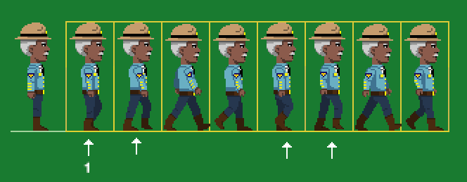
Developer Gary Winnick just released this article simply called, "A Pixel Here a Pixel There..."showcasing our very own Sheriff of Thimbleweed Park live on duty. A nearby witnesses gave this statement: "Watching him call for backup was HOT, but watching him backup. Well these pictures speak for themselves, bravo!" Reports have also shown a new fashion trend sweeping the country, spawned by the popularity of his recent story. It's being called the "Winnick Walk", and it seems everyone is doing it! Here are some exclusive images of this new fad: http://bit.ly/1OuYWOk , http://bit.ly/1MaCYxH , http://bit.ly/1OuYYpD
Remember to tune in next week when we cover: "15 inch monitors, has technology gone too far?" -Ransom the clown, executive press for the Thimbleweed Times
It shows the most commonly used chars and their frequency.
I ran it over two rooms of C64 Zak McKracken here in case people are interessted:
http://martinwendt.de/2015/usedchars/
It nicely reveals how 'costly' diagonal lines are in block-based graphics.
You did stunning work (already) back then!
Or the shadow beneath the fridge being identical to the edge of the TV (why is it such a whopper, btw? I always wondered)
But the real explanation is that the player needed to see the broadcast on TV, so it had to be big. Otherwise the TV would have needed an extra close-up view.
What has always bothered me was the placement of the couch. One can't sit on it and view the TV at the same time. But because of before mentioned matter with TV, I guess alternative placement was not possible.
"Elementary, my dear Watson!"™
I bet you could actually use it to good effect in iOS that actually uses that architecthure.
The game is looking great BTW!
Btw did you know there's Maniac Mansion Deluxe? playthrough in youtube. Pretty decent looking fan made deluxe version.
https://www.youtube.com/watch?v=ONrZcuCz1k0&t=815s
did you had a mouse back then?
Did you ever had to rely just on the keyboard?