Thoughts On Props

by Gary Winnick
Apr 09, 2015

Making a graphic adventure is sorta like making an animated cartoon. You have a world of backgrounds and stage pieces, some are interactive, some are just static set dressings that exists to reinforce the world and story.

Set dressing helps tell the story and gives the player valuable clues about where to go and what to do. Given the resolution we're working with on Thimbleweed Park, and we're paying homage to our earlier classic adventure games, most items are going to be displayed in some sort of straight on view, as odd angles are a bit harder given the 'jaggies'.

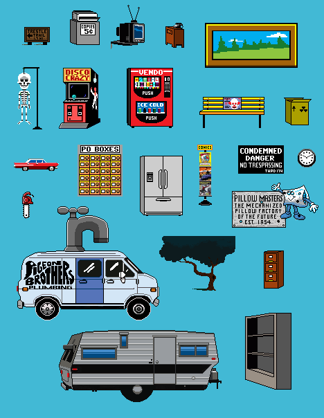
Once again, we're pretty much dealing with icons, we want the player to look at and immediately recognize their function: we really don't want people saying "What the hell is that ? Looks like a phone? Or maybe an adding machine? No, wait, it's a banana!"

Once we have our basic design, the first order of business, much like in film, is to make lists of all the visual assets, this includes characters, locations and all the objects and props.

Each of these needs to be designed, from a simple line rendition to fully rendered object. Use and location determines size/scale relative to the scene, angle, lighting and shadow and what if any animation might be required and each of these is layered onto the item as we go. Even though we're dealing with a limited number of pixels and colors, I think there's something very stylistic and recognizable about how we're approaching the art and how the resulting objects will look.

As we wire up a room and its associated puzzles we may decide to add more items or props, maybe because it's funny, makes the scene more interesting, or helps direct the player.

The ability to change and iterate items on the fly is a luxury we have over traditional film animation given that it's reasonably easy to modify 2D art in our style, once again, the power of Ron's engine and a versatile scripting language make all the difference... Hamster in a microwave anyone?...

- Gary


Brian S - Apr 09, 2015 at 12:55
Love the look of that RV Trailer.  Isn't the refrigerator design is too modern if you are going for an throwback vibe?

Just thinking about the interaction with these props is getting me excited for the game.

Mario - Apr 09, 2015 at 16:32
yeah, side by side fridge... was it already made in the 80`s

Gary Winnick - Apr 10, 2015 at 13:53
They actually had side by side stainless steel fridges in the mid 80's - they were just really expensive

Mattias Cedervall - Apr 09, 2015 at 15:12
I love props!

Dennis Bratz - Apr 09, 2015 at 15:46
Ah, the good old chain saw... fantastic!

P.S.: Am I getting worse in math or are the Seckrit Questions getting harder?

prinzjohnny99 - Apr 10, 2015 at 08:46
Half of my comments couldn't be published because I haven't had my abacus at hand.
Btw, you want to make sure I'm not a machine by answering the solution to a math problem? How appropriate! (You fight like a cow!)

Dennis Bratz - Apr 11, 2015 at 17:29
I wanted to make sure you'd feel comfortable with me!

Franz - Apr 09, 2015 at 17:28
The chainsaw!!!Yes!!!
And an old school arcade machine! Wonderful guys!!
Any plan for a blood red pentagram, strange voodoo totem, Necronomicon book chained to its lectern or something similar for the inside of your occult bookshop?

thom-22 - Apr 09, 2015 at 17:40
These look great!

Peter Campbell - Apr 09, 2015 at 19:11
Regarding icons being unrecognizable, I think we can all agree that many game designers of the 80's (don't worry Mr. Winnick you aren't one of them lol), especially the early 80's, deserve a big middle finger for being completely incompetent at drawing and in many cases not even displaying the names of their "What the crap is this supposed to be?" icons in their games.  If you didn't have the game manual for almost any Atari 2600 game, good luck figuring out what the heck the items in the game were and what they were there for.  You were totally screwed and it was absurd game design like this that helped cause the industry to crash until Nintendo revived it.

Tomimt - Apr 10, 2015 at 04:05
Well, back in the 80's many companies really didn't have any dedicated art department. Sierra and Lucasarts were among the few that were big enough to have different people for the job.

Christopher Griffin - Apr 09, 2015 at 23:51
Is it me, or does the comic rack seem to violate the palette look-and-feel from the other items?

TR - Apr 10, 2015 at 03:59
Yes, I was thinking the same.

Could it be that in a comic world comics actually look realistic...? ;-)

Rmn - Apr 10, 2015 at 07:09
The comics are just scaled down images, I think.
It definitely has a larger (24-bit?) palette than some of the other objects, which seem to use some sort of 8-bit palette.

So does the trailer, btw.
I think that both looks are appealing, but I fear that the low-bit objects need to be "upgraded" later on.
While the sprites of the trailer and the Pigeon Brothers car both look good, I think it would feel somehow odd if they were right next to each other in the final game.

But I think that it's just because Ron and Gary are in the middle "wireframing" the game. :-)

Gary Winnick - Apr 10, 2015 at 13:57
It is a combination of us being in the middle of wire framing- so we're still working on the overall consistancy of the art-
However in the case of the comics- I do have an ulterior  motive and will be bending the rules a bit so you can kind of actually make out
what the books are (which is somewhat impossible at that size without adding more colors to the palette)- either it will work or it won't
-you'll just have to wait and see...

T. Benjamin Larsen - Apr 10, 2015 at 01:01
The arcade game brings me back to the old days when I used to dream about being able to actually play arcade-games inside another game. (Guess I somewhat wanted a sandbox-game before neither sand nor boxes were invented).

Also love the vending-machine which for some reason seems to trigger an ancient mental image from the Labyrinth game. Which seemed to have some Winnicky-ish graphics as well(?)

Gary Winnick - Apr 10, 2015 at 14:10
Yep, I did most of the graphics for the Labyrinth game- with and assist from Ken Macklin

Brian S - Apr 17, 2015 at 14:41
Gary - did you really consult with Douglas Adams (of Hitchhiker's fame) for the game Labyrinth?  I just read that on the Wiki page.  That must have been fun.

natalija - Apr 10, 2015 at 04:39
I just startet to play Maniac Mansion for the first time and It's awesome,I recognise this saw,sceleton and disco crazy machine from the game..they are very similar to those on Maniac mansion.. :-) Can't wait to play this game!

Mattias Cedervall - Apr 10, 2015 at 11:54
Which version of Maniac Mansion do you play? The one for NES? I'm glad you also like the game!

natalija - Apr 10, 2015 at 15:27
I don't know .... I think it's the oldest version of maniac mansion,I play it on scumm... sorry if my english is bad I'm only 15 and I don't speak it very well

Mattias Cedervall - Apr 10, 2015 at 16:26
I see. I was just curious because it's the first time you're playing the game and there are new unofficial versions of Maniac Mansion. Your English isn't bad. English isn't my native language since I'm Swedish. I wish you a great day! ;-)

Frank - Apr 10, 2015 at 06:08
Steve Purcell would be a great Designer for the visual Part. I loved his work on Monkey Island, Loom and Sam & Max. Would it be possible to include Steve for the visual Part in the team. That would be awesome.

Gary Winnick - Apr 10, 2015 at 14:01
We'd love to have Steve involved and may get a few moments to consult with him-
However anything more isn't really practical as he's currently directing movies over
at Pixar- make sure to check out the Toy Story Christmas special 'Toys that Time Forgot'
both written and directed by Steve

Gary Winnick - Apr 10, 2015 at 14:12
or rather 'Toy Story that Time Forgot'

Christopher Griffin - Apr 10, 2015 at 12:06
The top-most comic on the comic rack appears to be a Superman comic, as you can just make out the logo, cape, and heroic pose.  I was unable to decipher what the next 2 were... Gary, please share the secret of The Comic Rackā„¢!

Gary Winnick - Apr 10, 2015 at 14:05
Actually the top comic is Superman # 1, the middle one is my own book Bad Dreams #1 (look for the collected graphic novel from red 5 coming out in mid-June- shameless plug-) and the bottom comic is the first appearance of Spiderman: Amazing Fantasy 15- good luck finding those three comics on the same rack in any universe...but since I'm in control of what's in the Quickie Pal, why not?

Christopher Griffin - Apr 13, 2015 at 10:09
Ah, I should have identified the Spiderman one, if not for any other reason than his pose!  * slaps forehead *

I did look at your other work on your website, but since some time had passed, there was no way I would have identified it.  I plan to check it out, thanks for answering about the comics!

Max - Apr 10, 2015 at 12:25
Is that... is that seriously a package with a "radioactive" sign on it?!? Or am I just missing some sort of cultural context (that would be a lot less awesome btw.)...?

Brian S - Apr 10, 2015 at 13:14
I was wondering if that was a radioactive symbol as well (that was my first instinct, but web searching showed it wasn't really a match).  In either case, we both thought that was what it was, so it worked if that was the intent.  I was thinking it would be funnier if the "this side up" arrow was pointing down. :)

Gary Winnick - Apr 10, 2015 at 14:07
It is meant to be a radioactivity symbol- mainly because it fits into the story and we think it's funny-
as to the how and why, you'll have to wait and see

badde - Apr 10, 2015 at 14:30
The design is really good ! I like it ! Could we see more of them?

hdort - Apr 10, 2015 at 16:51
As I see some text on the props: are you thinking about localizing/translating that as well, by using layers or something like that?

Ron Gilbert - Apr 10, 2015 at 17:16
Localizing text on art is a pain. Our plan is to avoid having text on art whenever possible, then localize the art as needed. There is a slight chance text on art won't be localized (due to time/resources... we don't have a building full of people working on the game). If that ends up being the case, then the text will never be critical to solving a puzzle, or the characters will say the translated text.

Matthew - Apr 10, 2015 at 19:42
I really like those sprites, the style of them is nice and and has a good consistent feel.
Is there really going to be a "Disco Crazy" arcade machine in the game, or are you just picturing some of those sprites to help illustrate the style?

Peter Campbell - Apr 10, 2015 at 21:06
According to the map chart, there's an arcade in Thimbleweed Park so there'll be more of these funny arcade game cabinets =)

Jalte Sorensen - Apr 11, 2015 at 03:25
Im really looking forward to this :-)
This is really an old school adventure. You  keep the best things, and update some of the not so good things. And the art style is great.

prbalbontin - Apr 11, 2015 at 14:49
The Pigeon Brother's van is SO beautiful... not to mention the sexiness of that brown file cabinet :)

Farooq - Apr 11, 2015 at 15:52
dat lone unusable chainsaw. >_<

dudey dude - Apr 11, 2015 at 17:20
Is this the style graphics will have? I was expecting something closer to Monkey Island, which although was very pixelated, had everything blend together pretty well. I understand the original idea was to make things look old, but not this old. It's distractingly simple and cartoonish, as opposed to the immersive graphics of MI.

Ron Gilbert - Apr 11, 2015 at 17:30
Yes, this is the art style of the game. We were pretty clear about that on the KS page, it should not come as a surprise.. Thimbleweed Park is a throw back to Maniac Mansion, not Monkey Island. Please keep in mind that we are sharing very early art. It will be in the style you are seeing, but it will go though a lot of refinements: lighting, shadows, texturing, etc. It is still going to basically look like this, but just better and probably not so flat. But, it's not going to look like Monkey Island, that's not the art style of this game. It's OK if you don't like it, but it's what we want to build.

Frank - Apr 12, 2015 at 15:43
A general question would be: I played all the LucasArts Adventures from Maniac Mansion to Grim Fandango. I was very often suprised, that a lot of Adventure Games use Night Sequences. A lot of Games are "Night Games": Loom, Monkey Island, The Dig, etc. What I loved so much is the imagination, that a lot of Games played in the "Blue Hour", at the time between day and night (or night and day), when the evening sky is blue (instead of daylight or complete darkness) (http://en.wikipedia.org/wiki/Blue_hour). There is some kind of "Edgar Allan Poe" Feel in the games, which makes it mysterious and scary, for example the forst in Meele Island (I loved the Forst Scene), the planet in "The Dig", the opening sequence of Maniac Mansion, a lot of sequences in Loom, the ending of Grim Fandango, etc. etc. Are there a lot of Blue Hour Sequences or Nuit Blanche Feel, also in "Thimbleweed park"???

Franz - Apr 12, 2015 at 17:46
That's a real good question!!! I'd love an answer from Ron or Gary. We would get a hint on the overall atmosphere of Thimbleweed Park.

Ron Gilbert - Apr 12, 2015 at 19:01
Yes, almost the entire game takes place as night (or the blue hour as you stated). The one exception are the flashbacks, some of those take place during the day. Night is just a lot more interesting visually and the colors can have a more feeling and mood. Also, Thimbleweed Park is a big mystery and mysteries are a lot more fun in the dark.

Dan - Jun 20, 2016 at 07:18
Hello

Really looking forward to Tumbleweed.

What are you drawing the graphics in - are you using DPaint?

Dan