Quick Sketching
May 13, 2015
One of the things you discover working on a good sized adventure game from the perspective of creating the art assets, at least for me, is that there's a lot of first pass visual design that needs to be done to get a feeling of where you're actually going.
Typically when I start a project I'm full of all kinds of grandiose visions of what the game might look like. The temptation associated with this is to spend way too much time - certainly in the beginning trying to realize every little detail and nuance of a scene. This can easily lead to too much time and effort for a given concept or preliminary image, although some of this can be great (and helpful to set the overall tone), is it really necessary to know how many rivets are on the side of a computer panel, or arrange all the flowers growing next to a stream into truly aesthetically pleasing shapes. On top of that, we're only human, and the more time you spend on something, the more you're loath to give up on it and start over.

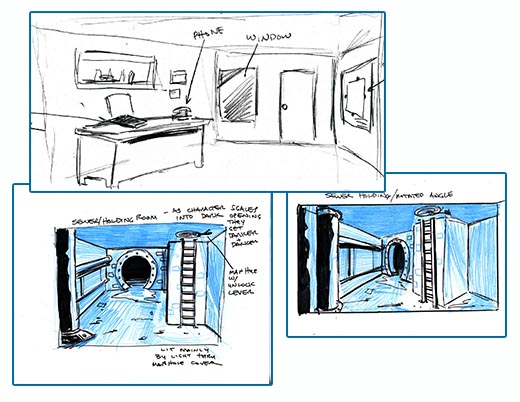
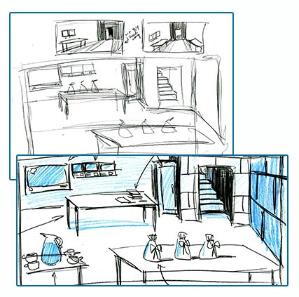
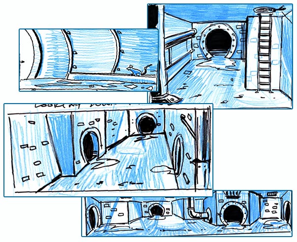
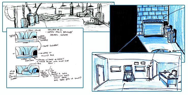
Sometimes for the sake of understanding where you're going you just need to dive in and limit yourself to a quick 15 minute sketch to understand basic layout, perspective and shading. It's amazing how freeing this can be, especially when you might be stuck.
At this point we have a pretty clear idea of the direction we're going with the story and the basic look, and the current task for the art department (namely me) is to get Ron and David as much wireframe art as possible so we can get a good working walkthrough before we really get into the swing of full scale production.

I learned early on in my career, mainly through working as an assistant to the likes of Neal Adams, to just grab a pencil and a piece of bond paper and rough out as many approaches to a scene as quickly as you could in an hour, it gets your juices flowing and helps identify problems early on.

When you're working on a long term (a year or better) creative graphics heavy project, whether it's a game, comic or movie, you never want to get too attached to anything- at least on the visual detail side. You need to build a framework that allows you to easily iterate and change for the better.
Additionally, if you're working as part of a team. hopefully it's a group of people whose opinions and ideas you respect- obviously I'm very lucky in that area, and wouldn't rather be doing anything else. Anytime you're responsible for the visuals of a project, especially a commercial endeavor you're not creating that in a vacuum (at least I hope not), you need to be in a synergistic team relationship that helps make your vision stronger as a result of collective brainstorming and evolve as you go. As Chip Morningstar once put it "You need to feel like your team is running along ahead of you with a steam roller, instead of chasing you with one".

Creating a game as complicated as Thimbleweed Park, and make no mistake, although we're working with an 8 bit art look- this is a complicated game from the perspective of the amount of 2D screens, the feelings we want them to convey, the number of characters, stories, puzzles and situations means you have to be able to easily change and adapt the visuals as you go. With limited resources, the quicker you can get on the right track, the more time you'll have to polish the final result.

Also, didn't know you worked with Neal Adams! Any good stories or neat things you worked on during that time you can tell us about?
since I'm really working quickly to get an impression of look an direction- it does become more important rendering
an actual scene for the game- however a lot of that can be somewhat impressionistic/forced as well- depending on what
feelings you're wanting to evoke. As far as translating a design to the computer- I've now done this long enough - where I
can pretty much look at any (reasonable) design image and reproduce pretty directly on the screen in photoshop.
Still as far as I know most digital painter pros go with Cintiq and many praise it to heavens.
http://shiniez.deviantart.com/journal/apologies-for-the-delays-ugh-528453563
[1] Comic artist, but also did the high-poly character model, concept and box art for Serious Sam 3... :)
Thank you for the insightful post, Darth Grafix. :-)
http://www.youtube.com/watch?v=ya4G7hRn5sI
Having to do rough sketches, wireframe art, object art, character art, background art, animations, then having to touch everything up and make everything look good, that's an insane amount of work to do. I hope you can hire someone to help you out with all of this, even if only part-time, otherwise your drawing hand is going to permanently cramp up and fall off lol.
One Question for Mr. Winnick:
How long did it take to draw all of the art for the kickstarter trailer, or yet how long did it take just to draw the inside of the fully stocked Quickie Pal that's featured in the trailer?
The budget allows for some more art assistance and we'll be figuring that out as we move into production
by next month.
As far as the art for the kickstarter campaign- if you added up all the actual working time- just the drawing
part- not how long it took for Ron and I to actually determine what we wanted to do (which was considerably longer)-
I probably spent somewhere between 2 weeks and a month on the kickstarter images- but there was a lot of other
back and forth as we crafted the pitch.
Re: the Quickie Pal - that probably actually took about a day (8hrs) of actual work to get up on the screen.
Glad to hear that you're getting some assistance with the art. Given the size of the game and just how much art needs to be done, it just seems like way too much of a workload for one person to shoulder and that hiring someone to help out, even just part-time, would make a huge difference, that way too the art can keep pace with the programming as you talked about in recent podcasts. Also, if lots of bushes and shrubbery are needed to be drawn in foregrounds, Ron can do all that as seen in the parallax video featuring the outside entrance of the Quickie Pal lol.
That is we have a LOT of history working together in a very collaborative way- so the process comes
very naturally- we listen to each other and weigh technical vs art vs creative decisions very candidly.
None of us is afraid to state their opinion and work through any issue together- so we have what I think is
a very enviable process on this project. It's much harder when you're working within a new group- you
have to learn that rhythm and just hope it all works out.
In Fate Of Atlantis instead you walked and walked and walked just to solve one little puzzle. It bored me, especially when I didn't come forth.
An adventure game has to provide quick paths, wherever you want to get to!
Gary, if you have the time at some point during production to do it, a time lapse of a photoshop session for one scene would be a great thing for this blog, I think.
Again, the rooms seen on the early test videos here on this blog are just wireframe art. They are going to lack detail, lack proper dimensions for things like the sizes of the buildings seen while walking the downtown streets of the town, lack any type of lighting and textures and stuff like that. Gary will fix all of that in the upcoming months. On a scale of 1 to 10 of how finalized the art is that we've seen so far, with 10 being the finalized look of the game, we're at about a 3.5 right now lol.
I must be the only one here concerned about the retro 8 bit look. I've always loved the great LucasArts/LucasFilm games with their great stories, humor and graphics besides the 8 bit limitation, but when time came and we had 256 color version of those games.... WOW impressive how adding more colors to the same graphics could make the experience even greater than it originally was, and some decades after that came the special editions WOWOWOWOWOW I really liked those editions and the work done with the backgrounds very true to their originals but in high res, I liked most characters fidelity to their originals too, but MISE2's Guybrush was very disappointing , the original character was way better.
For me visual aspect is as important as the good dialogs, music and story, it all goes together. So, here comes the question: Are TWP graphics going to be 16 colors or there will be no limit regarding the colors the game will have? I've seen very interesting 8 bit like looks where the art was kind of 8 bit wise but every "pixel" had gradients which gave a very interesting look (have you seen Lone Survivor game screens?). Is TWP going to have something like that?