Radio Station

by Ron Gilbert
Aug 17, 2015

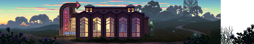
Here are a couple of new pieces of art from the Gamescom Microsoft trailer. These are 1-to-1 pixel images, just as they appear in the game. Neither of these are completely done, they both need to go though a polish stage.

I also wanted to thank Craig Derrick for putting together the deal with Microsoft and generally helping out at Gamescom. Craig worked at LucasArts and was responsible for the Monkey Island Special Editions. He was the executive producer and the driving force behind the re-releases getting made. Many thanks for that and for the help with Thimbleweed.

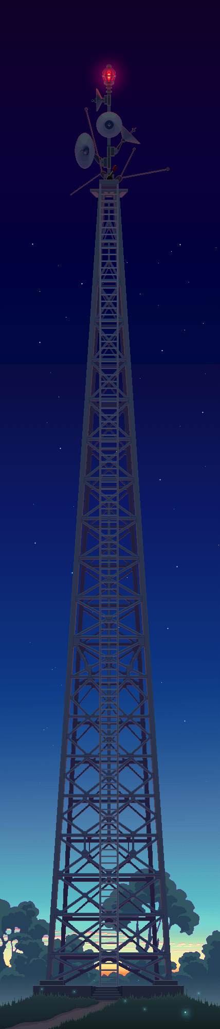
Also enjoy the glory of vertical scrolling rooms.

And as an added bonus...

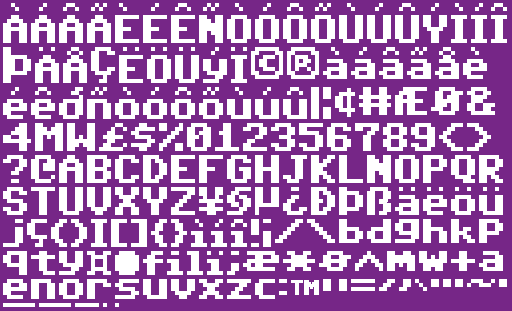
The fine folks at Style64 (Elwix/Style) offered to extend their TrueType C64 font, adding the international characters we'd need for French, German, Italian and Spanish, plus the ™ and a few other symbols. Many thanks to them.

It's kind of a short post today, using art and visual images to distract you from the dearth of actual content and information. It's been two weeks since I got back from Germany and I don't feel like I'm completely back in the swing of things.

- Ron


Patrik Spacek - Aug 17, 2015 at 15:07
Exterior looks great! will see how its gonna look on full screen. Great job.

Geoff Paulsen - Aug 17, 2015 at 15:09
Any idea why the lower letters are not "in order"?

Ron Gilbert - Aug 17, 2015 at 15:18
Because they have been packed into a sprite sheet. It's using a best-fit algorithm.

Geoff Paulsen - Aug 17, 2015 at 15:25
Ah!  Thanks.  I was drawing a blank.

Phaze - Aug 18, 2015 at 05:28
If it's using a best fit algorithm, why aren the underscores and periods aligned to the lower right corner, where they would have more room and you could shave a few more pixels from the image?

amb - Aug 20, 2015 at 03:14
because if they are spending time fixing the BestFit Software then they arent spending time improving Thimbleweed 😊

Ron Gilbert - Aug 20, 2015 at 12:45
I didn't write the packing code, it was done by the glyph editor I use:

https://71squared.com/glyphdesigner

Phaze - Aug 20, 2015 at 16:53
Ah, I just thought maybe there is a reason that it always seeks something from the file from the left side first or something like that. It probably doesn't take that much extra space, I just wondered why its kinda "semi-best fit". :)

Thomas Mølby - Aug 21, 2015 at 08:11
Thanks for the info. This looks great! I could use this for some of the projects I start and abandon :)

Helge Frisenette - Aug 17, 2015 at 15:14
Lovely, lovely, lovely! I think Mark is having a ball here.
Great that you are keeping the C64 font.

DorHajaj - Aug 17, 2015 at 15:17
This is really amazing, a great piece of artwork!
I can't wait to see how it all comes together.

Rum Rogers - Aug 17, 2015 at 15:17
Doesn't matter if it's short, this post made my day.
Vertical scrolling ftw!

Kevin Drum - Aug 17, 2015 at 15:19
GORGEOUS!!!

hihp - Aug 17, 2015 at 15:26
I love the Tower. I just wonder if we'll have to continually click on the top of the ladder while it is scrolling upwards in order to get to the top =D

Just one idea: it would actually be cool if the tower were to stand on top of the radio station building. Simply because it would be an awfully large structure on top of such a small building...

Plus you could add a puzzle on the inside that one needs to solve in order to get to the roof to access the tower.

Nicolas - Aug 17, 2015 at 15:27
Very nice!

Brian S - Aug 17, 2015 at 15:34
Beautiful.  Are those fireflies?

Looking at the weeds in the foreground, made me wonder if you were thinking about adding Thimbleweed into any of the backgrounds.

Ricardo Marichal - Aug 17, 2015 at 15:34
Nice !!... but still waiting for an Mark Ferrari post :P

Natalija - Aug 17, 2015 at 15:35
Awesome. I'm so excited about this game! I don't know why, but I got a feeling that this game is going to be perfect! (Just like The secret of Monkey island)

nibbles - Aug 17, 2015 at 15:41
Monkey Island 2 already did vertical scrolling (the cliff on Booty Island).

Ron Gilbert - Aug 17, 2015 at 15:42
That was horribly faked. It wasn't real vertical scrolling.

Leak - Aug 17, 2015 at 16:02
So it actually was Artificial Vertical Scrolling™?

Josejulio Martínez - Aug 17, 2015 at 17:22
Would you share a tale on how "Artificial Vertical Scrolling™" did the trick?

Murray-Mint - Aug 18, 2015 at 04:45
There's a reference on a Twitter post from May with regards to the ship diving sequence in MI2.

https://twitter.com/grumpygamer/status/603264137972436992

"That was faked through color cycling and sliding actors for the screen."

Grafekovic - Aug 19, 2015 at 17:43
You mentioned that the diving scene was faked, but there was some vertical scrolling at the cliff where you had to get the map piece, wasn't it?

Tomas - Aug 17, 2015 at 17:57
And when diving.

LogicDeLuxe - Aug 20, 2015 at 12:22
That scrolling is a scene transition effect built into SCUMM, just like dissolve and iris being other effects of that kind. Also Fate of Atlantis uses that effect a lot (in all four directions). It's not possible to freely walk around while the transition effect takes place.

Ron Gilbert - Aug 20, 2015 at 12:41
Here is the actual SCUMM code that did the cliff panning. It uses a special fade, then it switches to a different room that looks exactly like the bottom of the top of the cliff.

fades pan-down
current-room cliffbot
sleep-for 2 seconds
actor fishhook never-zclip
put-actor fishhook at 156,0 in-room cliffbot
start-sound clicking
walk fishhook to litter within 0
wait-for-actor fishhook
; get paper on hook
actor fishhook \
init-animation line-and-paper \
walk-animation line-and-paper \
stand-animation line-and-paper
do-animation fishhook line-and-paper
put-actor litter in-the-void
foo = -20
walk fishhook to 156,foo
wait-for-actor fishhook
fades pan-up
current-room clifftop

Dan - Aug 20, 2015 at 13:54
Hey, here is the void, you mentioned in the podcast #16, used once again, isn't it?
Fortunately you didn't put the map itself into the void, but only a litter! Otherwise I would've never played MI2 through to the finish. :-)

Grafekovic - Aug 20, 2015 at 14:20
What was the reason you didn't use "real" vertical scrolling?

Ron Gilbert - Aug 20, 2015 at 14:24
Because of how the SCUMM system did rendering. Everything was compressed into vertical 8px wide strips, this was to speed up horizontal scrolling. We didn't have a lot of CPU in those days, and every trick was needed to get 10fps! It could have been done by flipping the compression, but there were only a couple of rooms that needed it, and it wasn't worth the time.

Arto - Aug 20, 2015 at 15:13
Sounds like moon missions in 60's and 70's.

Marco Lizza - Aug 20, 2015 at 16:24
It was quite normal back in the days to work with tiles/stripes. From time to time this is done nowadays, too, but in a quite different way (chipset and graphic controllers of the time featured pixel-wise framebuffer offsetting that could be exploited to achieve very smooth scrolling despite the very low MHz availability).

Franzy - Aug 17, 2015 at 15:44
Waiting to see what this lever at the top of the radio tower does... :)

Peter Campbell - Aug 17, 2015 at 15:53
Is the sign at the entrance of the radio station intentionally supposed to be ambiguous as to what it says?

Arto - Aug 17, 2015 at 16:00
I think it says "Weeds and Thimbles".

I really like the misty morning atmosphere there. Looks really good, even if it is unpolished.

criskywalker - Aug 17, 2015 at 15:59
Wonderful! I love how colourful the graphics are.

Is the Gamescom trailer anywhere to be seen?

Brian S - Aug 17, 2015 at 16:46
Ron posted it on Aug 4:  http://blog.thimbleweedpark.com/xbox

criskywalker - Aug 17, 2015 at 17:58
Thanks! I'll check it out :-D

Lennart - Aug 17, 2015 at 16:12
Once again, proof that Mark known how to get lighting absolutely right.

Mattias Cedervall - Aug 17, 2015 at 16:18
Thank you, Craig Derrick! :-)

I like the vertical scrolling!

Ron, Elwix sent me the C64 font to try it and here's my reply:

I wrote a sample text in Swedish and I printed it on paper with
my printer Samsung CLP-325W (blatant product placement,
sorry!) using font-size 12 and I simply think it looks good and
readable unlike my handwriting. I don't know much more
to say except that I can see myself playing a game using this
font. I like to use some wordplay and call it "fontastic"! :-)

LichiMan - Aug 17, 2015 at 16:21
I love Mondays. This is totally beautiful.

How Mark Ferrari does that large pixelated gradient color for the sky in the vertical image?

Poe_Dameron - Aug 17, 2015 at 16:37
Awesome, i love that!

Marc - Aug 17, 2015 at 16:39
The ™-symbol is in a much higher resolution, you cheat!
(also since when did the Commie64 have a proportional font?)

Dan - Aug 17, 2015 at 16:59
Well spotted! It has a higher resolution indeed.

But don't criticize the font too loudly! It looks remarkably similar to the font of the subtitles in Monkey Island (DOS version), albeit it looks a bit complanate in the Quickie Pal video.

Mattias Cedervall - Aug 17, 2015 at 17:54
Commie? It's not a communist computer. It's called Commodore 64.
This new font is proportional and that's the way Ron prefer.

César - Aug 17, 2015 at 16:45
Yay C64 font with international characters (even if it is proportional)! Will that be released publicly? (Please say yes please say yes please say yes please say yes please say yes please say yes please say yes please)

Mattias Cedervall - Aug 17, 2015 at 17:58
You can download the C64 font here (read the license) even though this is an older version without the international characters: http://style64.org/c64-truetype

César - Aug 19, 2015 at 05:38
Had already found that one. Will wait for the international characters, thanks :)

Ian / Nihil Quest - Aug 17, 2015 at 17:05
You're going to need cheesy 80's music for this radio station! Maybe fans could provide some of it? Since Kung Fury I just wait for an excuse to do some power pop rock.

Mattias Cedervall - Aug 18, 2015 at 21:32
:-) I love Kung Fury! I recommend this retrosong Energy by Fire Tiger: http://www.youtube.com/watch?v=W4A--GBLkzk

urielz - Aug 17, 2015 at 17:09
I really like where Mark is taking the look and feel of the game, awesome job! Can't wait to peak on more rooms.

tomimt - Aug 17, 2015 at 17:58
That's just fantastic piece of pixel art. I'm so glad you decided to go with this style instead of full out "Maniac Mansion".

longuist - Aug 17, 2015 at 18:45
Yay, this implies the C64 font will stay. It is really alternativeless (thats not a real word..except in germany..). Its so iconic.

Btw, nice art 8)

Kaj Hansen - Aug 17, 2015 at 19:05
When I scrolled down from the top to bottom on my desktop I just got this "Star Destroyer" feeling of the signal tower. It just kept going and going.

Same feeling I had watching the first Star Wars movie on Betamax :-)

mr. T - Aug 18, 2015 at 15:49
Hehe I got some of those same vibes. Ever seen Space Balls?

https://www.youtube.com/watch?v=1dZveoBfiww

Now THAT's a fly-by :D

Patrick H. Lauke - Aug 17, 2015 at 19:26
Loved the little bit of pixel font info there, as one of my past-times is to recreate fonts from old computer/arcade machines (over 475 and counting) https://www.splintered.co.uk/experiments/ / http://fontstruct.com/fontstructors/145/redux

Mattias Cedervall - Aug 18, 2015 at 09:44
The Font is strong with you! :-)

Chris T. - Aug 17, 2015 at 23:34
Oh Germany... danke and prost for keeping adventure gaming alive for the rest of us.  They really need to get past Hasselhoff though...

Leandro - Aug 17, 2015 at 23:35
I LOVE THOSE IMAGES ! A BUG KUDOS TO MARK !!! HIS ART IS AMAZING !!!

nico - Aug 18, 2015 at 01:16
I wonder if those background aren't way too gorgeous. I mean, the initial goal was to capturate the spirit of Maniac Mansion, with the low resolution and big headed characters. Big head character will looks really out of place with such magnificiant backgrounds.

Ron Gilbert - Aug 18, 2015 at 10:09
We like the big headed characters, they are going to stay. I don't think they look out of place. Mark's art is very clean, which works well with the characters. If the background art was messy (scanned for example, like MI2), then I would agree with you.

Arto - Aug 18, 2015 at 11:33
I really like Monkey 2's scanned art, and I was going to show that the bubbleheads fit those backgrounds too. But they don't.
Exhibit A: https://www.dropbox.com/s/toifwww9g0weru8/Monkey-Island-2-Largo-Guybrush-Delores.gif?dl=0

Grafekovic - Aug 21, 2015 at 02:47
Reminds me how great the art in MI2 is.

Big Red Button - Aug 21, 2015 at 06:01
I think the reason why it doesn't suit is not quite the bobblehead. The characters and backgrounds from TP are very straight, whereas everything is very inclined in that rope bridge cut-scene - more than in other places from Monkey 2. If you had taken e.g. the sewerage or the closeup view of the fisherman on Phatt Island for a comparison with Delores, you probably would have come to a different conclusion.

Once the bobbleheads have got more plastic shading, they will go great with the settings in TP.

hoerry - Aug 18, 2015 at 13:12
Yeah, the big headed characters worked well with Zak Mckracken VGA and did not look out of place. Current character models just need perhaps a bit more detail/fine tuning.

Martin -enthusi- Wendt - Aug 18, 2015 at 18:15
Then again, Zak McKracken didnt have the Bubbleheads but rather proportionally normal ones.

Davide - Aug 18, 2015 at 13:39
I like much the wonderful art of Mark Ferrari, and I like the big headed characters from Gary Winnick too.
Have you ever thought to experiment with a Normal map palette
(e.g. a discrete set of normals: http://inpursuitofoptimal.blogspot.it/2015/01/normal-map-palette.html)
to be used for normal maps drawing (pixel by pixel) for the characters' sprites (not too much detailed anyway)?
Maybe characters would result a bit less flat, and give Mark/Gary an additional tool to build mood.
I love the current art direction, anyway.

Paulup - Aug 19, 2015 at 09:12
"We shall go on to the end, we shall fight for the big headed characters, we shall fight for the bobbleheads, we shall fight with growing confidence and growing strength on the blog, we shall defend our big headed characters, whatever the cost may be; we shall never surrender."

Winston Churchill - Aug 19, 2015 at 17:04
Aye!

Mr.Partybreaker - Aug 18, 2015 at 04:15
I love the art and while every one wants to see now the rest of the rooms too I would recommend to keep the box closed until lunch / launch? (Sry German :)

RM - Aug 18, 2015 at 07:35
"Using art and visual images to distract you from the dearth of actual content and information".

Kinda like what the video game industry has been doing for the past 15 years. ;)

Mattias Cedervall - Aug 18, 2015 at 21:32
I'm afraid you're right! :-(

peterszky - Aug 18, 2015 at 08:01
What does KSCUM stand for?

Iron Curtain - Aug 18, 2015 at 16:42
In the US, Radio Stations on the East coast have four-letter codes starting with W (e.g., the classic rock station Q104.3 here in NYC has the 4-letter code WXRQ). Stations on the West coast start with the letter K (e.g. K-Rock, a rock radio station in LA, had the code KROQ), so KSCUM is a reference to the fact that the radio station is in the western half of the US *and* a simultaneous reference to the SCUMM Engine Ron Gilbert used to make Maniac Mansion which was also used in the rest of the LucasArts adventure games up until Grim Fandango.

Mario - Aug 19, 2015 at 02:29
thx for explaination.

peterszky - Aug 19, 2015 at 03:47
The SCUMM was my guess for the SCUM, but the K... I had no idea, thanks!

Iron Curtain - Aug 23, 2015 at 11:00
BTW, I made a mistake. The four-letter code for Q104.3 here in NYC is WAXQ, not WXRQ. Iron Curtain regrets the error.

Mario - Aug 18, 2015 at 08:33
@RON: It's good to have Craig as business relationship. If TP hits the market like a bomb, it would be great to have a Special Edition later on with updated GFX and Stuff. i played both MI SEs few months ago and liked the new design very well. The implementation and option to play the "PIXEL Retro" was a great idea.

Dan - Aug 18, 2015 at 11:30
Of course the MI Special Editions are nice, but if Ron actually wanted to make a re-release of TP one day, he wouldn't have any reason to firstly make TP with such a low resolution, I think. Thimbleweed Park is rather meant to be a reminiscence of low resolutions and the very special charm of classic adventure games. So a TP Special Edition would miss the point.

Arto - Aug 18, 2015 at 11:47
I agree, it would.

I think it was a podcast where Ron said he played the MI SE version, but preferred to play in retro mode. So I'm pretty sure there won't be a hires-TP.

And. I've played both SE versions, and I always felt they were missing something. Maybe it's just the memory of those great moments with these games when I was young, but the SE versions, while they look gorgeous, just don't feel that good. And neither did Monkey 3, but then again, there was different team working on it.

Dan - Aug 18, 2015 at 12:41
That's true. When I was playing these later games I always missed the verbs and the inventory at the bottom of the screen. Not least because of their great ergonomics, even though they need space on the screen. And I also love the low resolution, as every pixel is chosen with a high degree of consideration. It's like enjoying an impressionistic painting.

By the way, I think that 3D is not very appropriate, if you want to create highly detailed settings. That's why I would always prefer 2D graphics in an adventure game.

Patrik Spacek - Aug 18, 2015 at 14:39
Now the art is right in the place!  Its not bad as Manian Mansion 1 or Zak mc kracken, and its not scanned detailed as Monkey Island 2. I wish I could see more shading on characters, but I am good at this point. I am sure fans will take care of it sooner or later :o)    (oops)

criskywalker - Aug 18, 2015 at 16:56
Well, I think the characters' art is not finished, so they can still look better. I'm really pleased with the art direction and I'm even more hopeful now that Mark Ferrari is involved.

Dan - Aug 18, 2015 at 18:09
Are the heights of the characters in the sprite sheet above correct? I just recognized that e. g. the ä, ё, ö, ü of the new font have a total height of 7 pixels, but the i has a height of only 6 pixels - incl. its dot. This doesn't seem very concerted.
Furthermore in my opinion the font would look a bit better if the characters h, l, t, b, d, f, k, i were as high as the majuscules (7 px instead of 6 px).

Dan - Aug 18, 2015 at 18:20
Well, I just compared the font with the one from Monkey 1 and recognized the same characteristics, unless the h, l, t, b, d, f, k are one pixel taller as I recommended above. Maybe I'm a little bit petty.

Bogdan Barbu - Aug 19, 2015 at 11:08
I'm not sure what Monkey Island, which uses a custom font, has to do with any of this. I suggest you check the default font on the C64 instead---you'll find it's a match.

Dan - Aug 19, 2015 at 12:51
I wasn't very familiar with the C64. I was simply wondering why some minuscles were not as high as the majuscles. It even would have been a little bit more readable if the heights were consistent. However you're right. It's definitely the C64 font, as I noticed later on.
Nevertheless I reserved the right to compare it with the MI font, which I'm very familiar with, and I found out that they also have a great deal in common, except of the inconsistency of the heights.

Bogdan Barbu - Aug 20, 2015 at 03:07
If I had to guess what is going on, the C64 screen was divided into cells of 8x8 pixels. If the letter "i" had been as tall as "a," then its dot would have been on the cell's top row, potentially touching letters using the bottom pixel row on the line above (e.g., the bottom of "j"). You'll notice that this font has some taller letters, given that we don't have the same limitations. However, they kept the legacy "i" and made its cousins (e.g., "ï") consistent with it.

Mattias Cedervall - Aug 18, 2015 at 22:20
I didn't think of the height difference earlier, but now I see what you mean. I recommend that you contact the polite creator(s) and ask your questions: http://style64.org/c64-truetype They appreciate feedback!

Dan - Aug 19, 2015 at 06:39
Though I presume that Ron likes it the way it is, as he prefers a C64-like font. It's a matter of opinion. I generally have a deep respect for his decisions, so I think I won't tamper with this subject.

Arvenius - Aug 19, 2015 at 19:46
Hmm... while I deeply respect Mark for his art (VGA pallette cycling, so cool!!), I can't help to find some parts of the backgrounds to be 'too clean'. Some of the gfx (i.e. the antennas on the broadcast tower) remind me of mid 90s vector based corel draw clipart...
But keep on rocking, im sure you'll gonna do great!

lennon - Aug 20, 2015 at 01:20
Hi Ron, I really would like you ro write more about puzzles.
How do you work them? when do you know that you have enough?
What kind of problem may arise form them. Anyway, thanks,
Amazing job!

lennon - Aug 20, 2015 at 01:59
How do you merge it with the story,
how much you do one first or the other, etc.

Dominik - Aug 20, 2015 at 03:53
Vertical scrolling? What vertical scrolling? I am sorely disappointed! ;-)

http://i.imgur.com/SF2vnYv.jpg

Will the occult book store be taller than the antenna? If so: There could be a puzzle to install the antenna from the radio tower on the top of the "World's Largest Occult Book Store" (TM) to improve the sginal strength...

Bogdan Barbu - Aug 20, 2015 at 07:54
I sighed as I started reading your suggestion but it turned out to be pretty funny. :)

Flowo1974 - Aug 21, 2015 at 05:17
LOL!

Howler Monkey - Aug 20, 2015 at 11:54
Sigh...I´d comment more often on the progress if it wasn´t for those damn Seckrit Questions which drive me to my limits...
I´m so excited about this game - I really love the current 80´s/90´s revival trend which already provided a bunch of fantastic games and this one will add to that list I´m sure! (Best thing about it is: I don´t need to update my relict-PC;))
I´m really perplexed by how detailed people seem to remember things such as (faked...) vertical scrolling on old games such as MI 2 ?!
The only thing about that game which I do (and always will - in fact it will likely be part of the short-film flashing before my eyes in the moment I pass away...;) ) is the part where you needed to get the last ingredient of Le Chuck for the Voodoo stuff.
Which was his underwear. To get it, you had to toss that coin in front of him so he would bend over...
I can tell you - whoever it was who came up with THAT RIDDLE - If I had been able to perform voodoo at that time - this person would suffer till TODAY from permanent beating :D:D
It took me two weeks or so to solve this (luckily by a sudden insight called Epiphany I guess...)
(hey-  there was no Internet at that time... the only way to get a hint was writing to the monthly game magazine and wait another month for the (potential) reply...
Oh the good old times.
Cheers and have a nice week everybody ;)

Brian Baker - Aug 22, 2015 at 10:51
Ron, you mentioned the MI special editions... Did you have any personal involvement in porting those over to Xbox 360? And if so, will any of that experience help when you create the Thimbleweed Park port for Xbox One?

Ron Gilbert - Aug 22, 2015 at 11:00
No, I had no involvement in those. I was long gone by then.

KJL3000 - Aug 22, 2015 at 11:15
Can't wait to climb that ladder...

Przemek - Aug 23, 2015 at 18:32
I think every pixel in this tower represents our expectations for Thimbleweed Park gameplay! :-).