UI Changes

by Ron Gilbert
Aug 24, 2016

Time for another fascinating and action packed Thimbleweed Park dev video.  This time we're going to talk about our latest change to the ui.... removing the sentence line.

I resisted making this change for quite a while, but when I finally got around to doing it, and played the game for 10 minutes, it became clear this was the right thing to do. Everyone who's played the game since likes the change a lot.

We've done some playtests since this change and it's interesting because no one comments on it. When I bring it up at the end of the playtest, there is a little bit of shock that they didn't even notice. It just felt right.

I guess that's a good thing.

- Ron

P.S. Here is a bonus GIF to show what happens when the cursor gets to the edge of the screen, since a lot of people are asking about that.


hihp - Aug 24, 2016 at 16:51
Pleeeeeease... add an option to turn the sentence line on again!

Franklin - Aug 24, 2016 at 16:52
Did you even watch the video? He shows that.

hihp - Aug 24, 2016 at 16:55
Ooops... I had watched the first minute and then posted... thanks, Ron, for implementing my wish so quickly 😁

Asterisk - Aug 28, 2016 at 08:18
I hope there's a way to play with the traditional sentence line but also keep the new font for the verbs -- "classic mode" sounds nice, but it'd be nicer if it weren't an all-or-nothing proposition, and settings were individually configurable.  

One of the nice things about the traditional sentence line is that I don't have to look at it if I don't want to: I can focus on the graphics themselves, and only refer to the sentence line to confirm my action before I click.  With this roving sentence line, there's now a bit of text constantly changing and following my cursor around the screen.  

OTOH, the new font looks really great, and adds some nice flavor to the game that helps to distinguish it without deviating functionally from the traditional SCUMM interface -- so I definitely want to keep it, but equally want to ditch the mouse-chasing description of what I'm usually already aware I'm doing.

Arto - Aug 24, 2016 at 16:51
This is a good change, although it takes us a bit more away from those early Lucas adventures we love. But still, a good change.

Aaron - Aug 24, 2016 at 16:53
What an awesome concept! I love it. Cannot wait to get my hands on this game! For those of you complaining about it being gone, if you would have watched the entire video, you would have seen that there is a 'classic' mode you can enable to bring the sentence line back.

Marco Lizza - Aug 24, 2016 at 16:54
It reminds me so much the various (good) Lucasfilm inspired adventure games that spurred in the early nineties. A lot of clever UI enhancements were tried... love it (although it seems to me quite a significant change from the initial 1987-era vibe)...

Ivan Braidi - Aug 24, 2016 at 16:55
I like it a lot!! A great UI improvement!!

And with the option to turn it on/off it's perfect even for the most "conservative" and nostalgic players ;)

Very well done, as always ;)

CIAO!!

franzzle - Aug 24, 2016 at 16:56
This is great for tablet releases, where it's possible that your finger could block your view on the sentence line.
So I think this is a logical step!

Charles - Aug 24, 2016 at 17:10
Except with a tablets touch interface ....there's no cursor?

Derrick Reisdorf - Aug 24, 2016 at 17:11
It definitely works because the line appears ABOVE the cursor.  I wonder if there is any object at the very top of the screen?  Does the line get pushed ontop of the cursor.  If you notice when you highlight an item on the very left or right of the screen, the sentence line remains on the screen.  I assume similarily that will happen at the top of the screen in which that becomes the only scenario/case where your finger might obstruct the sentence line on a touchscreen device.

Nor Treblig - Aug 25, 2016 at 16:37
Wait, isn't there a black bar on top anyway to allow space for those two dialog lines? :-)

Derrick Reisdorf - Aug 26, 2016 at 14:40
Doesn't look like it.

Brian Small - Aug 24, 2016 at 16:56
I think this is an excellent change.  I like the verb interface, but I didn't like how it always pulled me away from the game to read the sentence I was making - this keeps the verb/sentence interface, and makes it much easier to play.

Rum Rogers - Aug 24, 2016 at 16:57
I've always thought the sentence line was conceived brilliantly, because it was highlighted until the character reached the target object and you knew what was happening until it disappeared (once the walkspot was reached and the script started).
At least that's what happened with SCUMM games until Tentacle.
It's sad to let it go, but I have complete trust in what you're doing.

Derrick Reisdorf - Aug 24, 2016 at 17:22
It doesn't disappear but it does change to the default "Walk To".  (Inspecting inventory defaults to "Look At".)
Hmmm...I also wonder what the purpose of highlighting suggested verbs when mousing over an object?  Will you be able to select that instead using a different button?  If so, how will that work with a touchscreen?

Rum Rogers - Aug 24, 2016 at 17:49
Yes, "disappear" isn't the proper verb. It got reset, hence it came back to default (Walk to).
The suggested verb feature has been there since MI1: by pressing the right mouse button you could fast-select that particular verb on the object.
Good question regarding the touchscreen, though!

Emmanuel - Aug 24, 2016 at 16:57
I remember seeing Brian Moriarty at the Loom postmortem at GDC. He said he didn't know if SCUMM could handle the unusual interface he wanted to do and was surprised to see that it did. Easily. He'd said that the guy who'd made SCUMM (some guy named Gil something) had kept it remarkably flexible.

I'm wondering if this changed happened at the engine level or at the SquirrelScript level.

Mattias Cedervall - Aug 24, 2016 at 16:58
The sentence line might be gone, but I still have my pitchfork!

Martin Wendt - Aug 24, 2016 at 17:00
Will the placing of the line be dynamic if you have objects at the very top of the screen or near the left/right edges?
I can imagine it to be clipped pretty 'early' otherwise?
But also I can imagine it to be quite a great improvement (yes, I am very imaginative).

Akolade - Aug 24, 2016 at 17:08
You can actually see when he mouses over the plastic rings in the inventory that the text stays visible (shifts to the left of the mouse cursor). Not sure what happens at the top of the screen, I imagine similarly it just stops before it clips.

Derrick Reisdorf - Aug 24, 2016 at 17:25
The only issue I see this presenting would be on touchscreen devices.  If the line is pushed ontop of the cursor, your finger could obstruct what you're trying to read.

unwesen - Aug 25, 2016 at 03:00
On touch screen devices, you can't hover anyway. So all you will see is the uncompleted "look at..." bit until you touch what to look at.

Big Red Button - Aug 25, 2016 at 06:46
It depends on the control scheme.
When I played a few SCUMM games via ScummVM on my phone a few years ago, there was a cursor which moved to the same direction that I wiped in with my finger. It was comparable with controlling the cursor via a classic touch-pad. So, the sentence line worked well.
Thanks to the cursor, it still felt classic, even though I would have preferred a physical thumb-stick, because your hand delimits your view. Furthermore, I also prefer physical buttons for the haptic's sake.

Brian Small - Aug 24, 2016 at 17:04
Is it just me, or do other people keep eyeing that little piece of dust on floor uncomfortably.  I think the dust collection feature will be very satisfying for those obsessive compulsive tendencies.

Arto - Aug 24, 2016 at 17:12
I don't. But "dust collection" made me think if the character should have a handheld vacuum like Dustbuster to collect the dust. Would be funny, I think :)

Carlo Valenti - Aug 24, 2016 at 18:04
I completely agree. I will collect them instantly to make them disappear. First thing entering the room. Really.

Zak Phoenix McKracken - Aug 24, 2016 at 17:07
Well, I think this way is better. The eyes are focused on the cursor, and have not to go back and forth from cursor to the sentence line.
It's simply more natural, I agree with this change.
However... when the interface switched to classic mode, my mind flew away, back to the glorious moments, with that mix of joy and nostalgia.
I believe that I will play with the modern UI for 10 minutes, then switch to classic UI to feel "the undiscovered adventure lost in desk drawer", as if it was in that time... and then switch back to modern UI, to better focus on the game!

Nor Treblig - Aug 25, 2016 at 17:14
And you could switch back again to classic every 10 minutes to get that feeling again, and again, and again!

Charles - Aug 24, 2016 at 17:07
Yes it works great with the mouse-over, but how will this translate to the touch interface of mobile???

Ariel - Aug 24, 2016 at 17:12
Nice change and nice Maniac Mansion reference! :)

Giulio - Aug 24, 2016 at 17:17
It's great that you keep experimenting to improve things.
I was very skeptical about the previous changes made to the user interface, but thanks to the classic mode options everyone will get what he/she prefers. While I'm still not sure whether I'll use the new font or not, I must admit I've grown to appreciate the transparency of the UI.
Coming to this change... I really don't like it. The reason for it is that it somehow breaks the immersion to have the sentence line appearing next to the cursor (the cursor itself has a bit of the same effect, but hey, that's something which has to be there so coping with it is not a choice).
It's different from dialogues, when my attention sort of moves away from the art and focuses on the dialogue itself.
Moreover,  when exploring a new room, I have always enjoyed that brief instant when I realized something was a hotspot and tried to guess what it was just before my eyes rushed to the sentence line.
Anyway, this is just my humble opinion. Will I just get used to it in time? Who knows. In the meantime, kudos for the freedom of choice we are given. These details show how Ron, Gary, David, Mark and the whole team care for their fan base.
Loved the idle animations and.. WANTED: "Huh? A meteor?"

Ian - Aug 24, 2016 at 17:29
I like this

Derrick Reisdorf - Aug 24, 2016 at 17:30
Some questions arise when this UI is applied to a touchscreen environment, but overall I like the change.  It's something that probably would have been done back in the day had there not been the limitations there were.  Could you imagine a big long blocky sentence following your cursor around the screen?  That's kind of funny, thinking about it.

Ron Gilbert - Aug 24, 2016 at 17:32
That's what I had when I first made the change... then I thought... hey, I'll reduce the font size.

Brian Bagnall - Aug 26, 2016 at 12:20
I hope the final text uses the same pixel size as the graphics, otherwise having very small/fine text over chunky pixels really breaks the illusion and doesn't look aesthetically pleasing. Like a classic car with 2016 parts on it, a bit of a Frankenstein monster.

Ron Gilbert - Aug 26, 2016 at 13:25
It won't. The text is at higher res than the rest of the screen. It was done for readability issues. Unless you're in retro pixel mode, the resolution of the text, ui and backgrounds are not consistent. This is an artistic and aesthetic choice.

David - Aug 24, 2016 at 17:32
I totally agree with this change. It just feels right. Once again, congrats.

Big Red Button - Aug 24, 2016 at 18:19
It's an interesting idea. Given that there is still a sentence line nearby the cursor, containing the name of the current item and the current verb, no information gets lost for the player.

Well, making it an option is obligatory, of course. Though, I still have a question in this regard: What would I do, if I prefered both the newer GUI and the classic sentence line? Is the sentence line bound to the "classic" interface? It would be nice to be able to combine any option with any option. For instance, I would furthermore like to try the "pixel mode" with the newer verbs interface.

Ron Gilbert - Aug 24, 2016 at 18:35
You can turn on the classic sentence line and use the new verb font.  You can't use classic verbs with the sentence line on the cursor.

Big Red Button - Aug 24, 2016 at 19:13
Thank you for your reply. I think, I can live with this.

Hello Dolly - Aug 25, 2016 at 08:35
Those are some dire consequences to game development! :)

Gffp - Aug 26, 2016 at 05:00
I can't think of a more logical way to handle it. Great!

Derrick Reisdorf - Aug 26, 2016 at 14:59
How about creating a "hardcore" UI setting?  It's where you cannot see the names of objects or sentences.  Maybe the only time you can see the name of an object is when it's in your UI.  You'd still be able to see subtitled dialogue, of course.

When you change the UI setting to "hardcore", a loud gritty voice (as if from some FPS game) says "Hardcore!!!".  Okay, that's maybe more dumb than it is funny.

Nor Treblig - Aug 26, 2016 at 15:38
Via microtransactions you can buy the  "What is" verb and use it for a duration of 5 seconds.

Zuckerberg - Sep 03, 2016 at 15:03
It seems the point-n-click interface is going down an inevitable evolutionary road, over and over again: here's (https://youtu.be/WE0Cf1JWsAg?t=12m49s) Tim Schafer in 2014 talking about how they got rid of the verbs at the bottom of the screen in "Full Throttle", and went for a "dial" interface...
I still like the "full screen with transparent verbs" decision for TWP. I'm also sold on having the sentence compile near the cursor. I'm not so convinced about the "directional door arrows" and the "hotspot 45° double-cross" decision, though.

Nor Treblig - Sep 03, 2016 at 16:43
Somehow you have to show hotspots and exits, although with that sentence change you don't really need a special hotspot cursor in this mode anymore. The exits still should have a special indication. Full Throttle used big red arrows for example, would something like this be better?

Btw. I want to have part 2 of the video! Or is he afraid to get stuck at those INSANE action sequences?
Since they are now remastering the game I hope they complete this series.

And they should also remove "teleportation", I think it takes you out of the game. Maybe add running on double click instead which keeps you traversing the world faster but still in realistic manner.

Zuckerberg - Sep 03, 2016 at 18:02
Yeah, where is part 2? From this "Sidequest" series, Tim sat down with Dave Grossman (https://www.youtube.com/watch?v=vx0mU5h59BU) to play DOTT in a 3 hour session - sorta part 2. So the FT closure might be coming in 2017, with the release of the remastered version, right?

I've got no opinion about teleportation. It's like a jump cut in movies and well, dunno.

You're right with the sentence - when the sentence completion is triggered, that's just as good as having the cursor change. I actually liked the red exit indicators in FT, but I don't like the (probably temporary anyway) 1px wide up-pointing arrow we saw in Ron's video. And the 45° hotspot cursor, mh, well. Now thinking again about it, I realize, my concern is more about how it was graphically done here - again, probably in first pass anyway - but I'm generally okay with what it does and I'll probably like it after polish.

Nor Treblig - Sep 04, 2016 at 06:57
Exactly, that's why my hopes for a full playthrough of FT are high!

If a game has teleportation like FT than I will most likely use it: zipping through the screens, getting from one end of the game world to the other in no time.
It doesn't help to make you feel you are really in this world, I think it breaks the immersion very much.
A feature to speed up the process is OK (and I would recommend it), e.g. running like in Sam&Max Seasons 2 or later.
Or if you can explain it with game logic like in Simon the Sorcerer (Magic!).

I agree that the cursors look at least unusual. Maybe it will change until release. But probably I would get used to them anyway, whichever way they end up looking like.

Zuckerberg - Sep 04, 2016 at 08:05
Well said.

Nor Treblig - Sep 04, 2016 at 12:43
ad Teleportation&Co:
Sam&Max Season 2 added running (if I remember correctly). When playing Season 1 afterwards it really sucked not having this feature...
Also when testing things in older adventure games (though not really during normal playthroughs) I often make use of this "fast" feature in ScummVM when going from room to room.

i.e. games with a lot of running around (large rooms, a lot of rooms connected in series, a lot of backtracking) should probably implement a similar feature. I don't know if TWP needs it, but that's something testers should already know.

Ron Gilbert - Sep 04, 2016 at 10:57
Teleportation destroys a players sense of the world. I played an adventure game recently that allowed you to teleport around the game and I had no idea where I was. I had no mental map of the world. For me, the most important character in an adventure game is the world and you have to spend time letting the player get to know your main character. Players need a sense of space.  

In Thimbleweed Park, you can double-click to run, but, for a first few hours of the game, you will need to walk around the world, getting to know it.  Then you solve a puzzle that allows some limited ability to teleport around the world, but it's all in the context of the story and world.  It's not magical teleportation.

Because it comes later in the game, after players have built a mental map of the world, it feel OK and it's a great moment.  It's also something players have to "discover" so that is also a great feeling.

Nor Treblig - Sep 04, 2016 at 12:46
Thanks for the info about how it will work in TWP!

longuist - Sep 04, 2016 at 14:42
Thats the attention to detail we got used to in the 90s and unknowingly missed since then. TWP might be the game of the decade :P

Carlo Valenti - Aug 24, 2016 at 18:19
Mr. Gilbert, could you please add to the web site a progress bar with the estimated completion of the game? Something like "Game completed at 76%" and a wonderful, fascinating red-to-yellow-to-green bar below.
This would be a tremendous enhancement to our devblog experience.
Expectation levels would definitely skyrocket in my bloodstream to critical amounts.
Thank you a lot!

Nor Treblig - Aug 25, 2016 at 16:50
But using fake data to make it look complete on a date like 24th of December 2016, Bwahahahaha!
People will love it, I swear :D

Bogdan Barbu - Aug 26, 2016 at 12:37
If you want actual data, it's hard to quantify (because what is 1% and what about the things you haven't yet considered?). If you want a countdown to the release date, you'll have to wait for one. If you want to see how much of the money is left---they won't show us that cause we'd be able to tell they're ripping us off. :D

Steffen - Aug 24, 2016 at 18:26
Nice UI change.

Is the dark blue font for actions only available in classic mode? Actually I like this darker font because it does not grab so much attention. The lighter blue font looks nicer - indeed. But its an eye catcher and thieves my focus...

Steffen - Aug 25, 2016 at 15:20
Some addition: I watched the video today again.
As written above I like the simple font style more for playing. The new one looks nice but it reminds me of a neon ad.
Same with the new cursor! It looks nice as well. But also here I probably will use the classic style with the fixed text line. It's less intrusive.
So I go with the more classic UI. (Does that mean I really getting old? Hmmm....)

Michael - Aug 24, 2016 at 18:27
... I just had the same impression or idea like hihp... if there is a way to turn this on and off and if it is gonna remain in the release version of the game one could have a fallback once you're not getting' used to. And I thought that would have been a video editing trick to get the sentence back on. ;) But, yeah, to have that sentence line right at the cursor's position sounds quite like a nifty thing... ;o)

A. - Aug 24, 2016 at 18:43
Ok yeah.
It does look like you'd get a different groove from playing the game, scanning the area more quickly with the mouse rather than pausing and looking at the sentence line.
I wonder how the change came about...were you like, okay, the sentence line is nice, but we're 2016 and we can probably improve that...

Ron Gilbert - Aug 24, 2016 at 18:50
Robert, the lead tester, suggested it. The testers are always throwing out odd ideas, some don't work and others are great.

Derrick Reisdorf - Aug 25, 2016 at 00:10
Robert Megone (sp)?  I forget all the names of who-does-what.

Nice suggestion!

Martin Wendt - Aug 25, 2016 at 03:49
Must be him, yes.
He wonderfully demoed the game at Gamescom (wohoooo!).
We even had a chance to play it a bit ourselves and were introduced into controller-schemes (it's come a long way since 1 button joysticks it seems).
http://martinwendt.de/gc16/

Big Red Button - Aug 25, 2016 at 06:21
Thank you for the link to your photos! What a big fair!
I like the eye acting between Ray and Reyes on the screenshots.
The dark little corner, the game was presented in, seems to be well hidden indeed. I agree, that it wasn't a good place for presenting a game.

Big Red Button - Aug 25, 2016 at 08:26
By the way, I like your retro game Caren and the Tangled Tentacles. Well, I haven't had enough time yet to complete it, but I definitely will do this in the foreseeable future. It's a nice C64 game!
I just read on your Caren page that Robert had helped you with translation, proof-reading and testing. That's interesting!

Derrick Reisdorf - Aug 25, 2016 at 13:40
Yes!  Thanks for the photos!

Oh man.  Fourth wall dialogue, I see: "...You can tell by the pixelation around the nose and neck."

(Smiles, but also rolls eyes).

Was that some retro-gaming going on?  An Atari 2600 Jr. and a Commodore 64C?

Martin Wendt - Aug 26, 2016 at 03:44
Yes, there was a retro gaming area pretty much on the other end of the Gamescom. Actually, TWP might have made sense there as well. It was a bit more relaxed there. We presented our C64 point-and-click there as well as something I made for the 2600. But I went to see two of the three public TWP demos ;-)

Derrick Reisdorf - Aug 26, 2016 at 14:43
I have my 64C just sitting in a box.  One of these days I'm going to take it out and see if the thing still works.

Mario F. - Aug 26, 2016 at 18:23
Also visited this hall 10 with all the retro amiga c64 stuff. Very good atmosphere there. I copy that: TP would have been a good additional fit there too.

Simon Simon - Aug 26, 2016 at 08:48
Thank you for posting the Gamescom pics, Martin.

OT: I just realized that you work only one building away. I always wondered whether / when I spot someone wearing a TWP t-shirt here in Germany. It seems, chances are quite high....

Martin Wendt - Aug 27, 2016 at 12:11
Oh, that is funny. In particular for Golm. Send a 'Hi' if you want :-)

Tobias R. - Aug 25, 2016 at 13:09
Very good, Robert. Great to have you on board!

Ben - Aug 24, 2016 at 18:59
Looks great! Though i still kinda want a DoT-remastered-style action wheel. :)

Patrik Spacek - Aug 24, 2016 at 19:40
Ron...you were sceptical, so you probably kept it on your mind for long time. This feature was my first UI change on Fate of Atlantis Special Edition years ago. And its good you still keep the classic style as well....good job.

Derrick Reisdorf - Aug 25, 2016 at 13:42
I was wondering if the cursor-sentence was used before...Thanks Patrik for the info!

Derrick Reisdorf - Aug 25, 2016 at 13:43
But, it was a suggestion from Robert.

Derrick Reisdorf - Aug 25, 2016 at 13:44
...and it sounds like Ron was STILL skeptical on making the change.

Patrik Spacek - Aug 25, 2016 at 21:30
I made the UI 2 years ago... I believe we will find old adventure games that implemented same thing.

Cheeseness - Aug 24, 2016 at 19:44
This is a really interesting change.

I found when playing/working on DotT Remastered that I didn't enjoy how much having the object name hover near the cursor would occlude things and pull attention away from the environment/cursor.

The description you have here is much less obtrusive, but from watching the video (which is no substitute for playing!), it still feels like it pulls the eye away from the cursor itself, making the cursor style for interactable items much less prominent. Those aren't necessarily bad things, but I feel like on a hypothetical point and click adventure of my own, I'd probably have designed a different type of cursor if I'd planned to have things work like this from the outset.

It's always good to shake things up and explore new approaches. I'm glad to hear that dropping the sentence bar is getting good feedback from testers and I'm definitely looking forward to seeing and thinking about how the new interface works when I get to play :)

Dr. Graybeard Curmudgeon - Aug 24, 2016 at 19:50
Ron,

After falling out of my chair at the sight of the new sentence line, I was moments away from seppuku when you saved me with the "classic mode" availability. Thank you.

Something caught my eye in the video; the odd walk path of Angela Ray from the posters to the drawers (at ~00:55). The depth of the desk and Arrestotron 3000™ (back leg of desk, front leg of A3000 are on the same plane) wouldn't allow Angela pass so fluidly.

Shenanigans!

Mister T - Aug 24, 2016 at 19:56
I like the idea, although it seems to work against the cursorshape right now. It probably would look more balances if the cursor would be a triangle pointing downwards.

Also it feels a bit blinky. Maybe if the text could float slower than the cursor, rather than being attached or have a trail. It might be different when moving the cursor oneself, but when watching someone else play it feels a bit too seizureinducing for my taste. In the classic version the flickering is further away from the center of attention and it feels a lot more meditative that way.

Will you somehow be able to gather information with which options turned on/off the game has been played? It should give valuable information for future projects. Or for geeky statistics.

Lukas - Aug 25, 2016 at 17:14
> "Maybe if the text could float slower than the cursor"

My suspicion would be that this would be way more annoying than the current solution. But I agree that it looks kind of twitchy (though when you play it yourself, your perception might be very different). One way of making it less twitchy would be to show the text relative to the hovered object, rather than relative to the cursor.

Ron Gilbert - Aug 25, 2016 at 17:25
I tried that. Some objects are large enough that is was confusing, plus it moved your eye off the cursor, which is the problem I was trying to solve in the first place. When you're driving the cursor, it's not really an issue.

Mister T - Aug 28, 2016 at 06:03
But is there a way to soften the blinking?

Bogdan Barbu - Aug 24, 2016 at 20:54
Iiiiiiiiiiiiiiiiiiiiiii like it.

Geoffrey Paulsen - Aug 24, 2016 at 21:49
wow, I read the text, and thought I'd hate it, but then I watched the video and I instantly loved it... proving once again, that it's good to try new things.

Please ensure that the cursor text is BEHIND the character's lines! :)

Geoffrey Paulsen - Aug 25, 2016 at 00:36
Another idea might be to provide an option NOT to display it at all, since the phrase should be on the tip of the user's brain, since they just requested that.

Peter Campbell - Aug 24, 2016 at 23:15
Great change, and I like that those who prefer the original style can still have it in classic mode.  And... that's all i have to say lol.

Ricardo Marichal - Aug 25, 2016 at 02:43
Fantastic !!!!!

Math - Aug 25, 2016 at 02:54
Oh no!! No, no, no...that's not the old school game style I was awaiting for!! Make an option for this feature...please!

Zak Phoenix McKracken - Aug 25, 2016 at 05:45
Please, look the video until the end. The option is already ready!

unwesen - Aug 25, 2016 at 02:56
"use wax lips on yak"

'nuff said.

Geoffrey Paulsen - Aug 25, 2016 at 12:59
Absolutely!   I loved that gag, I hope there is something similar in Thimbleweedpark.

Mario Torre - Aug 25, 2016 at 03:14
I like the current interface quite a bit, and is lovely to be able to play in "classic" mode too. Just one question, is it possible to have the actions written in "classic" mode style, with everything else "modern"? I find the "classic" mode cleaner and easier on the eye regarding the actions block (not for the arrows, really just the words).

Dienes - Aug 25, 2016 at 04:25
I really have an issue with this. Having hotspot names appear at your curser is a good thing for scanning a room for things, but having the verb in front of it is really irritating. I have to concentrate a lot more to notice when one hotspot ends and another starts because all of them start with "Walk to ..." and just the end of the line changes.

Nor Treblig - Aug 25, 2016 at 15:57
My solution would be to remove "Walk to" completely when in this mode. This verb isn't shown in the verb UI anyway.
Is there a reason to keep "Walk to"?

Zak Phoenix McKracken - Aug 25, 2016 at 16:56
It's 1987 style, I'll add also WHAT IS verb, it saved me from becoming crazy a plenty of times.

Zak Phoenix McKracken - Aug 25, 2016 at 17:08
I better elaborate my previous sentence: in 1987, the WHAT IS verb saved me much time and pain. In Maniac Mansion, Zak McKracken and Indy 3 that verb had sense.
But starting from Monkey Island, the user interface has been renewed (two times! Version 1 had 12 verbs, while version 2 only 9) so the WHAT IS verb had no sense anymore.
For that reasons, improvements to the UI are welcome, up with the times, with the right compromise.

Conclusion: this changement in the UI of Thimbleweed Park is good.

Nor Treblig - Aug 25, 2016 at 17:09
I do wonder if there was a particular reason for having "What is" as verb or if just no one had thought about it then.

Also I'm fine with not removing "Walk to" verb completely but just the text, I'm not that crazy :-)

Arto - Aug 25, 2016 at 17:13
It's not actually a verb...

Ron Gilbert - Aug 25, 2016 at 17:28
The walk to only shows up when the cursor is over an object, and that is intentional. When you click, you're performing the "walk to" action on the object and that can (doors for example) have consequences. I want to make it clear that you are "walking to" that object, not just mousing over it and seeing a lone name.

Nor Treblig - Aug 25, 2016 at 17:44
I see. I think I would prefer it to just show an object name e.g. when I'm scanning through the room to find objects to interact with.
Maybe just show "Walk to" for exits? This would highlight the consequence even more. (btw. you are also performing a "Walk to" when clicking on the floor/background but it doesn't show the verb in such case)

Derrick Reisdorf - Aug 26, 2016 at 14:55
I also think you could just show the name of the object as you move your cursor over the object.
Since after performing a verb, the verb defaults back to "Walk To", "walk to" could be implied without having to always see "Walk To" on the screen.  You wouldn't necessarily have to keep reminding the player that if s/he does not select a verb, they will be performing the "Walk To" verb.

OOOH!  Ron should implement a "hardcore" mode that doesn't let you see the names of objects or sentences.  The only text you see is dialogue.  Maybe you could see the object name only when it's in your inventory.

Alexander - Aug 25, 2016 at 04:31
Now it's only a small step towards using dynamic toolbox icons for the cursor (even spiderify the cursor to have more options, as usually multiple options are available). So here the question is, where to draw the line between manual labor and automation.

My 1st impression being.. why is there text on top of my cursor now? if so.. why doesn't it change its icon (crosshair -> tool) )

Anyway it is freeing up space and eye-coordination time. So I like the idea.

SunDancer - Aug 25, 2016 at 07:39
I love the classic UI but I really can see the benefit of the new one. Especially when playing on a big screen. Keep it up!

Jonny - Aug 25, 2016 at 08:31
I'm not really fond of The font of the sentence following the cursor... If it could be the same as the old one... Why not

Zak Phoenix McKracken - Aug 25, 2016 at 08:53
NOTICE: the item in the lower-left corner of the inventory, looks like a GameBoy cartridge. It's not that, right?
It can't be: in 1987 the GameBoy was not yet released.

Zak Phoenix McKracken - Aug 25, 2016 at 08:55
I better checked it: "Atari cartridge". Sorry!

Andrew - Aug 25, 2016 at 09:31
Love this advancement. I appreciate many changes you make because that's what made your games so great in the 80's and 90's. You were always innovative and implementing new things then. While we want the classic feel of the old games, these updates in UI are just an improvement that will make experiencing the story so much more enjoyable. That's the main thing that made your games great in the past: story. I think that is what will carry this game as well, along with brilliant puzzles and accessible controls. Playing this in your most updated style when it comes out!

longuist - Aug 25, 2016 at 11:10
What happens when hover over a hotspot on the far side (or top)? Have you already added code to change the centering of text?

tomimt - Aug 25, 2016 at 12:49
That's really a good chnage. I've always thought that the static sentence line was a bit cumbersome, as you had to refocuse your gaze all the time. It has never really felt good to me and placing the sentence line on the cursor just feels more right as you're following it all the time with your eyes.

Aubrey - Aug 25, 2016 at 13:11
You know, I didn't think I liked it but after watching the video I really see your point.  It is much easier and I like it.  I also enjoy I can still drink a few beers, switch to classic mode, squint, and pretend it's 30 years ago.   So great change for usability!

Redenhalter - Aug 25, 2016 at 13:27
I don't like it. I wanna play a old school LucasArts style game, no modern crap.
Good, i can change it. I will spend more time on the setup as on the game ;)

Ron Gilbert - Aug 25, 2016 at 13:40
What is an "old style LucasArts" game? We changed the UI on every release. Mansion Mansion was painful to play, so we changed it on Zak, then Indy, then Monkey Island 1, then Monkey Island 2, etc, etc, etc.  The way I look at any changes we make to the Thimbleweed Park UI is: Would we have thought of and made this change to SCUMM after making Monkey Island 2.

ne0n - Aug 25, 2016 at 14:08
Touché. Good answer and good to think about. It was a huge change when you didn´t have to klick and move the mouse two or three times for simple actions like "Look at Chuck the Plant" or What is two-headed squirrel". The changes were very noticable indeed.
So personally, I like this fine tunig of the UI very much and it totally respects the "old Lucas Style".

Bogdan Barbu - Aug 25, 2016 at 14:31
Obviously, I'm not telling you what to do but if I were you, I'd scrap both the pixel purist mode and the old-style UI. (Except doing so at this point would probably result in a mutiny.) Most people think that more options mean more freedom and how could that be worse? After all, you get to play the game in whichever way appeals most to you.

On the other hand, a game (or any project, for that matter) is really a bunch of rules and constraints imposed upon the player (or user); it's *the opposite* of a blank canvas. These restrictions are meant to create a fun experience (or do something useful) according to the authors' vision---which is what we're all after. Otherwise, you can go on forever: add the ability to change the UI, to change the sprites, to change the sounds, to change the story, to change the logic, etc. and in the end you'll be left with no game at all. Give enough freedom and you'll be left with a Turing machine. :)

Redenhalter - Aug 26, 2016 at 03:36
IMO the perfect UI was on Monkey Island 2 / DOTT. The separation between UI with black background and play area made the game IMO clearer.

Bogdan Barbu - Aug 25, 2016 at 14:44
Why does it say "Zheriff" instead of "Sheriff" on the door? Puzzle or typo? :)

Nor Treblig - Aug 25, 2016 at 18:05
American spelling I guess :-)

Steffen - Aug 25, 2016 at 18:07
Draw a Z on a glass door and turn it. Alternatively use a mirror. What's the turned letter like? Got it?  ;-)

Bogdan Barbu - Aug 26, 2016 at 10:46
It won't look like a Z. I was too lazy to put it in words but it currently spells it with a mirrored Z instead of a mirrored S. Happy?

Ema - Aug 26, 2016 at 12:08
I'll give you people some other material to rack your brains....

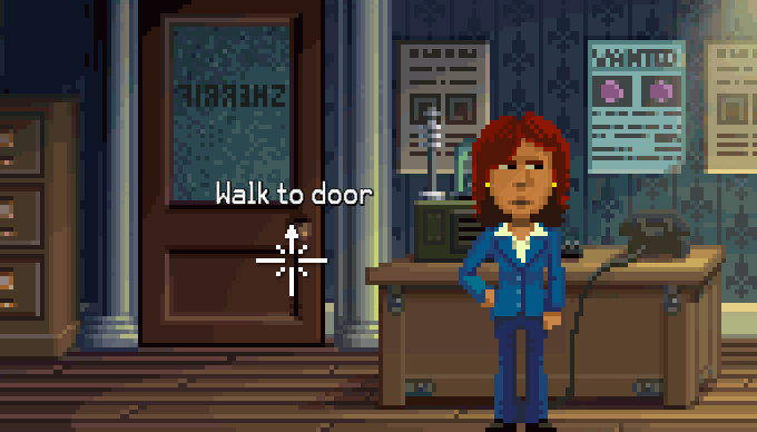
The mirrored word is, actually s(z)eRRiF, with two R's and just one F.

Another Thimbleweed Park Mistery that will take away the sleep of fans?

Please, Mr. Gilbert, make an option to write "sheriff" on the door and to correct all other intentionally mispelled words in the game, I don't want to feel guilty for some people :-)

Tobias R - Aug 26, 2016 at 03:00
As mentioned above, the “S” is mirrored. Actually, its shape should look rounder; the way it is, it really looks like a (mirrored) “Z”.

By the way, it is wrongly spelled “Sherrif”. The last time I saw this spelling was in a medieval age TV series…

Team, was this on purpose, or is it a mistake?

Arto - Aug 26, 2016 at 18:29
It's not a mistake.
Sheriff is ALWAYS at his office. You need to get some documents from his archives, but sheriff is reluctant to give you those. Even though you are an FBI agent. What to do? You know his pride and joy is the lettering "SHERIFF" on his door.
You need to get paint removal to get those letters removed.
Once you remove the letters, the sheriff phones to letter painter. (make sure you remember the tone he dials)
Figure out what was the number sheriff called to.
Call to letter maker.
Convince him you are sheriff's assistant, and sheriff is adamant the wording should be "Sherrif", and the S should be reflected Z.
Once painter has completed his word, watch the cutscene, where sheriff goes berserk. He goes to hunt down the painter.
Enter sheriff's office and browse his archives to find what you are after.

Matej - Aug 25, 2016 at 15:11
This is a really nice change. It is great to see that you keep innovating and improving the game. Just because it has a look and feel of something from 1987, it doesn't mean that we couldn't imagine someone making such a change at that time. Loom is case in point. Keeping the choice for those who don't like it also makes a perfect sense.

SigKill - Aug 25, 2016 at 16:15
Have you figured out how the UI are going to work on touch screens?

Loftcraft - Aug 25, 2016 at 16:19
I'm a Graphics Designer (in Europe) and am very sensitive about "visual style". There is one real problem with the UI: The text over the cursor and the dialog text has a higher resolution than the rest. It looks extremely inconsistent and (for someone sensitive) quite ugly.

I know that there is a classic mode :)

Ron Gilbert - Aug 25, 2016 at 16:33
Text is at higher resolutions to make it easier to read. If it was the same resolution as the screen, it would be huge or very chunky.  I opted to favor usability and readability. The text on the cursor is currently antialiased, but that will be hand removed for the final game to make it crisper.

Nor Treblig - Aug 25, 2016 at 17:05
That's awesome to hear/read! That anti-aliasing was the only thing I didn't like about the UI/font changes so far (I'm a little bit picky with something like that in general).

Also I'm feeling a little bit sorry for that particular hand...

Loftcraft - Aug 26, 2016 at 02:37
Great! Without AA the text will fit a lot better!

Gffp - Aug 26, 2016 at 04:58
That will be a nice nice touch.

Tom - Aug 25, 2016 at 16:48
The level of detail the developers are putting into this game is amazing. Watch out No Man's Sky. You are about to have some competition. :)

Paulup - Aug 25, 2016 at 19:43
As soon as I read "removing the sentence line" I immediately envisioned the comments section engulfed in flames, angry/confused lamentations ringing out across the lands, etc. etc.
But it looks like everyone has taken it pretty well...
I think this works either way, sentence line or on-cursor both seem fine to me.

Jammet - Aug 25, 2016 at 22:17
I love the concept. A minor nitpick would be that I don't really think the crosshairs need extra crosshairs as soon as they hover over one of the hotspots. Dunno, it feels too busy that way.  But what I *do* miss is the cursor slowly pulsating in brightness. That was wonderful.

Giskarrrd - Aug 26, 2016 at 00:16
I agree on the "extra" crosshair, that's the only thing that irks me about this otherwise pretty awesome change :)

Someone - Aug 26, 2016 at 07:46
I agree too: I don't like the extra crosshair. The text above the the cursor makes it already clear that there is an object under it. :)

Ema - Aug 26, 2016 at 12:13
Me too.
But it's minimal. So no matter.

What matters is that I can't get used to the floating sentence line. it distracts me.... I'm sure I will get used to it and I'ill prefer this than the classic mode (since I'd like to have the new font), but.... It'll be awkward at first.

Sorry, team.

entropy - Aug 27, 2016 at 03:33
I don't like the look of the diagonal crosshair either.
However, the idea to have the crosshair change on an object is nice imho.
What about just having a non-broken crosshair on an object,
e.g. the four lines snapping together forming a 'real' cross: + ?

P.S. Showing the text is a great thing.
P.P.S I'm so looking forward to that game!

Zombocast - Aug 25, 2016 at 23:56
Yes, We're one step closer to getting the Full Throttle GUI!
http://bit.ly/2c0t4pM

Zombocast - Aug 26, 2016 at 00:33
Gary, we need 2 special case inventory icons made immediately!
Boobs icon, for the guys!
Butt icon, for the ladies!
We can hover-over them and watch them jiggle!

Zak Phoenix McKracken - Aug 26, 2016 at 03:00
That's would be too much! The verb interface must stay!

LogicDeLuxe - Aug 27, 2016 at 03:56
That's odd. They seem to have ditched the idea of object names at the cursor completely in The Dig afterwards. And in Curse of Monkey Island, the sentence line was back at the bottom, despite having a very similar pie menu as in Full Throttle.

Gv - Aug 28, 2016 at 15:29
The UI is something I never cared too much, I prefer the Loom UI by the way :)

Mario F. - Aug 26, 2016 at 01:58
@Gary: the FBI Badge could be 1 pixel more wider to the left to fill out the complete placeholder for the item. i hate asymmetry. ;) Keep in mind when polishing all the items.

Zak Phoenix McKracken - Aug 26, 2016 at 03:02
I believe that Ron will put an option called "Random Badge ID every 4 seconds in the inventory item", to please everyone!

Joe - Aug 26, 2016 at 02:57
It's great to have BOTH options (classic and modern), because I'm not so happy with all that text flying around. Looks a bit distracting. It's still a smart addition, though.

Marcel Taeumel - Aug 26, 2016 at 03:18
Hmm... those fonts for the sentence or the talking are still not pixelated enough. Too hi-res for that style. Is this going to be changed?

Marcel Taeumel - Aug 26, 2016 at 03:22
And now that we have the sentence directly near the object it is only a small step further to also let the user choose those verbs at the same spot. Well, we would have to reduce the verbs to not clutter the UI. ... :-O ... ;-) ... Just kidding. It's a good trade-off. Keep it.

Zarbulonian - Aug 26, 2016 at 04:45
@Ron, couldn't you now get rid of the small diagonal lines added to the cursor on hotspots?

They are redundant in modern mode, and detract from the classic feel in classic mode...

Tim Lammert - Aug 26, 2016 at 06:08
To remove the line is OK in my opinion. Exactly as leaving it as it was. It was like this to play the old ones. Maybe having an extra Option only for that would realy be good for a lot of pLayers. To be able to play with the modern comfort but with the old sentence line in classic style. Of cousre, as said by Bogdan before, too much options are not good. Maybe you should invent a hidden hidden options menu :)

Or it is like the testers found out. playing it feels right. Not easy to say, just seeing a video.

But I have to write this too: The Cursor really feels like to much. Lines everywhere and additionaly an arrow showing the direction you will pass through a door. I guess i know it without that too.
Yust a collor change for highliting objects or something else that is more discret. Reminds me a little (liiiittle) bit to an egoshooter but just looks like to much.

Mario F. - Aug 26, 2016 at 18:19
I think same way. The diagonal lines of the cursor hint to much to what object can be interact with. Old games used to have items/objects without any function.

Guga - Aug 26, 2016 at 06:23
I like it, except for the "walk to" part, but anyway that's just a minor annoyance.

However, am I the only one who wants to play the game for the feel, not the look? I mean, of course we all want a bit of nostalgia (that's what brought us here, isn't it?) but if I wanted a 100% old-school game I'd play Maniac Mansion again. I'm here for the puzzles and the humor, I really don't care if the UI gets improvements or if the resolution isn't actually 320x200.

Zak Phoenix McKracken - Aug 26, 2016 at 09:10
Well, a few points should not be changed: for example the humor, the funny and clever puzzles, the cutscenes, the unability to die.
They all were part of a magnificient adventure game.
Then, the graphic part could change, to fit our time.
But since the best adventure game ever were created with the verb and inventory items always on screen, in big pixels, with the sentence line above the verb, I feel happier if I see all of them, because it reminds me those times.
But improvements are always welcome.
As I wrote before, I probably will play 10 minutes with the new interface, then switch to the classic one, to return the the new, and play the game as they creators intended to be played.

Big Red Button - Aug 26, 2016 at 10:53
You put it in a nutshell.
Though, I don't really know yet, which way of playing the game I will prefer. I'll try all of the options first. I'll even try the game with a control pad, even though I'm much more familiar with the mouse. I assume that there will be days when I prefer the more classic appearance with a 4:3 aspect ratio and other days when I prefer the modern options and Full HD in order to enjoy contemporary conveniences.

Ron Gilbert - Aug 26, 2016 at 13:42
The game will not be playable in a 4:3 aspect ratio. There would be too much art to change. Even in retro mode, it will be in 16:9.

Big Red Button - Aug 26, 2016 at 15:27
Well, that's a pity, but I'm okay with this fact. Though, seeing your comment from the Podcast #52 blog entry, this decision has been made recently, hasn't it?
I completely agree that it would take a great deal of effort to make it work according to desire, especially in terms of the GUI, which has been optimized for 16:9 ab initio. Moreover, 4:3 is actually as dead as VGA. I'm now just looking forward to enjoying the game in 16:9.

Derrick Reisdorf - Aug 26, 2016 at 15:04
Thanks for the .gif, Ron.  But, I was wondering how it was handled, specifically, when the cursor is at the TOP of the screen.  Is the sentence pushed ontop of the cursor?

Ron Gilbert - Aug 26, 2016 at 15:06
Not sure yet.  Currently is drops to below the cursor, but I'm finding that irritating, so I might slide to the right.  Still playing. Nothing is final until we ship... and even then... DAY ONE PATCH!

Gffp - Aug 27, 2016 at 13:25
I say my two cents, probably the usual odd thing, who knows... Anyway: you consider the screen like a Cartesian space divided by the axes. In the first quadrant (top right) the text is down left and so on (basically the opposite). More important the text is always floating around the cursor, since at the center (0, 0) the text is on top of the cursor, but it slowly slides to the down left in the top right quadrant, to the up left in down right quadrant, to the up right in the down left quadrant, to the down right in the up left quadrant. But I completely ignore how much effort it takes to implement this movement, even if it was good...

Gffp - Aug 27, 2016 at 14:37
Click on my name to show a gif of what I mean...

Gffp - Aug 27, 2016 at 20:34
Note that in the gif I made a correction based on what Ron said (text sliding to the right instead of down when the cursor approximates to the top edge, with the exception of top right corner where the rule of the opposite is still valid).

How much I loved old point'n click adventures to be here wondering how a text on a cursor should be? I surprise even myself.

Arto - Aug 26, 2016 at 18:55
This is not really related to this... or maybe it is, I don't know...
Today I have, by chance, been listening several hours of 80's music via my JBL GO, and I just realized I like the music of this era better when it's played through the small mono speaker than through my big hi-fi surround speakers.
I was just thinking... will I find the same analogy while playing Thimbleweed Park? Will I go with don't-follow-cursor-lines-pixel-purist-give-me-all-the-basics-option, or will I go with all the hitech-stuff there is? I'm listening my small mono speaker and I think (although new UI change looks good) that I might go with the stuff that's closest to what we had 25-30 years ago. But it's great we have options.
If only we had an option to switch sound to 80s mode...

Big Red Button - Aug 27, 2016 at 09:10
I would prefer the best sound option the game provides, because I like acoustic details. But, this doesn't mean that I would have been disappointed, if the game supported only MIDI. I even like PC speaker sound, too, but if there are better options within a game, I just don't want to miss any detail.

Okona - Aug 28, 2016 at 08:53
SID chiptune music and modern digitized speech would still make a good nostalgic sound mode.

Chris - Aug 27, 2016 at 14:06
Sorry if this has been answered before, but the thought came to me while watching this video.  Will Thimbleweed have keyboard shortcuts like the old Lucas games such as T to talk and S to push?

Someone - Aug 27, 2016 at 17:56
Yes.

Nor Treblig - Aug 27, 2016 at 21:32
NOoooOO! It's E for Push and X for Talk to! EOD.

Big Red Button - Aug 28, 2016 at 19:17
What do you need those keyboard shortcuts for? You can move the mouse cursor so fast!

Steven - Aug 27, 2016 at 17:44
Glad and happy that games like this made it through Kickstarter.
Btw. there is a another little Retro Point & Click Adventure on Kickstarter atm: http://goo.gl/Wr42CA
A little more pixels than thimbleweedpark, but looks quite funny I think.

Big Red Button - Aug 27, 2016 at 19:16
Some people have criticized the brightness of the more modern verbs. I recognized that the default verb gets darker once the cursor is on an item. What do you think about inverting this, so that the default verb is brighter (and therefore more eye-catching) than the other verbs, similar to SCUMM? At the same time, you would reduce the general brightness of the verbs?

Arto - Aug 27, 2016 at 19:43
I would like this. My suggestion, when new UI was presented, was similar:
https://dl.dropboxusercontent.com/s/9p6guz6yigm5v01/Thimbleweed_Park_new_ui_1.png

Mattias Cedervall - Aug 31, 2016 at 18:56
Hyvä.

Gins - Aug 28, 2016 at 04:17
I'm not really a fan of this change, because (to me) the sentence line seems to be harder to read now.
It has a smaller font, and when it overlaps with art, there doesn't seem to be enough contrast to quickly process the text. I noticed this especially for the inventory.

But I can't complain, since you're leaving in the good old classic UI, of which I also prefer the plain blue font anyway! Thanks Ron :D
I hope most other people enjoy the new UI though, I can definitely see your reasoning behind this.

mr. T - Aug 28, 2016 at 14:05
I think this is a nice improvement and I predict the younger generation will prefer it. I'll probably use the classic mode for nostalgic reasons and strain my eyes just a bit more but that's okay :)

Martin Wendt - Aug 29, 2016 at 04:25
Hi Ron & Team,
it is great that you keep the fall-back-option for all non-80s-features but in the end it is your decision.
I for one (despite living in the past, gaming-wise) can totally live with it when you say:
THIS is how I/we made this game. Different sizes for pixels. Light effects. Pixelsize scaling with actors. Rotation of pixel-gfx in 'subpixel' space. Sentence-line at pointer.
In fact I would even prefer to play it the way that you intend/prefer, no matter what my personal taste on few things might be.
It's not an adventure-game-kit, it's an adventure game ;-)

° - Aug 29, 2016 at 19:10
It looks distracting, jumpy and destroys the silence of a scene but as long as you can turn it off.

Albert - Aug 30, 2016 at 18:22
Great change! Finally my ball-eyes will get a break :P

A. - Aug 31, 2016 at 18:10
I guess the testers are on this but in the hope this doesn't cover up the awesome graphics experience too much ;-)

Bill Jackson III - Sep 03, 2016 at 16:06
Love seeing this! My first thought after watching the video was "Might it be possible to  hack the same behavior into classic Point+Click games?" :P (Obviously not, but still a fun thought experiment...)

Nor Treblig - Sep 04, 2016 at 06:54
With ScummVM you have complete control over the code. I don't see a reasons not being able to mod it to show the sentence line with the cursor.

frisby - Sep 13, 2016 at 13:50
Don't really like this either, seems really noisy.    Hope we can get an itemized set of options for the UI instead of just classic or all-in, since some of this stuff seems better than others.    You need some hardcore grumpy adventure gamers on your testing team!