Wireframing the Game
Mar 23, 2015
Ron and I are now in the throes of what we call "wireframing the game", which really is just another word for prototyping a playable walkthrough.
This is a first pass at putting in preliminary art for all the rooms and their associated puzzles, then connecting everything so we can walk through all the contiguous locations to get an idea of what the game's really going to feel like. How long it takes to walk from one location to another and does the game give the player the right mental map of the world?
This is something we want to do fairly quickly. In the old days, with Maniac Mansion, we actually created a version on paper to give us a rudimentary feel of how everything was connected, but now we have the tools to do it all digitally.
We've always called these "wireframe rooms" because they just need to be laid out in flat color and composed with their most prominent necessary features in place. All the rendering detail, as well as a lot of additional window dressing (plants, non-essential objects, patterns, dither, and the like) will be added as we move into more final versions. I think we also call these 'wireframes' because at this point they can now actually be "wired-up" into the game engine.
Fast quick versions are good because we might not like how they feel once in the game, and we don't want a lot of time invested. We need to be able to throw out a room and the art with no investment. We don't want to keep a room that is wrong just because we've spent time on it.
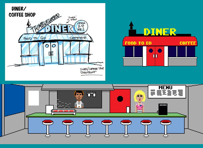
Here's a little progression on the Diner exterior and interior, doing a bit of a take on the classic 1950's diner. At this stage I stay with a number of basic geometric shapes: circles, rectangles, triangles, etc. As things evolve, we look at different positions for the camera, scales, and layouts, but right now I like to keep things pretty basic

When we first started working through the design back in January, I spent about a month sketching some of the more well defined game locations out on paper. Once I had a rough image I went ahead and blocked it out, trying to retain the flavor of the associated graphical approach we developed for Maniac Mansion and the rest of those first Lucasfilm games.
In those days, given the C64 character set constraints, I'd literally just block everything out with rectangles of different basic colors, a solid brown rectangle for a wall with smaller blue rectangles for windows and doors, like I was cutting it out of colored paper, then start layering details on that, window and door frames, bricks, etc. The most repetitive details at first, followed by a few unique ones to iconically reinforce location and function.
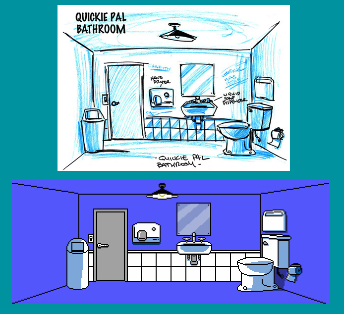
Here's what the bathroom looks like, taking the concept to a first blocked-in pass:

Once the design process for Thimbleweed Park got underway and brainstorming began in earnest (and David Fox became involved), it really geared up the list and functionality of the 'rooms/locations'.
As we quickly added more rooms, I stopped roughing out all but the most complex room layouts on paper and went entirely digital, cranking these out directly in Photoshop. At this point these are mostly out of my head, although I'm referring to the internet via google image search for some of the more specific and iconic details.
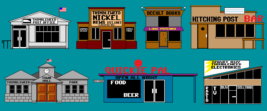
At the wireframe stage it's really like looking at iconic game tokens.......Monopoly anyone?

Rooms will ultimately come in a variety of sizes, scales and potential camera angles (most likely for larger, more impressive expansive areas such as the factory and hotel lobby, etc.) .
As we get deeper into figuring all this out, I start by working my way through some of the more obvious and straight-forward locations so we can both get a feel for how things will actually work and feel in the game.
Once I'm done with the room's wireframe, I give the art to Ron and he wires it up in the game. We might have some videos of a game walk-though in the near future.
- Gary

I still feel like Zak & Co. need to be in this world somehow. At least the two Martian Girls. Occult Books seems to be good place for em? No?
Mecking-up locations really gives you a sense of the word around you. :)
Will eagerly wait for that walk-though!
The neon DINER sign brought back some memories. Thinking of the Hair Salon in Zak. Hmm.. you could have the letters N and R flickering.
I'm finally playing Zak (for the first time), so don't be surprised if I make more Zak references...
Ron, that video with your sultry-radio voice narration was awesome! You did a terrific job explaining the features in a natural, intuitive manner. Really looking forward (as most probably are!) to future videos documenting the development!
Any chance you might share little video snippets demonstrating nifty scripted workflows, thought process when solving some particular coding problem, or explanation/rundowns of raw code?( like how a co-ordinate system, sprite animation or event system might work?) For the swarms of us new to programming/game development (and those experienced), seeing a true master at work in his craft would be a real, inspiring, treat!
Also, Gary's obviously pretty busy, but would he possibly be willing to do a screen-cast of his work-process while producing assets?
Again, I'm sure I speak for many... we would LOVE to see the raw game development in process in video form with full talkies! Blog posts are super awesome nonetheless, though there's a different, more authentic depiction of what's going on when the process is done in video/audio format!
/2 cents
PS. Could you poach 2 Player Productions from DF? :P
A regular podcast would draw many new folks in and keep supporters excited and feeling more intimately connected with the project! It also might serve as a means for your own ideas to cross-polinate and develop further!
I have always wanted to do a podcast, but more with me talking to other indie developers. I was going to try and start that, but got side tracked on this Kickstarter.
It's also amazing how much time all that stuff takes. We're a team of two (soon to be three) and we spend all of our time making the game. But, we'll try and do some stuff.
I'm pretty sure the way you're doing it is exactly the way all these "crowd funded" project sites wish the projects would go.
Its really a cool thing to see, and I'm glad I signed on as a supporter.... I don't see myself supporting many projects since I'm poor (I'll be in for Super Troopers 2, but that's about it)
You guys are going above and beyond, and I get the feeling when all is said and done, your campaign will be one that many others aspire to be like.
(What I meant by a round-table general dev talk podcast, was more along the lines of a 10-15 min phone/skype call, retrospective take on the past week. Just a casual convo, maybe answering comments/questions, touching on blog posts, nifty tidbits that come to mind...just whatever really... As you said though, these sorts of things take time, and with the written blog... that's a bit of an undertaking for sure...)
PS. (If you're ever looking for volunteers to assist with any audio/video production/editing... :) )
OK, that's kind of an interesting idea. Maybe a micro-podcast of sorts.