Exploring Delores III
Jun 18, 2015
Recapping the visual design process for the Delores character, we started off by defining the character as a text description. Once we had a reasonable criteria for who she needed to be, we proceeded to gather a broad range of visual reference to provide a good framework for a character's basic look, appropriate wardrobe, hairstyle, props etc. The next step, at least for me is to proceed with color sketches.
This is when you need to take all the information you've gathered and boil it down to a reasonable number of visual choices. Personally, I like to present somewhere in the neighborhood of 6-10 character concept sketches to a development team. Many more than that tends become confusing, these should be all in the same general scale, orientation and render style so people can look at them and easily mix and match their most prominent features: "I like the hair from that one and the jacket from this".
Additionally, in the case of this style of character development (I.E. for simpler game graphics or Saturday morning cartoons), for the sake of economy they lend themselves to components primarily rendered of solid colors. This allows for easier adaptation from design to an actual animated sprite. Some asymmetry Is acceptable, but we try to keep that minimal, as every detail you add, increases time needed to render the final character when you're potentially animating hundreds or even thousands of frames. That's why Saturday morning cartoons simplify things like comic book characters, unless you happen to be Disney, there's usually not enough time or budget.
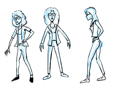
I'll start this stage by printing out all the reference materials and arranging the pages out around the edges of my drawing table and pinned up on the walls, etc. so I can easily see everything at a glance. Then start roughing out individual standing figures in blue pencil. I began using non-photo blue pencils a long time ago (I personally like Staedtler brand) as a holdover from working in comics, but mainly because they don't reproduce on a copy machine, so if I make any photocopies the only thing that copies is my black ink lines.

Once I've sketched out my rough drawing typically on regular 8.5 x 11" white copy bond, I'll ink line it with a black flair pen. I usually don't get that exactly to my liking the first time, but once I have a somewhat usable first version I'll put it on my light table and retrace until I'm happy with the drawing. I'll then scan and open it photoshop to color.
In the good old days at Lucasfilm, I'd just make a stack of copies of the lineart and color different variations with ad markers (those were expensive sets of alcohol based colored felt markers. We used to go through those markers by the dozens at a price of about $3/per pen, but Star Wars could pay for a hell of a lot of pens).

Once I have the colored rendered versions of a character properly arranged on a page, we'll sit down with the team to review and hopefully choose one or two candidates to take to the last step in this process: namely rendering final versions of the character appropriately as pixel art for the game.
In this case our team's pretty small and has worked together enough so it doesn't need to be sent off to marketing department or upper management, Ron and I will figure that out on our own. So remember who you have to blame for any of our design decisions....

:)
But my favorites are 4, 6 and 8. Closely followed by 3, 9 and 7.
I just feel that 4, 6 and 8 are more graceful and have more intelligence than any of the other. But 3, 9 and 7 also have style, and also some grace and intelligence (but not the same level).
The rest I didnt mention (1, 2 and 5) are too geeky for my taste. Maybe it is the bow-tie-thingee in their hair, of 2 and 5 that make them look immature, or the "old woman" feel of number 1.
Because as number 8 is portrayed now I keep thinking of Garth from Waynes World. That is an insecure guy and not an intelligent girl, as Delores is supposed to be.
So you know what that means! WAYNES WORLD! WAYNES WORLD! PARTY TIME! EXCELLENT! VIEVVIEV!!1
But all seriousness (if you can say that in english): The design is great. But I think they should change the hair color on her. Dark or redhead. But keep the long hair, if you ask me.
I love the sketches Gary, specially number 3, she looks like a modern independient girl.
I think a lot of people will like #3, and I would too in real life, but not for Delores. Both the flashdance outfit and the rockstar hair don't seem to fit the character bio from the original text post. If you change her character up a lot though it could be a good pick.
Is number 8 the model for the pixel art of last post? http://images.thimbleweedpark.com/delores/_delores_36.png
I'm really curious to see which one you choose and you transform it to pixel art.
Any chance to make glasses absurdly big? :) That could really make the point. Also I imagined Delores smaller, like a little woman with a LOT of character :D (http://thumb7.shutterstock.com/display_pic_with_logo/86135/86135,1301307872,15/stock-photo-happy-and-smart-young-blond-woman-with-funny-glasses-and-plait-looks-like-nerdy-girl-smiling-and-74085538.jpg)
-dZ.
I like 9, 3 and 8