PAX East 2016 Report

by Ron Gilbert
Apr 23, 2016

We just finished the first day of PAX East and I thought I'd give a quick update.

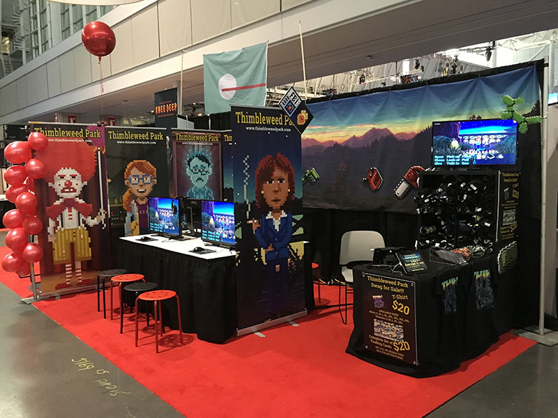
Here is our Thimbleweed Park booth just before the gates were opened:

And here is a few hours later:

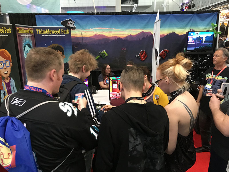
We had four stations to play Thimbleweed Park and they were full all day long, with a line several deep always waiting to play. The thing that excited me the most was - with the exception of a couple of people - everyone played through the entire 20 minute demo. That is always a good sign. You know you're in trouble when they leave part-way through.

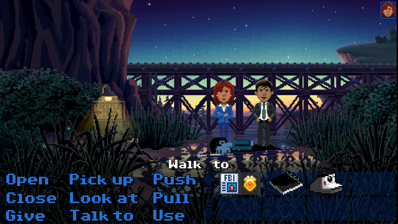
As I mention in the podcast, we've done some work on the UI.  The big change is that we're taking all the rooms fullscreen, then floating the UI over the top. We also switch to a new pixel based font.

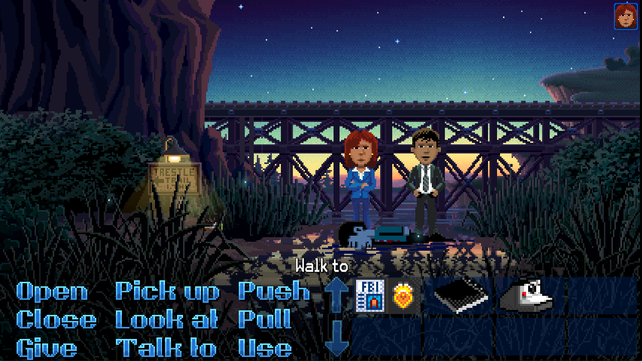
You can always switch back to the classic C64 font if you want.

The black bar under the ui was a holdover from the SCUMM days. Back then we didn't have the memory to do full screen room, nor the ability to overlay the UI. It took me a long time to realize that none of this was a constraint anymore and needed to go.

The other advantage is that during cut-scenes, you no longer have the ugly black area at the bottom of the screen. You now get fullscreen goodness.

I write more about this when I get back... Off to another grueling day on the show floor.

- Ron


Giulio - Apr 23, 2016 at 08:34
Uhm.. Won't some of the amazing art get covered by verbs and inventory items this way (except from cutscenes)?
Anyway I do believe it makes it more immersive so I guess it's just matter of getting used to it.
Coming to the font: the old one looks so much better IMO, but maybe it's just because it brings back memories. Glad we will have the option to choose what we prefer :)

Geoffrey Paulsen - Apr 23, 2016 at 08:57
I'm hopeful there will be a key to "hide the commands", so that if you want to take a screenshot or just look at it all or something you can do that momentarily.

Rodrifra - Apr 23, 2016 at 09:19
Agree. When I first knew Ron Gilbert was making a new adventure game I went all the way down and bought it in Humble Bundle's web page (kickstarter was already finished). Then I read a bit more and found the game was going to have old graphics style :/ (I started to be scared) I've been my whole life pursuing better graphics, my C64 graphics were WAYYYY better than those of the spectrum and sound couldn't be compared, C64 was like having an orchestra in your home while spectrum's were disgusting sounds. So when VGA came by I was amazed, when Monkey Island was ported to 256 colors, WOW that was heaven, then years passed and the remastered versions brought the game alive again. I love both of them (MI1 and MI2), graphics were impressive (except for Guybrush, what a way to destroy a character) and I liked the UI better than the original, I don't want nothing in my view messing with the full screen image, I want to be able to bring into screen my inventory when I need it, but then hide it again when I'm done, because I want to enjoy full graphics full screen. The best part of the remastered versions is that those that wanted to play the game with the old graphics could do that, and those of us that want to enjoy high res images without the UI messing around could enjoy that too. I think being able to hide th UI in TWP would be a great plus, those wanting to play the game in full graphic mode would be able to do it and those wanting to have the UI in the bottom of the screen could enjoy that too. I'm sure implementing that is not very time consuming. On the contrary I think it would take little time and be a plus for the game. Pity my comment is too large an RG will scan over it and ignore it. Anyway, game will be great even with the UI messing around, I'm sure of that.

Iron Curtain - Apr 23, 2016 at 09:41
You have nothing to worry about; Ron Gilbert reads EVERY comment.

Mattias Cedervall - Apr 23, 2016 at 15:46
Due to OCD? :P

uses Crt; - Apr 23, 2016 at 14:45
The MI1 Special Edition UI was really bad in my opinion. I had to switch back to classic mode for the grog mug puzzle.

Nor Treblig - Apr 23, 2016 at 15:08
Why was that? I remember they even added a special case here by showing the mug on the screen so you can see its melting state (since the new UI doesn't show the inventory on-screen all the time).

JordyT - Apr 26, 2016 at 03:41
Where's the Humble Bundle link? I backed it from pledge manager https://terribletoybox.pledgemanager.com/projects/thimbleweed-park/summary/

Rodrifra - Apr 30, 2016 at 16:28
I think that has changed. If I am not mistaken, when you accessed the "support us" page before (not much time after the end of the kickstarter), you were redirected to a payment through the humble store. That was the method I used and I don't know if it is still active.

longuist - Apr 23, 2016 at 10:31
I think Ron forced Mark and Octavi to add an extra margin of artwork at the place where the UI is. You can compare it to old screenshots, like here:

https://www.rockpapershotgun.com/images/16/mar/thimbleweedpark1.jpg

You can see, nothing was cut, instead stuff was added. I suppose the extra art is more in the likes of simple and unimportant foreground stuff, so its not a big thing if its partly occluded.
And chapeau to the extra lighting in the scenery.

I must say, i like it very much. Its still the same setup, but more modern.

In contrast, as many others, i dislike the new verb style. (Can't say the same to the text font, as i have to see a little more of it in a dialogue or so to form an opinion)
I am very happy that i can switch back to old school !
Beside my nostalgic view to the matter, it is ok to change the default verb style, it is never bad to have a unique look. And it is not that bad. You may consider to give it an overhaul though. You still have time for some fine tuning.

longuist - Apr 23, 2016 at 11:03
Forget what i said to the verbs. It needs some time, but then it looks good.
But still, I will switch to C64 classic style (both font and verbs), because I'm a inveterate whippersnapper (with gray hair).

Ron, could you please, when you have some time (after PAX), post an image with dialogue options and actual dialogue inside the main view with the new font?

Until then, i will refrain from dispraise :)

dada - Apr 25, 2016 at 17:37
I'm also all for being able to hide the ui and maybe being able to scroll through the verbs somehow and maybe being able to show the inventory independently

Charles - Apr 23, 2016 at 08:35
Woah! I don't mean to be rude, and have never voiced a complaint before, but that new font hurts my eyes!

That one pixel outline on it just makes it wayyy harder to read and unnecessarily bolder.

Actually I'm kinda hoping this and the box change are all just one big late April fools joke...

Fin C - Apr 23, 2016 at 08:39
I like the outlined font, and it will make more sense when you see it full size on screen. Also in the example above you're seeing it against one particular background, but the font needs to stand out against every background in the game. And regardless of all that, you can switch it back to plain if you don't like it.

Also, Ron famously doesn't do April Fools because it's stupid.

Charles - Apr 23, 2016 at 08:49
"it will make more sense when you see it full size on screen"

Yea just zoomed it to full screen on my phone (as this is the platform of choice I will be playing on in the future) and on this handheld size that font is quite a jumbled mess...

Ludo - Apr 23, 2016 at 08:50
I'm with you. I do prefer the old font. It's not a big deal :-)

Geoffrey Paulsen - Apr 23, 2016 at 08:59
Same.  I prefer the mono-color font with black border.

McP - Apr 24, 2016 at 15:09
I like the old font too, because I'm of the opinion that the verbs shouldn't really catch your eye.  That said, if old school is optional, I'm golden.

Derrick Reisdorf - Apr 23, 2016 at 11:27
Yeah, I'm not digging the new don't either.

Derrick Reisdorf - Apr 24, 2016 at 18:26
font

I'm not saying the old pixelated one should persist.  Just choose a different font other than this new one.

Lukas - Apr 24, 2016 at 04:00
That was my first reaction, too, but after staring at it for a while, I think that might just be because I'm so used to the more conservative old style. People who see this for the first time might prefer the new font. I think it also stands out better against different backgrounds, because outline and font color have high contrast regardless of what the color behind the type is.

Bogdan Barbu - Apr 26, 2016 at 05:22
Some changes take a bit to sink in for a lot of people but they usually make sense after a while. Some folks were really upset that they weren't going to use the original wireframe icons but those would look horrible in the current game. I think it's mostly the same with the font.

Bogdan Barbu - Apr 26, 2016 at 05:19
I like the outline for a different reason. It kind of makes it look more ghostly/alieny (?) which I think fits the whole Twin Peaks / X-Files theme. I'm not sure if that association makes sense to anyone else.

Mattias Cedervall - Apr 28, 2016 at 21:08
That association makes sense to me.

Rado - Apr 23, 2016 at 08:36
Full-screen room is nice, but what if there is a hot spot in the bottom 1/4? Were all rooms designed to avoid it from the beginning? Thanks.

Fin C - Apr 23, 2016 at 08:40
There will only ever be an extension of the background under the UI. They wouldn't put a hotspot underneath it.

Ema - Apr 23, 2016 at 17:46
"There will only ever be an extension of the background under the UI. They wouldn't put a hotspot underneath it"[unreferenced]

JordyT - Apr 26, 2016 at 03:38
It doesn't need one, it's common sense, look at the full image again.

Ema - Apr 26, 2016 at 18:11
Still unreferenced, though.

Mister T - Apr 26, 2016 at 06:21
They built the whole gameplay with the big black box in the lower third. I am sure they would have noticed by now if they placed a hotspot in the inaccessible area.

Milo Casagrande - Apr 23, 2016 at 08:37
That looks gorgeous!
Not really into the pixel based font, but it looks neat as well.

Keep up the awesome work you guys are doing! Really looking forward to playing it!

pmarin - Apr 23, 2016 at 08:42
he C64 font is much better in my opinion, not sure if it is  the typeface or It is just the plain color.
Non the less the game looks awesome this way. Good job!

Nor Treblig - Apr 23, 2016 at 08:49
I prefer the C64 font in this comparison too. But maybe it's a problem with rendering, the new one looks too blurry.

Mario Faroß - Apr 23, 2016 at 08:50
oh yeah. it's a big improvement to leave the black bar out and overlay that. somehow i feel myself more sucked into the game this way.

Ron Gilbert - Apr 23, 2016 at 08:52
The font is crisp. That's your browser scaling the image.

Nor Treblig - Apr 23, 2016 at 09:17
The verbs look great!
It's just the dialog text ("Walk to") that does not look crisp. It's using anti-aliasing which makes it look blurry imho. Would it be possible to render this font in without anti-aliasing?

Big Red Button - Apr 23, 2016 at 14:25
I'm sure that if you use the retro mode in the final game that text will be as pixelated as the rest of the screen. That's the purpose of the retro mode.

Nor Treblig - Apr 23, 2016 at 15:00
You cannot use this font and pixelate it, it won't look any good, you have to leave it as it is (maybe retro mode uses C64 font by default).

Big Red Button - Apr 23, 2016 at 17:59
That's true, I assume that the retro mode will use the C64 font - probably with black outlines by a width of 1 px (as it was done in Monkey Island 1 & 2) instead of that slight shadow effect that is shown above. Anyway, Ron knows what he does.
Especially, I hope that the new design of the verbs is going to be available in the retro mode as well. I've always disliked the oversize C64 verbs.

Geoffrey Paulsen - Apr 23, 2016 at 09:00
So, does this mean that you need to go back to all of the backdrops and "add art" to the bottom?  Wow.  that sounds like a lot of work.

Man who jumps on dirt - Apr 23, 2016 at 09:01
I will always love things to be as retro as possible. But the game should also be easy to play. Fx I love Maniac Mansion in its most original C64 form. But it always frustrates me, playing it in an emulator, that I cant use keyboard shortcuts and such (or can I?). Like pressing 'P' to pick up stuff, and such.
The transparent UI.... I dont know, it looks good... but I am too retro-biased to give an honest opinion, because I would love it to look like a UI from the 80s. As in Maniac Mansion..... but then again, the game should also give one an overview over the environment, and be easy to play. Damn you design dilemmas.

Paulup - Apr 23, 2016 at 09:03
I really like the new verbs font... it gives Thimbleweed Park its own UI character, in the same way Monkey Island, Indy, Day of the Tentacle, etc. had different styles for the verbs, while still being pixelated.
I felt the classic C64 font was cool but too generic, so I think this is a lot better.

Though I think the white writing for creating the sentence (showing "walk to" in both screenshots) is better in the old font, I don't think the thin new font for that part is quite as good... so I would keep the new verbs font but with the old sentence font.

Paulup - Apr 25, 2016 at 08:17
Having seen the thin white "walk to" sentence font in action in the Pax footage, and it being used in dialogs, I now think it works really really well, so I'm now for keeping both the new verb font and keeping the new main sentence/dialog font too. Good stuff guys.

Screwtape - Apr 23, 2016 at 09:04
I definitely agree that the verbs could be made prettier than the traditional single-colour C64 font, but that *particular* choice seems a bit.. Smilin' Stan's Previously Owned Vessels, if you know what I mean. Not that that's a bad thing in itself, it just seems a bit over-the-top when the rest of Thimbleweed Park is so subdued and sleepy.

Paulup - Apr 23, 2016 at 10:13
To me it looks "detective-y", like an 80s detective show type of font almost, so for me it fits perfectly... in fact the sentence font is also growing on me now as well, the more I look at it.

Mattias Cedervall - Apr 23, 2016 at 09:04
:-( I dislike the new font! They worked hard on preparing the C64 font for TP and then you change fonts, Ron! :-( Shame on you! At least let us choose font in the options!

Mattias Cedervall - Apr 23, 2016 at 09:10
Sorry, Ron, I read your text but the new font angered me so I forgot to stay calm and realize you wrote we can switch to the C64 font. Thank you! We're still friends, right?

Dirk - Apr 24, 2016 at 15:18
Also overlooked this the first time.

I am generally a fan of having config options like that (which obviously is additional work).

If possible, I'd also vote on such an option for the black bars - although I have to say the overlay is a great idea and also looks very good.

Mattias Cedervall - Apr 24, 2016 at 16:02
I totally agree that there should be an option for the black bars!

tcmsurfer - Apr 23, 2016 at 09:09
To me the UI has improved a good bit. It did bother me a bit that part of the screen was covered with the UI permanently. This way it looks a bit more modern but still has the old charm as it used to.

Regarding the font this is up to taste. I like the new one but the old one is OK, too. The only that that bothers me about the C64 font is that in my opinion the text should be brighter.

It would be cool to have a couple of UI choices actually, not just the two. Don't get me wrong, the UI is classic and great, but on a Desktop or even a laptop, I feel like you are telling me I need glasses with the font size you are using. If you already have a big screen, maybe you can come up with a bit more compact UI with smaller font that only covers part of the screen. I don't have an actual idea how this would look like at this time though.

Since you want to release the engine itself, maybe users can produce UI mods? :)

Anyways, great work and have fun! Wish I could be there.

- Andreas (Germany)

Andreas - Apr 23, 2016 at 09:13
I like it!
1.) Did you guys design the new verb-font by hand?
2.) Is the same font used for the dialog text?

Iron Curtain - Apr 23, 2016 at 09:19
I'm not liking the new UI. Then again, I think I have to let it grow on me and then I think I'll change my mind. That'll probably be what'll happen.

Mattias Cedervall - Apr 23, 2016 at 09:19
You should make the arrows more visible (darker) when using the C64 font because I can barely see them even though I have good vision.

Nor Treblig - Apr 23, 2016 at 09:26
I think they are in a disabled state because there aren't more than 8 inventory items.

Mattias Cedervall - Apr 23, 2016 at 09:51
I'm not so sure of that because I can clearly see the arrows with the new font even though the number of items is the same as the C64 font.

Nor Treblig - Apr 23, 2016 at 10:05
This new UI uses different graphics for verbs + arrows. Maybe the new (disabled) arrows are just not so dark anymore or they just haven't made them in disabled state yet.
We will see the result soon enough :-)

For comparison here's a screenshot not so long ago: https://storage.googleapis.com/images.thimbleweedpark.com/factory.png

Mattias Cedervall - Apr 23, 2016 at 10:50
I trust Gary to not let us down. Don't tell him I told you that. :P

Adam - Apr 23, 2016 at 09:32
You guys must be on the home stretch if all the complaints are about the new font! What a good problem to have : ) Awesome work! Have a ball at PAX east and I can't wait to get my hands on Thimbleweed Park down under.

Loftcraft - Apr 23, 2016 at 09:41
<p><b> Desktop Wallpaper?.</b></p>

Hi, would it be possible to release a desktop wallpaper (4K) of the mountain view panorama (as seen in the back wall of the booth)?

Big Red Button - Apr 23, 2016 at 09:58
What a blast! I like the new GUI and the font.
My patience for a revised interface (okay, sometimes it was rather an impatience) has been worth it.
You've never shown us the fullscreen versions, have you?
Has Mark done all the rooms in a fullscreen version from from the beginning?

Though, you should still keep the black GUI background as an option in the game, for everyone who wants it to be 100 % classic.

Nor Treblig - Apr 23, 2016 at 10:11
I'm sure Mark had/has to revisit all of his backgrounds and add a lower area in retrospect. It was probably one of those requests from Ron which made his eves roll :-)
All of the backgrounds shown on his GDC talk were with original height.

Alex - Apr 23, 2016 at 10:04
Hey there,

I have to say I actually like the new font!
It looks like a logical "update" on the classical C64 format yet is obviously still pixelly enough!
I'm sure people will get used to it.

The challenge with the full screen images will be to actually fill this additional graphics area in an interesting way (rather than just with "filler material") even though there won't be any hotspots down there.

Keep up the great work guys!
A.

Big Red Button - Apr 23, 2016 at 15:34
I think, it depends on the respective room. The elevator doesn't need any extension at the bottom, whereas the above scenery is significantly more immersive than the older versions of that crime scene. Moreover, there are rooms that can be extended with a lower detail - maybe with some blurred and shaded items in the foreground (e.g. the Quickie Pal).

Sundance - Apr 23, 2016 at 10:05
Nice. Really. Very nice. Like the UI and full screen rooms.

EdoBvd - Apr 23, 2016 at 10:43
I second that; It's a good idea to have even more huge pixels goodness.

Arto - Apr 23, 2016 at 10:27
I like the new verb font, but I dislike the bright outline. It hurts my eyes. I would rather like to see it more like this:
https://dl.dropboxusercontent.com/s/56qhuqi1uh84yt5/Thimbleweed_Park_new_ui_1.png

Also the "Walk To" seems too out of place as it seems to be way sharper than the rest of the graphics. I would go with the C64 font here.

Have a merry PAX East! Really wish I could be there.

Loftcraft - Apr 23, 2016 at 11:45
Your font style looks a lot better! Please email it to Ron!

Arto - Apr 23, 2016 at 12:00
All these comments go straight to his mail, so... already did :)

Mattias Cedervall - Apr 23, 2016 at 12:02
Hyvin hyvin. Your version looks better.

longuist - Apr 23, 2016 at 12:04
The bright outline makes it more distinct, but you are right, its a little bit too bright. Especially when compared to the inventory.
Maybe a midway between the two?

Paulup - Apr 23, 2016 at 12:26
Nice work, though I prefer the version with the bright outline, I think the bright outline just fits the overall aesthetic better and makes the verbs stand out more...

Big Red Button - Apr 23, 2016 at 15:19
In my opinion, the bright outline is a nice detail. It may appear a bit bright, but that's probably due to the dusky setting. I'm sure it won't hurt your eyes so much when you're in the Diner or in the Quickie Pal.

urielz - Apr 23, 2016 at 10:49
Glad to hear people are enjoying the demo!

+1 for the new UI design (and hopping it can appear/disappear with a keystroke)
-1 to the new font. I'll stick to the old font as well.

Alessander - Apr 23, 2016 at 12:19
I am of the same opinion. I think that
(i) the new font hijacks my attention from the room to the verbs, what may disrupt the immersion;
(ii) the bright corners of new font do not go well with the gloomy theme of the game.

As long as I can use the old fonts, I am ok with the new UI.

Jenny - Apr 23, 2016 at 10:57
I'm trying so hard to score a pax badge today.. I neeeed that shirt

Michael Nicke - Apr 23, 2016 at 11:09
I like the floating UI! It's a beautiful improvement, even with the inventory - it doesn't look like a mess like I would have expected.

Karl - Apr 23, 2016 at 11:15
The floating UI looks great - good idea! But sadly, the new font really doesn't cut it. The old CBM-64 font is a clear winner here! I would indeed think twice before making the new font the default one.

Derrick Reisdorf - Apr 23, 2016 at 11:25
It looks good, but does it feel right?  Does it kind of take the player out of the game when you see a scene but cannot interact with the bottom bit of it?  Why does it always bug people when a screen is not "filled up"?  I go insane when people have there picture on their home tv all stretchy or fisheyed just so that they don't have any black bars on their picture.  Ahhhh!  Insane!

I would feel better if there was still a distinct line that separated the UI from the ineract-able scene.

Derrick Reisdorf - Apr 23, 2016 at 11:29
It bugs me so that I cannot change "there" to "their".

Nor Treblig - Apr 23, 2016 at 11:36
"Pick up white edding"
"Use white edding with monitor"

I know it's a hardcore solution, but it's a distinct line on a distinct monitor :-)

(btw. I agree with aspect ratios, it's sad what often happens e.g. with 4:3 material like movies on TV or similar: it's sometimes stretched, sometimes cropped (also both)..., just horrible, brr)

longuist - Apr 23, 2016 at 11:45
But this doesn't apply here, because the aspect ratio is not touched. Would look like *putswearwordhere* if the art is just stretched to fullscreen.

Derrick Reisdorf - Apr 24, 2016 at 18:23
The backgrounds are now displayed in a different aspect ratio.  But it's not really my argument.  Ron had said they were getting rid of that big ol' black box of a UI...kind of comparing it to how people don't like black bars on their tv sets (when video is displayed in a different aspect ratio than the dimensions of their tv).  But, since the added background art  is going to be mostly hidden by the UI, the interactable background area will essentially be in the same aspect ratio.  I kind of like it better.  My only gripe is that it shows you a little more area, but you know you won't be able to interact with it- This introduces a slight gameplay anomoly which could pull a player out of the game.  I know that the art that's behind the UI won't be aesthetically interesting enough for a player to want to click on any of it, but it might add to that 4th wall.  Again, I'm just bringing up negative aspects just for the sake of arguement, because I do think it looks better. They just need to change the font.

Mister T - Apr 26, 2016 at 06:33
Monkey Island already established the big vistas with the smaller playable area. The game avoids Guybrush hitting his head on the top of the screen as well as it often stops him from reaching the lower part with his feet. So there is little change when it comes to immersiveness, other than that there is a meaningful barrier to keep the characters from banging into the 4th wall instead of just letting them stop.

But it might be a bit different with the vertically scrolling room, as one might which to click hotspots under the UI directly

Zak Phoenix McKracken - Apr 23, 2016 at 11:57
Ahahah that movie... with Kevin Spacey!

Mattias Cedervall - Apr 23, 2016 at 12:00
Yes, I bought it on DVD. I hope you feel better!

Zak Phoenix McKracken - Apr 24, 2016 at 07:20
Yes, I'm good now, thank you! It was just a very bad day, but it has been passed!

Mattias Cedervall - Apr 24, 2016 at 16:00
I'm glad you feel better! Better rhymes with weather. :-)

Zak Phoenix McKracken - Apr 23, 2016 at 11:59
Seen? The game IS and WILL BE a success! I'm very happy to read that there are people in lane waiting for their turn to play, all day long!
Great job!
P.S.: do you still need some testers, to play the game under the eyes of one staff member?

Mattias Cedervall - Apr 23, 2016 at 12:04
I thought the people just stood in line to get to know the secret of Monkey Island and get some massage from Gary.

nibble - Apr 23, 2016 at 12:06
I think it's a bit too bright. It draws too much attention to the verbs.

Redenhalter - Apr 23, 2016 at 12:41
Can we also switch back to the black bar under the ui? Pleeeeeeaaaase!

Chris T. - Apr 23, 2016 at 13:08
Wow! Amazing work guys.  The booth and the game look fantastic.  Can't wait to try it out!

Patrik Spacek - Apr 23, 2016 at 13:14
I always prefer to hide the action bar. But I know you wanna keep classic style, so the second image is my option for this game. The first is disturbing because its too bright and of course, the last one is the best.

advrms - Apr 23, 2016 at 14:43
When did you decide to add the bottom art?   Wouldn't adding the bottom 3rd effect the intended composition of the image?   Which version of the images are canon??  :P
I'm never really a fan of UI overlays, but that's the OCD screenshot collector in me.

Gins - Apr 23, 2016 at 14:44
Love the new UI, the transparency makes it look modern while still retaining the spirit of the classic way.
I'm also happy that we can switch between the two fonts, great decision!

Jesper Hansen - Apr 23, 2016 at 15:00
Wow, going from a black boarder to a transparent background and a new font seems like small changes but what a difference. Like you I never thought of it, but it really makes sense.

At first glance I wanted to just dislike it because it is such a change from what once was, but I can't. I am amazed at how you, with small but important changes, are able to make the game look so much more fresh and moderne, while still retaining the old-school feel (at least as we remember it) ;)

Great work you guys!

Carlo Valenti - Apr 23, 2016 at 15:18
The obvious solution is: font black to background deep black, full screen with the GUI, and the room graphics in one small floating box in the bottom left corner, with the option to disable it. In full CGA 40x30 resolution.
This would save significant resources both in developement, and system requirements. The release time of the game could also be anticipated, maybe even one week.

Diduz - Apr 23, 2016 at 15:29
I'm not sure I like the transparency, I think it makes the image... overcrowded. I'm especially thinking about the brighter locations: this location is pretty dark, but couldn't a brighter location "engulf" the interface?
I see where you're coming from, because it's a little change which could make the game more modern-looking, but I still think the game looked a bit more elegant with the black backdrop behind the interface. You could still make the backdrop optional...
Anyway, maybe I just have to get used to it.

Mattias Cedervall - Apr 23, 2016 at 15:44
I share your concerns.

Nor Treblig - Apr 23, 2016 at 15:59
I do think this is something which we can get used to easily. I also guess the outlines of the verbs are for this exact reason brighter than before to always have them standout from the background.

Arto - Apr 23, 2016 at 16:45
As it is, the (new) verbs already have a black "shadow", so there is no point to make them stand out even more. Also, the verbs (even without the outline) seem to be brighter than any background would be with the dark transparent box.

To my eye the outlined verbs just steal the show. I would like to use the new verb font over the old, but with outline, I would have to go with the old.

Marco Lizza - Apr 23, 2016 at 15:45
To be honest, since the first time I saw this in Maniac Mansion back on the C64, I always found that having the cutscene the black solid bar at the bottom of the screen gave the game itself a "movie vibe" that I liked a lot. It was mych like watching a real movie at the cinema!

Big Red Button - Apr 23, 2016 at 18:48
Nevertheless, the aspect ratio is 16:9, which, in my opinion, is very cinematic, compared to the old 4:3 screens.
Since I'm used to the old SCUMM games, I've always perceived the screens in TP, which is optimized for 16:9 displays, as being a bit too wide due to the black background of the GUI. So, it's even logically consistent to use the full 16:9 screen for the rooms, even if there is a classic verbs interface at the bottom. It's a great idea, even though I also like the classic black bar. Therefore, I hope for an optional black background mode - or even better an adjustable transparency.

Kroesi - Apr 25, 2016 at 18:14
I think I would prefer the black bar, too.
But what I know for sure is, that I will like TP, no matter what it will be like!!!
Keep that great work up, you are awesome!

Ian / Nihil Quest - May 01, 2016 at 18:07
Yup, same thing here. It's a bit of Pavlov's dogs syndrome. It was exciting when the verbs disappeared, as you knew you progressed and was about to be treated with a cutscene. However cutscenes seemed to be much more important for player in those days. It changed somewhere in the CD-Rom era I think.

Franz - Apr 23, 2016 at 16:01
Excellent idea!!!!!

e - Apr 23, 2016 at 16:44
I always thought that the plain black UI background looked quite spartan in comparison with the rest of the graphics, so I can understand the decision to do something about it. But was a Fate of Atlantis / Simon the Sorcerer type of approach with a static drawn background for the UI ever considered?

That said, I do like the new look. The fonts look fine too. Not sure about the brightness of the blue verbs, since all the backgrounds I've seen so far have quite muted colors. The verbs need to be legible, but they don't need to be the visual focal point on the screen. They stand out a bit too much right now, maybe? Then again, like I said, we haven't seen the verbs over different backgrounds yet. And I guess they still change color to match the character you play with?

Gene - Apr 23, 2016 at 17:13
Think about other font, please.

P. S. Full screen idea is really cool!
P. P. S. Think about other font, please.

Thomas - Apr 23, 2016 at 17:14
Ron, one small thing always gets my attention when seeing the verb UI:
Back in the Lucasfilm Games days the verb "USE" was always on the top right position with "PUSH" & "PULL" underneath it. It may be a small detail but for me the USE-verb is on the "false place" now. So I suggest to change its place where it always was in the "old days". :-)

Gene - Apr 23, 2016 at 17:24
Same for "Give".

Thomas - Apr 23, 2016 at 18:35
You're absolutely right! Ron, what's your opinion of changing the position of these two verbs to their "original" position?

Marco Lizza - Apr 27, 2016 at 11:24
I agree. The should *at least* be consistent with Maniac Mansion ones (as far as possible, being fewer on TP).

Big Red Button - Apr 27, 2016 at 18:21
I'm open-minded about such changes, provided that it's not an impairment. Even the Lucasfilm games are not perfect in any detail.
In my opinion, the more important verbs ought to be at the top. So, I would have put "use" to the top, too, but I'm not sure in terms of the other verbs.
When I played such a game, I used "give" rather rarely. For this reason, I fully understand the decision to put it to the bottom. Maybe Ron should implement counters which count every click on a particular verb during the playtests, so that he would be able to arrange the verbs frequency-based, eventually.

On the other hand, it's almost equal however you arrange the verbs, as the player would get used to any newness.
Moreover, this game is intended for paying homage to Maniac Mansion, which actually featured a completely different interface - but these nine verbs are hardly adaptable to the MM interface, of course.

Gv - Apr 23, 2016 at 17:56

Ema - Apr 23, 2016 at 18:06
How did you this?
Isn't that a HUGE work? I mean, you do not have to simply draw a new part of the backgrounds: there's a lot of layers, lighting effects, scrolling concerns.... It seems to me a really long job, because drawing the rooms fullscreen from scratch wouldn't have been much different in terms of effort than drawing them with the black board....but adding a whole new sector to 100+ rooms should have been... crazy!

Anyway, I love the effort. and the effect.

I don't care about the font, even if I don't like very much the new one too. I agree you should let the player to choose if playng with the black board. I won't certainly do that, but if somebody prefers it, why not? It is easy to implement.
Last, marginal thing: I agree to put "use" verb on top in the right column.

Ema - Apr 23, 2016 at 18:09
To make myself more clear: Congratulations! Big effort and the final superb effect worths it.
The font could be better, but, uhm... it could have been worse. It could have been a rainbow comic sans.

Big Red Button - Apr 23, 2016 at 18:19
Do you mean the font of the command line or of the verbs?

Ema - Apr 24, 2016 at 03:17
I mean ALL.... all comic sans serif.... in rainbow color.

No, wait a minute: there's something even worse: comic sans, rainbow, 3d effect and shadowed.

But really, I don't mind the font, if the counterback is the fullscreen.

Big Red Button - Apr 25, 2016 at 08:30
Yeah, Comic Sans is actually a paradoxon: Even though nobody ever took that font seriously, it has already outlasted more than two decades. In the meantime, there even is an italic version of Comic Sans available in Windows.

By the way, I'm glad, that you didn't write "blinking", since it would be nice to see some blinking dialog subtitles in TP, similar to those from Monkey Island when the three "important-looking" pirates in the SCUMM Bar are laughing or simultaneously crying for grog.
Blinking texts have become rare, since DOS is out of use. That's one more reason for using such a stylistic device in a retro game, provided that you do this in a reasonable and conducive way.

Brian S - Apr 23, 2016 at 18:35
I personally like the see-through style of the verb/inventory area, but I can see the perspective of those that don't like it as well.  Perhaps you can have a setting to set the "opacity" of that area, or just having an option to back it see through, or black.

You have certainly creating a firestorm of reaction with adding a new (optional) verb font, Ron!  I'm curious to hear what the reaction was like from the live crowd at Pax East.

someoldkook - Apr 23, 2016 at 18:50
I love the crowds validating how great the game looks and plays already.

I like the floating UI.

I dislike the new verb font, perhaps more for the interior pattern / colors than the font itself.  As is I think it is too brash.

I will play and enjoy the game no matter.  Kudos for the great booth!

Paulup - Apr 23, 2016 at 19:46
Riots broke out today as Ron Gilbert, esteemed point-and-click adventure game pioneer, audaciously changed a font from a pixelated darkish blue to a pixelated lightish blue.

e - Apr 23, 2016 at 20:13
One more thought. Now that the room graphics fill the entire screen, weren't you tempted to go all the way and hide the UI altogether, Legend of Kyrandia 3 style? Just leaving the sentence line visible until you move the mouse pointer to the bottom of the screen to bring up the rest? That wouldn't work with the mobile versions, though.

http://img.gamefaqs.net/screens/e/d/b/gfs_29620_3_5.jpg
http://www.mobygames.com/images/shots/l/74615-the-legend-of-kyrandia-book-3-malcolm-s-revenge-dos-screenshot.gif

Nor Treblig - Apr 24, 2016 at 04:24
Now that they've decided to create fullscreen rooms I'm sure he will consider hiding the UI too (as alternative).
It will be like an original version and remastered version in one!

Mattias Cedervall - Apr 24, 2016 at 18:10
That's a good description.

Carsten Jensen - Apr 23, 2016 at 20:18
This change seems like it's a Special Edition or Directors cut.. ;-)

oh well, can't complain.. full screen graphics looks awesome!

Big Red Button - Apr 23, 2016 at 20:27
Seeing the general response here, what about an automatic dimming of the new verbs interface, depending on the brightness of the respective room, similar to the adjusted illumination of the characters?

Jennie - Apr 24, 2016 at 01:52
Made it to pax, got to meet Ron, got my Thimbleweed shirt.. Didn't get to play the demo but I'm super happy :D still don't know what to put in my voicemail >_> and uh, the font looks good to me 😂

Nathan - Apr 24, 2016 at 04:08
Hi Ron,

The new UI looks great!  I'll take more great art any day.

Helge Frisenette - Apr 24, 2016 at 05:03
Super kitsch typeface! Like it! It looks something straight from the period of they had made a game for a top of the line computer with 256 colours or more in the mid 1980's. Because let's face it, this is far beyond anything that could be done on a C64 even with modern techniques.
An Amiga 1000 could do a pretty close approximation in HAM mode. Same with VGA PCs or Pro Macs from back then.

Marco Lizza - Apr 27, 2016 at 11:55
> An Amiga 1000 could do a pretty close approximation in HAM mode.

If you consider the screen to be static and deprived of most (if not all) animated elements... yes, the HAM mode could handle it. :P

A far better would be using the Extra-Halfbrite mode (with some clever Copper-tricks one wouldn't notice any huge difference).

( Fun fact: the Amiga 1000 you mention, in some older revisions, lacked the EHB mode )

Michael - Apr 24, 2016 at 05:14
I've never said a negative thing about this project until now... but, that new font is so grating on the eyes, it would be preferable to have even Comic Sans instead of it.  I will definitely be switching back to the other one.
The transparent UI is rather nice looking though.

Herbert - Apr 24, 2016 at 06:14
Would there an option to switch the black bar on? I prefer the classic look.

Simon - Apr 24, 2016 at 07:56
Reading all these comments is too funny. I got a chance to play Thimbleweed Park at PAX yesterday and the new UI and full screen looks amazing. You have nothing to worry about. It was a little jarring for about 5 seconds because I was used to the old one from reading the blog, but it fits and looks great all on screens and even with the clowns colors.  The game is everything I wanted. Ron and Gary did everything they said in the Kickstarter.

longuist - Apr 24, 2016 at 09:37
Ok, it may look like a lot of criticism because everyone has an opinion about that. But I'm under the impression most people do like (or should I say love) the UI change. There is some nitpicking going on about details of the used font. Thats a very sensitive topic because everyone has his own idea about a perfect font. Compared to internet standards, its just a very mild discussion.
You have a better impression of how it looks in general (and i envy you for that :). We are just wild guessing how it may look by seeing "Walk to" and extrapolating.

And nothing to worry about, it is
a)  just the font and verb interface
b ) you can switch it back

p.s. I would like to see a screenshot of the 100 page options screen :)

Jack - Apr 24, 2016 at 11:16
I never liked the old font nor the black background, the new interface is just great.
Excellent work!

Assaf - Apr 24, 2016 at 12:05
The new UI and font look GREAT.

Sushi - Apr 24, 2016 at 13:21
My opinion doesn't really matter, so rather than starting a rant on how much I would prefer the full classic look, I want to put some ideas on the table on things that were not possible back then, but are easy to pull off today and could help to get that modern and fresh look, appealing to new audiences: 1) go all the way on the Stan-font and do color pallette cycling to obtain a kind of flashing effect on the outline or a flash of lighting over the complete word 2) automatically move the UI to the top side when you move the cursor too far down- so you can see all the art!- and vice versa. Of course that would make it impossible to still select any verb or inventory icon, but that sort of gameplay is just for old farts anyway! Heck, give them an option to not flip the UI if you keep the right mouse button pressed while moving towards the UI part of the screen...
(Sarcastic BS mode off)
Isn't that Gary standing in the background on the second picture? Although everyone here was probably more focused on geeky gamer girl!
:P

Gffp - Apr 24, 2016 at 14:36
Ahah Sushi, you make me laugh! I don't have too much to say, since there are both choises, using the C64 font or the new one. This new one is very circus-like, and it is perfect for Ransome and his circus' backgrounds. It reminds me of the game "Fiendish Freddy's big top o'fun" (during the screen of "Now judging") that was released also for C64 and Amiga in the early nineties, and it was all about a circus. So it is very well drawn imho, but I understand that for the most of the readers it seems too splendorous.
The idea of UI floating over the background is great. Also because it corrects the proportion to a real 16:9 (otherwise the background would be a 20:9). I can only imagine what a work it's been for Gary, Mark (!), and Octavi to upgrade all the images.
Oh yes, that's Gary in the right corner, what is he thinking? Is he worried about something? I don't think so :-).
And what is Jenn explaining to the people with the help of her right hand? Maybe the game controls? They seem so young afterall...

Big Red Button - Apr 25, 2016 at 18:03
Gary is probably just looking after the visitors at the computers.
It's an exhausting job, for sure! I hate to stand around for hours.
Jenn - or whoever that likeable person is - is seemingly distributing flyers, on which you can see Ransome.

Nor Treblig - Apr 24, 2016 at 16:15
ad 2: Haha, this is a great idea! David should implement it secretly and make it so that it only activates on 1st of April.
Ron will love it >:D

Zak Phoenix McKracken - Apr 25, 2016 at 04:26
ihih but of course, even if you can't select any verb or inventory item, old-school users know that you can select a verb by pressing a particular key, so, what's the matter? :-)

LichiMan - Apr 24, 2016 at 14:09
Really like the new UI with transparent background. And the new font looks really pleasant to read. Congrats!
Can't wait to play it! But before that I still need to record my voicemail. Wait for me guys :)

Matthias - Apr 24, 2016 at 16:30
I like the classic C64 Font :-)
Why the hell i want to play a little on my 64 when i see a damn FONT?

Jammet - Apr 24, 2016 at 16:53
Would be nice if you could hide the verbs. Ron, have you ever seen NeXT, or other UI systems where rolling the mouse wheel up rolls in a window and only the decoration of that window is still floating on the desktop? I imagine it would be neat if you could hide and unhide the UI by giving a short roll up/down on the mousewheel. It could have a roll in-out animation. Like the consoles in many first person shooters you get when you press tilde.

longuist - Apr 24, 2016 at 17:17
Okay, now its *spoiler* time, so don't press the (big red) button and look away. Don't watch the PAX footage!

https://www.twitch.tv/xsplit/v/62544477

Skip to 3:53. Watching it in action makes me wanna play it ASAP. And i must say, it looks very nice. The floating UI is well done.
If you like, you can compare it to the GDC demo:

https://www.youtube.com/watch?v=TVmioEtIZiU

You can see how the bottom part was filled up with art (in all parallaxing glory). I like the last row of people in the circus tent. Full house, every time :)
You can also see lots of refinements.

Now that i have seen the new font in a whole, here's my verdict: Guilty of just being okay. But i'm biased. C64 is my friend. I'm one of this odd creatures who turns off font anti-aliasing for maximum crispness (combined with a font with proper hinting of course. Modern Typie McTypefaces look like *beep* without antialiasing). I was carried away.

Don't watch the videos! Wait and play.

longuist - Apr 24, 2016 at 17:26
Forgot to mention the splendid animation. Wow. Guess i will have to press the turbo button to get a decent FPS.

(p.s. don't watch the videos)

Gffp - Apr 24, 2016 at 17:50
I'm another of those odd creatures, eheheh, I patched even Windows to have crispness (I hate new fonts that require clear type, they only look sharp with a mac retina screen and I have a 20/20 eyesight)! Wow in the first video there's the opening scene with all the glory of Mark Ferrari's color cycling effects! I had finally the time to watch his video at GDC: his tecniques are amazing and he's great at explaining them.
Yes don't watch the videos! Just stop at the opening scene which is wonderful!

longuist - Apr 24, 2016 at 18:28
What a relief. At least one more person with the same perception. Usually nobody knows what i'm talking about (hint: hinting). Pro tip for linux users: install package "ttf-mscorefonts-installer" + add "tahoma" from a windows install (Segoe was the beginning of the end), change system fonts to desired variants, disable font smoothing and set hinting to full. 9 out of 10 will hate it :)

Nor Treblig - Apr 24, 2016 at 20:34
Sounds like a proper setup to me.

P.S.: I hate clear type with passion. I mean it's OK on smart phone screens and such, but on a proper monitor with just 1080p... I just can't understand that other people aren't bothered by it.

Gffp - Apr 25, 2016 at 08:33
Glad to hear that, I took a note of what you said about linux, since the thing I hated most in ubuntu's first sight was cleartype-like font (yes segoeUI and clear type are the beginning of the end to me, too). I hope I will be able to do what you suggest.
If you use Windows, by clicking on my name you will be redirected to the forum where I found infos about how to disable segoeUI and use Tahoma font. What a Joy!

Watching the video with the Ron Gilbert's interview at PAX East, I noticed that when you put the cursor on a verb, an inventory icon or a line of speech, it shakes. Since there are two different interfaces, the old one with C64 font, and the new one, it would be great if the "shaking" would happen only in the new UI, leaving the old one in classic style, without shaking elements, words above all.
I say this because adventure games have a direct link with written storytelling, since they all come from text adventures. To me, it is always an experience close to "interactive" reading, especially when dialogues and stories are well written like in this case. So leaving the classic C64 UI without shaking would be great because I don't really expect words to shake, but only characters or backgrounds, and it gave me a headache sensation!

longuist - Apr 25, 2016 at 13:34
Ok, very offtopic :)
For Windows it is not necessary to do ux patching. Easiest way would be to use the tool "ClearType Switch" plus you need to change the metrics (size 9->8) and delete segoeUI from font substitution. For Lazy Jones' look out for the reg in the link.
For Linux, more complete:
copy a font file in the directory /usr/local/share/fonts (for all users) +
sudo apt-get install ttf-freefont ttf-mscorefonts-installer ttf-bitstream-vera ttf-dejavu ttf-liberation
You need to change the default fonts in your browser too, or your world gets ugly.

--
now back to topic :)
You are probably right that there should be no shaking with classic verbs. But i can't guarantee that i won't like it. I already pity Ron for adding this huge amount of options, just to satisfy everyone :)
I guess putting everything in would end in too much clutter in the options menu, so that crazy stuff and weird combinations will end up in a config file like:

resolution = 1920 1080
fullscreen = true
gv_EGA = false
square_pixels = true
IRQ = 7
dma = 1
port = 200
pc_speaker = false
verbs_classic = true
verbs_custom = circus.bmp
verbs_shaking = true
verbs_brighness = 80
verbs_outline = 30
ui_opacity = 30
ui_rollover_opacity = 50
ui_black_bar = false
ui_autohide = false
ui_windowed = false
ui_paralax_ratio = 1
ui_follow_up_movement = 50
ui_smooth_movement = true
walk_speed = 20
font_classic = true
font = comic.ttf
font_size = 16
font_speed = 30
turbo_loader_garble = true
override_font_color = unicorn_rainbow
pixel_purist_mode = true
show_mi_secret = true
disk_22_inserted = true
custom_translation = klingon.xlf
custom_speech_path =
swear_words = true
toggle_wireframe_art = false
annoying_random_character_toggle = true
mansion_stairway = true
custom_keyboard_mapping = false
force_tabletpc_mode = false
disable_cutscene_skipping = true
i_m_feeling_happy = true

Gffp - Apr 26, 2016 at 07:09
You're right, longuist! It's too easy to forget all the hard work of coding! I just say my impression, in the potential case it could be useful. Hmmm, since there are all these options, maybe Team Thimbleweed could sum up them in two greater preset configurations: the classic style, and the modern style. Nevertheless, you could set every single option as you wish.

Big Red Button - Apr 26, 2016 at 13:54
I think, the GUI is still manageable. As for the GUI, the following parameters might suffice:

GUI_type = modern / oversize_C64_font  (+ classic_MM_like_text_only - maybe?)
verbs_shaking = true / false
verbs_brightness = custom / auto
black_bar_opacity = 30
pixel_purist_mode = true / false
command_line_font = pixelated / modern

Ema - Apr 30, 2016 at 03:54
font = comic.ttf

:-D

Zak Phoenix McKracken - Apr 25, 2016 at 04:29
Ehi people... with one hand you are giving a fantastic footage, and with the other one you are stopping us.
So, I want to trust you and I will not watch the video, but the curiosity is increasing....

Zak Phoenix McKracken - Apr 25, 2016 at 04:43
Well, curiosity just told me "go Zak, a little peek, it's not a sin, go... c'mon, non is watching you, go see that video..."
So I did.
Just to see the wonderful animations of the very first room, where the dead pixellated body is. My jawbone hit the desk!
After Ron Gilbert said 'you can pick up the b****e', and after having watched what happened... I decided to stop the video!
It's really, really wonderful and I don't want to riun the surprise when the game will finally be completed!

I agree with you: DON'T watch the video!

longuist - Apr 25, 2016 at 06:59
Yes, that was purpose of the spoiler warning :)
Gladly I looked and listened just partly to get a glimpse of movement and gameplay, so i don't know how to solve anything. ^^

Zak Phoenix McKracken - Apr 25, 2016 at 07:06
It's like playing a Lucasfilm 2.0 adventure game!

Jesper Hansen - Apr 25, 2016 at 13:54
Yay, water animation is in :)

MINOR SPOILER!
What a fantastic polaroid camera - when you take a picture from the top of the head in direction of the feet, the photograph shows the body from the side :P

longuist - Apr 25, 2016 at 18:24
Fantastic indeed :)

Zarbulonian - Apr 24, 2016 at 18:28
Fullscreen art looks tremendous. I like both the new verbs and the new font (which is reminiscent of the one used in Indy 3 and for the inventory in SCUMM v3-5 games, but in higher resolution).

On the down side, it was not too noticeable when the inventory was opaque, but now, with the bridge reflected in the river, the lack of sprite reflections is more visible...

Zombocast - Apr 24, 2016 at 20:46
Ron, I have an idea for the swear jar.

Ransom has a combination safe in his trailer, Ransom F!#&ing hates Combination locks.
If you look through his Swear Jar you're bound to find half the code.

Zombocast - Apr 24, 2016 at 21:04
oops never mind, just watched the 13 minute play-through.

e - Apr 25, 2016 at 00:46
Just had a look at the PAX footage. Everything works, fonts, colors, everything. Seeing things in motion will make all your worries disappear. It's great. It looks like Lucasfilm 2.0 and it's just great.

Roman - Apr 25, 2016 at 02:26
Old Font: vs New Font.... 1:0
I wonder when the new font starts to sinus-scroll over the screen....it's way too C64/Amiga intro style
Good you keep a font-switching option in.....make the old one the default ;-)

Sushi - Apr 25, 2016 at 02:32
3): a windowed 16:9 mode, with the UI outside of the full windowed screen, floating over perfect black. Add some black border left and right as necessary. I don't mind the extra black, as colours get distorted around the corners on my CRT screen anyway when I turn on my speakers next to it! ;)

Ema - Apr 25, 2016 at 04:05
Same to me! !! And I can't turn it off, because when the speaker is off, it catches some FM signal. And it is the signal of a radio station I hate.

Zak Phoenix McKracken - Apr 25, 2016 at 04:30
Radio Maria? :-D

Ema - Apr 25, 2016 at 13:57
You got it.

Zak Phoenix McKracken - Apr 25, 2016 at 16:36
To non-italian users: it's the official radio of Vatican City. The signal is so powerful that can be heard also in turned-off devices, like disconnected speakers or intercoms. It's a miracle :-)

Gffp - Apr 26, 2016 at 02:39
What?! Official radio of Vatican city? Ahahah They're just a bunch of the most fanatic catholics from northern Italy. Here in Naples the signal is not as strong. Oh shut up Gffp!  Padre Livio is listening...

Guga - Apr 26, 2016 at 01:03
I wouldn't have expected to read the words "Radio Maria" on the TWP blog.

THEY'RE EVERYWHERE!

Gv - Apr 26, 2016 at 18:38
I have no problem with Radio Maria because I'm from Argentina and also a Catholic. :)
I recommend three of my favourite catholic authors: Chesterton, Malachi Martin and Michael Burt (The Case of the Angel's Trumpet is genius), though I would take Malachi Martin with a grain of salt for his tendency (I suppose) to certain sedevacantism.

Zak Phoenix McKracken - Apr 27, 2016 at 03:31
I'm sure this Pope will improve the strength of the radio signal in order to reach its native country! :-D

Gv - Apr 27, 2016 at 06:56
:))
Speaking of radio signals and signal processing
Here's my new "EGA" picture, now dithered with a 4x4 matrix (looks a little better, though I prefer the "bad looking EGA")

http://www.freewebs.com/gfvh/sci/tw8.png

Gffp - Apr 27, 2016 at 18:08
I don't think Pope Francis will ever hug padre Livio (director of Radio Maria, he has a strong and exclusivist point of view on many matters ) like he did with director of radio Maria Argentina, which seems to me a little bit different (less fanaticist). Anyway what have you done with that image, my eyes are wondering... It's strange but it's fine...

Gv - Apr 27, 2016 at 20:01
Thanks. It's again my obsession with EGA.
Now it is clearly not EGA, it's 8 colors: Red, Green, Blue, Magenta, Yellow, Cyan, Black and White.
I did it with VB for Excel. I took the bytes of the image with a Windows API function and for each byte, if it is less than 128 it is 0 and if it is greater then it is 255. That means that each color component (red, green, blue) can only be 0 or 255, thus the 8 possible colors. That is without a matrix, if I use a 4x4 ordered dithering matrix (see Wikipedia) I have to check against that matrix, if it is greater than the value in that pixel, corresponding to that matrix value then I change the pixel red green or blue to 255,  if it is less than the value then it is 0. Basically that is what I did. It is not EGA, but almost :)

Soong - Apr 25, 2016 at 04:12
This looks amazing!  I had hoped for a somewhat modernized version of the classic interface that would allow us to see fullscreen art.  So I'm really excited.  Will the overlay be permanent outside of cutscenes or will it appear when the mouse enters the interface area?

AbuJafar - Apr 25, 2016 at 05:08
Dear Heroes of my childhood,

obviously I was too late for backing your project on kickstarter, book a flight to the US and visit you at PAX East or anything else to get me a fancy TP-shirt. What a f*** pitty ! But instead of drown in boundless despair I could make you a nearly irrestible offer: as a singer in numerous classical german choires with a wide audience (potentially fan base!), I would wear that shirt during our appearances (proof pics included). Too few people in germany know about your groundbreaking project! It's time to change that! As a poor student I only can afford the Pirate Bundle, what I'll certainly do to get my fingers on the reason I'll have to pause my studies.... So help me, help you!

Best wishes from the beautiful south of Germany!

Mario - Apr 25, 2016 at 15:06
Spinner.

AbuJafar - Apr 25, 2016 at 16:36
:-*

longuist - Apr 25, 2016 at 06:48
Subservient suggestion:
If you click on one stack of old newspaper in the thimbleweed nickel™

https://storage.googleapis.com/images.thimbleweedpark.com/german_nickel.png

you may grab one issue with an article describing a riotesque gathering of people with pitchforks and torches after the thimbleweed nickel™ changed its main typeface.

Sushi - Apr 25, 2016 at 19:31
Great idea!
Or as the kids say: +1

Rather than a newspaper, just have it as part of a dialogue... Or a full animation, now Gary has finished the circus crowd ;)

George - Apr 25, 2016 at 08:04
Wait - everyone could buy a T-Shirt for $20 at this Event and all other including the backers had to pay additionally $250 ? ...

Big Red Button - Apr 25, 2016 at 13:36
The backers' t-shirt will be different.

Jesper Hansen - Apr 25, 2016 at 13:41
I think I could settle for a Pax shirt if it saves me 230 bucks :P

Ron Gilbert - Apr 25, 2016 at 15:56
When you back the game, you're not buying a t-shirt, you're helping us make the game. The rewards are thanks for that. It's not a store.  We will have a "store" up soon where you can buy t-shirts, but non of that money will help make the game better. T-shirts are too expensive to make any profit from.

HawkEyeTS - Apr 26, 2016 at 17:38
Hearing that the t-shirts will be available for purchase on a store makes me super happy.  I'd have loved to attend PAX and buy one from your booth while I was there, but due to immune system reasons, it would be a really risky decision for me to attend conventions, particularly one with a repeated history of spreading really nasty bugs just from the sheer number of people in the space.

I also want to say that I really like the floating UI style shown off in the blog post, and although I have no issue with the font itself, I personally would prefer it to be a slightly darker shade so that it is less harsh on the eyes and matches better with the other components on the right side of the UI.  The mock up someone else earlier in the comments made looks more like I would prefer.

Big Red Button - Apr 27, 2016 at 13:17
I agree. But please keep the outlines! Just make the verbs darker on the whole.

Big Red Button - Apr 29, 2016 at 18:25
... if any!
I have to admit that I've become accustomed to the brightness of the new verbs. They may be brighter than the C64 verbs, but never mind, because the C64 verbs are pretty dark. Furthermore, there are brighter rooms in the game. And even the above "room" has some brighter areas, which are at least as bright as the new verbs.

Patrik Rak - Apr 25, 2016 at 08:31
1) I think the new font is too much - it's like a neon sign, detracting too much attention from the main screen. But as long as I can enable the old font instead, whatever rocks their boat.

2) As for the completely transparent UI, I am afraid that it will cause legibility issues on some backgrounds. The text looks fine in this screenshot as it is on mostly black, but it's already visible that the icons blend in just too much. I think that at least somewhat translucent background would help.

3) As someone else mentioned - how do I know where the screen ends and inventory starts? I am worried about being able to click on the hotspots in the lower part of the screen, especially on vertically scrolling rooms.

4) I always ment to ask - is it just me or does anybody else find the names Ray and Reyes completely confusing? I never know who is who. They sound almost the same, they spell almost the same, and provide no right clue about gender of the bearer (quite on the contrary - normally I would assume Ray is a male name). Unless there is some intended plot joke which relies on this, I would say it's about as bad choice as casting two similarly looking actors in a movie (The Departed, I am looking at you).

Zak Phoenix McKracken - Apr 25, 2016 at 08:45
I think that "Look at FBI Badge" for each character will help you.

Sushi - Apr 25, 2016 at 19:26
GIVE FBI badge to Reyes
GIVE FBI badge to Ray
(I think you could also do that in Zak with the credit cards... Or was it just with the monorail tickets? Time for a re-play!)

Zak Phoenix McKracken - Apr 26, 2016 at 04:15
If I remember correctly, the Credit Card cannot be given away.
David Fox could confirm :-)

Nor Treblig - Apr 26, 2016 at 19:10
Of course I always have Zak installed and ready to go so I tried it:
1. It's called CashCard, blasphemer!
2. When you try to give your CashCard to another person your character says: "That's useless - it only works for me."
3. You can pick up Annie's card as Zak and give it to her. You cannot use it to purchase something and she cannot give it back.

Zak Phoenix McKracken - Apr 27, 2016 at 03:35
1) correct! (in italian was "carta di credito", I had translated in Credit Card)
2) correct!
3) correct!
WE HAVE A WINNER and a NEW CHAMPION!!!
(Applause!) (Confetti)

Nor Treblig - Apr 27, 2016 at 07:09
Yay! So do I get a cookie or what?

Just checked the German version: It also says CashCard, luckily they didn't translate it.
CashCards are much cooler than credit cards: You can just look at the card and see the current account balance!

At that time credit cards weren't common where I lived so I thought CashCards are really futuristic, although now I realise there isn't really much difference between those two.

Nowadays it even doesn't seem too absurd that a bum has a mobile card reader for accepting donations...

David Fox - Apr 28, 2016 at 02:47
When I came up with the idea of using CashCards in the game, it was so the player wouldn't have to carry cash around. In real life we had credit cards then, but not really the debit cards that are so prevalent now. One of the funniest, "out there" ideas in the game was the bum with a CashCard reader. But I now have one for my iPhone (actually two, one from Square and one from PayPal), so no big deal now. Too bad I didn't think of the idea of iPhones back then!

Nor Treblig - Apr 28, 2016 at 10:26
Quotes from The National Inquisitor:

"... 'currency bulge' is not only unsightly, it's unfashionable"

"Panhandlers are no longer asking for 'spare change', but for 'spare charge' - on a CashCard."

Patrik Rak - Apr 26, 2016 at 03:28
It's not that I can't find out who is Ray and who is Reyes. I mean that it's hard to make a mental connection who is who, at least for me. When someone mentions Ransome, I immediately imagine the clown. When someone mentions Reyes,  a thought of "one of the two detectives" springs in my mind.

So I was wondering if that's because I am not a native English speaker, or if someone else has similar problems. I didn't mean it as a criticism - I guess it will sort out itself once we can play the game and get more attached to each of them.

Sushi - Apr 26, 2016 at 13:27
As non-native English speaker, I totally agree: Ray is short for Raymond. So that's the dude! (Which it isn't) Reyes sounds weird and more female. Unless they're their LAST names?

"Har har! Guybrush Threepwood? What kind of name is that?"
"Oh yeah? What is YOUR name?"
"Mancomb Seepgood."
Classic!

Arto - Apr 26, 2016 at 14:16
Listen to podcast #41 from 26:02 forward.
https://blog.thimbleweedpark.com/podcast41

Once the game will be released, we will find out, that Ray is actually a male.

For Reyes the story is more complex. We will find out, that he is actually a female FBI agent named Monica Reyes (Google it). And Reyes translated from Spanish is "Rey is". As such we would assume that the sentence should go on, but if we use Yoda-translator, "Rey is" = "is Rey", which is a rock solid proof that Reyes is actually Rey from Star Wars.

Gffp - Apr 27, 2016 at 02:19
Classic! I totally agree. Ray and Reyes are popular surnames of English and Spanish origin respectively. Look at her: she has red hair, he has brown skin (Hispanic). After all: have you ever called a detective by his\her first name? Eheheh

Sushi - Apr 27, 2016 at 02:32
Erm... Sherlock? (Dirty) Harry?

Come to think of it, why is Fox Mulder 's first name a surname, Mr. David Fox? (If that *is* your actual name...)
The conspiracy plot thickens !

Patrik Rak - May 02, 2016 at 03:22
Well, I am used to calling the protagonists by their first name: Zak, Indy, Guybrush... So I automatically assumed this is the same. And Ray is perfectly fine male first name, so why not? That's why I got completely confused when I saw the trailer and was like "Wait, Ray is she? Eh?".

But thanks for your english/spanish surname mnemotechnics - that seems to finally solve it for me.

Zak Phoenix McKracken - Apr 26, 2016 at 15:24
Ray is the male, Reyes the female.
the phonetic pronunciation is:
Ray: [rei]
Reyes: [reies]

Nor Treblig - Apr 26, 2016 at 18:23
Well, it depends on your definition of female and male...

Gary Winnick - Apr 28, 2016 at 20:28
Ray is the last name of the female agent, Reyes is the last name of the male

Nor Treblig - Apr 26, 2016 at 18:27
Ray and Reyes. If they are in this (alphabetical!) order than it's ladies first! (That's how I remember it.)

Zak Phoenix McKracken - Apr 27, 2016 at 03:38
Now I'm coonfusing myself... 8-O

Dan S. - Apr 25, 2016 at 11:58
I had the same thought about vertically scrolling screens. If you are climbing down a ladder, the temptation will be to click at the bottom of the UI. And the screen here looks like it has walkable space behind the UI, but presumably you won't be able to walk there. It can be annoying to have invisible walls preventing users from accessing areas that look like they should be accessible. But it might not be a problem if the screens are designed well. I trust the Thimbleweed Park team will look at how the changes play-test and make the right decisions.

BTW, I kind of like how the names of Ray and Reyes are confusingly similar.

Patrik Rak - Apr 26, 2016 at 03:36
BTW, when I have checked the screens again in the evening, I have noticed that the inventory icons actually have a bluish translucent background already - didn't see it at all during the day at normal light, so it's hardly enough.

Perhaps it could work that way that the background of the inventory area would fade in to say 40% transparent black when your mouse is over it and fade out to completely transparent background when the mouse is over the screen. That would also solve my problem with not being able to see whether I am clicking inside the screen or inside the inventory area near the border of the two, while still being able to enjoy the full screen view, which I like, too.

Big Red Button - Apr 26, 2016 at 14:36
As for your 3rd point: What about introducing a "slim" background bar, which would be arranged only behind the command line, but not behind the verbs or the inventory, unlike the classic "big" black bar?
Such a slim bar might be a sufficient method in order to indicate the edge between the interface and any walk-boxes, even if its transparency would be of high degree. Furthermore, the dimmed area of the room screen would be minimized, compared to the classic big bar.

Roberto Cano - Apr 25, 2016 at 08:31
What about setting the UI transparent until you roll the mouse over it? Maybe not completely transparent, but that could be adjustable: Roll over to show (Yes/No), Transparency when hidden (0%-100%)? I think it would be cool!

Patrik Rak - Apr 26, 2016 at 03:46
Exactly what I was thinking - you could have Transparency (mouse outside) (0%-100%) and Transparency (mouse inside) (0%-100%). I guess that would make everybody happy. Plus perhaps configurable transition duration in the config for ultimate tweaking. :)

A. - Apr 25, 2016 at 10:29
Just watched the playthrough of the demo.
WHERE HAVE YOU BEEN!!! ;-)
It all appears to be working just great.

Herbert - Apr 25, 2016 at 12:19
Hmm… I like the graphics style a lot, and I really mean it. A lot!

It’s just a pity that now there is nothing left of the originally presented pixel style. The “old” version is lost forever. I wish you would have spared the new style for game #2; it looks a lot more like 1992 than 1987.

Still I’m eagerly waiting for the finished product. Will you present something on this year’s Gamescom in Cologne, Germany?

Zak Phoenix McKracken - Apr 25, 2016 at 16:27
Please don't worry. Ron stated more than once that the game will feature a "pixel purist" mode, where you can see the pixels in the really old fashion. But you soon will switch to the "2.0" mode :-)

PrinzJohnny99 - Apr 26, 2016 at 08:04
I don't think he meant it that way. I think what he meant was, that the pixels are scaled according to the size of the screen and the position of the characters on the screen (very close or far away). The "default" will be that if the character moves towards the background, the resolution will be pimped and the character will look neat and crisp event when standing close to the horizon.
The pixel purist mode will be, that the resolution stays the same all the time. So the character will look more and more blurrish when moving to the background.

Herbert - Apr 26, 2016 at 13:56
What I meant is simple: The pixels used to be a lot bigger during the Kickstarter. In every aspect.

Just compare the Kickstarter trailer to the latest “Ray” trailer. It’s a completely different style.

Alex - Apr 25, 2016 at 12:59
Hey Ron,

Could you possibly comment on the scope of the game? Or perhaps what you'd expect the average play time to be for a full play-through?

Cheers!
A.

Big Red Button - Apr 25, 2016 at 13:58
They've announced that the complexity would be going to be similar to Monkey Island. It will have a similar number of rooms and puzzles.

Alex - Apr 25, 2016 at 15:03
Ok that would be awesome!
Because for a moment I was frightened it would be too short ;-)

Carlo Valenti - Apr 25, 2016 at 15:40
Welcome back from Pax!

Andy Hall - Apr 25, 2016 at 16:23
Watching the twitch stream and it all looks super slick.  The only thing that I found weird was Ransome's swearing.  He talks about *beepface* *beepers" *beeping* and *beepholes*, but that looks odd.  

To me it feels like the beep should be separate to the rest of the word i.e.  *beep*face *beep*ers *beep*ing etc.

Andy Hall - Apr 25, 2016 at 16:25
Dammit! that bold formatting caught me out again!!

Brian S - Apr 25, 2016 at 17:10
That's what you get for swearing in your post :)

longuist - Apr 25, 2016 at 18:54
Oh no. My dear classic interface admirers, the end of the world is nigh. m(

http://i.imgur.com/ID2QU3B.png

the verbs are askew :)

JordyT - Apr 26, 2016 at 03:24
No it isn't. It looks symmetrical like the UI of Monkey Island.

longuist - Apr 26, 2016 at 06:50
It is. One up to three whole beeping pixels. Gross. Subtle compared to the sheer size of the verb font (at least 5px). In previous screenshots they were perfectly aligned though, i guess its just a quick mockup after the UI change with classic verbs. I know, its not final :P

Sushi - Apr 26, 2016 at 01:15
RE the confusion between Ray and Reyes... They had to change it since word got out the new girl in Star Wars was called Rey and Disney's lawyers forced them.
It is Billy and Bobby now.
;P

Gabarts - Apr 26, 2016 at 04:24
Zak had extremely challenging puzzles and a very complex world+items interaction. Monkey is been a walk in the park compared to Zak. But what I've always loved of these adventures is that they never get old. I played the cave and it was good fun, but hey, nothing can beat the insult sword fighting, that's an epic moment in the history of adventure gaming! Hope Thimbleweed puzzles will be challenging too.

Bogdan Barbu - Apr 26, 2016 at 05:25
Hey, is there any chance we'll get to see a short video with the animated rooms you've mentioned in the podcast? It sounded really good. :)

Zak Phoenix McKracken - Apr 26, 2016 at 06:41
Yes, here is the video of the 20 minutes demo exposed at Pax East, commented and played by Ron Gilbert:

https://www.twitch.tv/xsplit/v/62544477

WARNING: high spoilers!! Very High!!

Bogdan Barbu - Apr 26, 2016 at 09:34
Thanks :D

I liked most of what I saw. I am even more convinced now that the new UI is a good fit, after seeing it against several backgrounds.

The two minor complaints I have are that:

* the shader animation seems (to me, at least) just a little too fast-paced, particularly in the case of the river and the flags.

* the animation job on the audience clearly has very few frames and it looks kind of inconsistent with the rest of the stuff; obviously, I understand that there are a lot of characters in there that are only used once so the economics works out better that way but still thought I'd mention this.

Bogdan Barbu - Apr 26, 2016 at 09:36
Ugh, I keep forgetting that my asterisk bullet points switch the text to bold or back to regular.

Mister T - Apr 30, 2016 at 10:54
It is like that awkward moment when you mistakenly talked louder than the room would have needed it and people start staring at you.

Ajira - Apr 26, 2016 at 08:17
I like more the old font. Great you can choose between the two.

Like someone said, the level of opacity of the black bar could be customizable, also the color.

What bugs me still it's the not pixel-perfect alignment (pixels of different sizes and the sort).

I hope it will be fixed with the retro-mode.

Keep up good work.

JanW - Apr 26, 2016 at 11:48
Me too, I prefer somehow the old font. Maybe it's just the illusion of staring at one of the old Monkey Island screens again...
But the idea of a transparent interface seems great to me. It could just disappear if you don't hover the cursor over it (or the user could lock/unlock it by double-clicking inside the UI) to allow the player to admire the screens in full. After all, there won't be that many cutscenes going on in every screen, will there? So some art would permanently stay hidden, frustratingly enticing...

Stefano - Apr 26, 2016 at 12:21
The transparent UI is an awesome idea and it looks great! Regarding the new verb font, I agree it's a little bit too bright.
The game looks magnificent, by the way!!

Michael Leybas - Apr 26, 2016 at 13:51
Cant wait for the finished game to be on my computer!!!  Looks fucking beautiful.

Daniel - Apr 26, 2016 at 14:38
I had a chance to play this at PAX East 2016 and is was fantastic! Anticipating the release for this!

Zak Phoenix McKracken - Apr 26, 2016 at 15:26
You lucky, Daniel San!

Zak Phoenix McKracken - Apr 27, 2016 at 07:17
@Nor Treblig: I have a suggestion for your script. Please read my question on Greasy Fork, thanks :-).

Nor Treblig - Apr 27, 2016 at 11:49
I've seen it, this is easy to implement. I'll probably also add an option screen when I'm at it.
Though not sure if I can do it before the weekend.

Nor Treblig - Apr 27, 2016 at 11:53
Too much money on your CashCard? Don't fear, solutions are nigh!

GOG is selling some discounted games for the next days: Many great LucasArts games for e.g. $16,90:
https://www.gog.com/promo/bundleopolis_academy_of_lucas_arts_250416
Also includes Zak!

P&C Adventure Games including Grim Fandango (hey it's point and click now!) and a lot of Wadjet Eye games:
https://www.gog.com/promo/bundleopolis_pointnclick_park_260416

And since you are at it, they take also your money:
https://terribletoybox.pledgemanager.com/projects/thimbleweed-park/participate/

Carlo Valenti - Apr 28, 2016 at 15:52
We are in the urgent need for a blog post. Please do something. Even a comment on the weather would be highly appreciated.
Regards,
Carlo Valenti

Ron Gilbert - Apr 28, 2016 at 17:44
There will be a podcast tomorrow or sat.

Carlo Valenti - Apr 28, 2016 at 18:37
Thank you.
By the way: there's a three-headed tuna right behind you.

Gffp - Apr 30, 2016 at 06:33
Speakers
of the Lost Podcast
(?)

Zak Phoenix McKracken - Apr 29, 2016 at 04:43
I'm sorry I'm late too... :-)
my 'fake' David Fox is ill, so he couldn't record his voice.

wysiwtf - Apr 28, 2016 at 16:54
probably been said but: I do like the old C64 Style verbs better but I can see how a more crisp font benefits al the other Texts in the game.
Maybe the new verbs arent all that good after all, maybe Im a fucking nostalgic but that would be the combination I prefer.

Mario - Apr 29, 2016 at 07:49
hehe, could see jenn and ortario in the crowd. i like that you hooked all characters in, even guybrush.

Zak Phoenix McKracken - Apr 29, 2016 at 09:18
Tom's Hardware Italy has published today an article: "Retro Corner: the story of LucasArts", with many references to our loved games: Maniac Mansion, Monkey Island, Loom, Sam & Max, Full Throttle, Grim Fandango and so on... until Broken Age, 2014.
Article in italian.
http://www.tomshw.it/news/retro-corner-la-storia-di-lucasarts-75661

Brian Small - Apr 29, 2016 at 11:14
Fun article!  (Thank you Google Translate)  But I'm very surprised Thimbleweed Park wasn't mentioned at the end!

Zak Phoenix McKracken - Apr 29, 2016 at 13:01
And most shameful thing, Zak McKracken is not mentioned either!!!

Sushi - Apr 29, 2016 at 14:44
No Indiana Jones and the Fate of Atlantis either!
What a crappy article!!! Even Wikipedia is better.
I recommend the mix n Mojo archives and another series of articles describing a year of retro adventure gaming (I'll post the links later)

Sushi - Apr 29, 2016 at 14:57
Extremely well written and funny articles by Kosta Andreadis over at IGN . There is even a full article on Zak!
http://m.ign.com/articles/2015/02/02/a-year-of-adventure-wrap-up-spectacular
(The beginning of this last article has a link to all in the series.)

And for more lucasarts biased goodness:
http://mixnmojo.com/news/All-the-LucasArts-Secret-History-articles-back-online
(Also check out the main page)

Nor Treblig - Apr 30, 2016 at 07:05
Interesting article. I've never heard of The Colonel's Bequest before!

Sushi - Apr 30, 2016 at 15:01
Hi Nor Treblig,

make sure you read the other articles in the series too,
http://au.ign.com/articles/2014/12/01/igns-year-of-adventure-all-our-point-and-click-adventures
just click on the pictures to go to the articles:  they're even more interesting when they feature Lucasfilm/Lucasarts games
And there is also an interview with David Fox and one with Ron and Gary (who had just begun on TWP) to be found on that site if you look around a bit!

I remember playing the sequel to the colonel"s bequest, something with a murder case in an Egyptian museum. And at every mistake you ended up getting killed of course - as in any Sierra adventure-...
So I am really looking forward to solving a murder mystery the LFL-way this time with TWP!!

Nor Treblig - Apr 30, 2016 at 16:38
Seems like an interesting read and a lot of content.
I will definitely go through does articles!

And yeah, Sierra... but there is quick save and quick load in ScummVM so...

badde - Apr 29, 2016 at 14:39
I like the classic C64 !

A. - Apr 29, 2016 at 18:07
After watching the demo in action, and having played the original games, I completely embrace all the decisions re. classical style and modern look.
Bravo!

DZ-Jay - Apr 30, 2016 at 09:03
Dear Mr. Gilbert,

The new font looks great, and the updated interface is very slick.  Just the right amount of "retro" and "modern" sensibilities.  Personally, I'm a bit biased towards the Commodore 64 font because it immediately gives me a burst of warm and fuzzy nostalgic feelings, but I like it either way.

Great job!  I can't wait to play the game on my Mac, iPhone, iPad, and PC -- in series! :)

    -dZ.

DZ-Jay - Apr 30, 2016 at 09:08
Dear Mr. Gilbert,

Is there any chance you will release the game for older PlayStation editions (e.g., PS1, 2 or 3)?  I stopped buying consoles the moment they started requiring an Internet connection for the most mundane reasons.  (I also program games for ancient consoles from the 1980s golden era, so I am partial to the retro feel.)

   dZ.

Ron Gilbert - Apr 30, 2016 at 09:18
It's unlikely Thimbleweed Park will be released on older consoles. It's a lot of work and not enough people would buy it to even make our money back from the port.  Older console are especially hard to develop.

Gv - Apr 30, 2016 at 12:40
If you want I can make the port for the Atari 2600, but with it's memory constraints only a very limited demo it's affordable.

https://www.youtube.com/user/gfvh2003

Gabarts - May 03, 2016 at 08:30
Well, Sierra adventure games, especially "gobliiins" series, were so tough, I remember spending a whole day figuring out what to do with the crazy inventory stuff. Leisure suit Larry was also not quite logical, basically the player get frustrated and eventually stop playing it... and boys, 5 floppy disks in the Amiga and hours of loading screens... that's why lucasfilm ruled!

I cannot image children and "smartphone" boys and girl today playing on Amiga or Atari or some commodore 64 :)
Gaming is so caotic now and internet destroys all the fun, but hey adventures are still here!

Nor Treblig - May 03, 2016 at 20:29
I remember Gobliiins (1) and also Goblins 3 not being extremely hard because they happen in quite confined spaces (e.g. one screen). Gobliins 2 on the other hand...

longuist - May 04, 2016 at 07:09
I found them all being very hard, even if most things happened on one screen at a time. It was all about correct order and sometimes timing. (if i remember correctly the first one had no real inventory?)
A lot of trial and error, which i normally dislike very much. But here it was part of the concept and kind of rewarding (with stupid slapstick).
The Grandfather of Samorost, Machinarium and Botanicula. A big recommendation! (Hint: ScummVM plays them)
Hmm, always wanted to play Woodruff...

Nor Treblig - May 04, 2016 at 08:25
In the first one there was one who could pickup one item. So no real inventory. This first one was completely trial and error but due to being always only one screen it wasn't so hard and the failure animations were part of the fun.

The third one was hard, but I remember it at least somewhat knowing what to do and the puzzles were kinda logical. (It also included a hint system which I'm sure I had to use at some points.) Also some environments spanned multiple screens.

The second one was so hard (at least for me) because of multiple screens puzzles, a real adventure-game-like-inventory and timing (I remember timing puzzles in 1&3 being much more straightforward).

I should really try it with ScummVM again when I have time, I think I haven't played Goblins 3 since its original release (had issues running the CD version with DosBox).

Gabarts - May 04, 2016 at 03:20
I have to replay all those games, I was 9 at the time, also Lightouse, that was a great one and of course broken sword masterpiece. Somehow when Alone in the dark came out, I was going into a different direction and growing up lost a bit of interest. But then ScummVM and you know... all the great stuff was back to life.

Nor Treblig - May 04, 2016 at 08:29
Lighthouse was a Myst-like game which I really liked!
It was only much later that I found out how well designed the game actually was, having nearly no dead ends!

E.g. when I wasn't fast enough to get that steering lever before the bird-like creature I thought I've lost.
Or when I didn't go through the portal right at the beginning I also thought there is no other way to complete the game.

Colin Vella - Nov 21, 2016 at 00:58
Hi Ron,

Given that the UI  transparency is a change done well within the production phase, did it require an overhaul of the background and parallax assets? Would you have laid out the backgrounds any differently in view of this design decision?

Regards,
Colin,
P.S big fan and super stoked about TP. If only I spotted it any sooner on KickStarter!