Happy Birthday Thimbleweed Park
Nov 18, 2015
One year ago today Gary and I launched our Kickstarter for Thimbleweed Park!
So... Happy Birthday Thimbleweed Park!
In lieu of presents, please click on the Support Us link at the top of the page and buy yourself a collectors edition boxed copy. You're worth it.
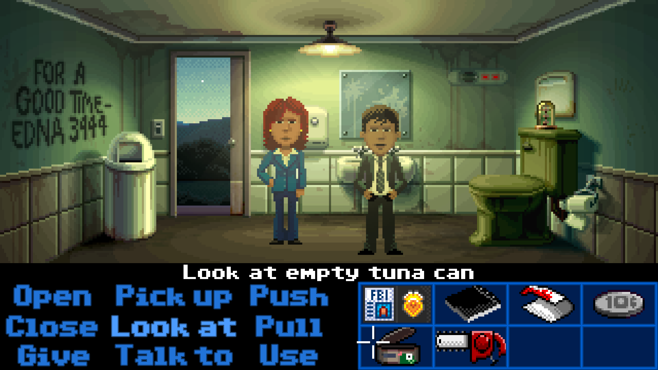
As our present to you, here is some new art. Nothing says Happy Birthday more than a gorgeous piece of adventure game art. Or in this case, a horribly disgusting bathroom.

This weeks post is a few days late because we're all scrambling to get ready for the first playtest by a non-Thimbleweed Park team member. We're all giddy with excitement. I'll do a post next week talking about how it was conducted, how it went and what we learned (spoiler free, of course).
OK, back to the salt mines.
- Ron

BaaaWOOOSH!
Happy birthday, Thimbleweed Park!
I did that couple a weeks ago:Supported You and bought myself a collectors edition via your page. Will it be signed ? :) Thanks!
I'm going to guess this one was done by Octavi... some of the single-pixel-wide lines of liquid remind me of his work...
Also the icons are looking real nice too...
Sorry... Couldn't miss the joke.
If DOTT had been a little bit more geared to its predecessor MM, it would have looked very similar to this for sure.
Happy Birthday TWP! \o/
http://blog.thimbleweedpark.com/quickiepal_bathroom
...and now, here is the final art! Big Applause to Mark Ferrari!!!
Plus, inventory icons are getting cool!
Happy birthday, Maniac Monkey!
Will you change the verbs so they start from the left instead of being centered?
It looks a bit messy now.
I will now call Edna! <3
One of the reasons why I want to advance in adventure games is to see new backgrounds. (For example: the great winterly backgrounds in Blackwell Epiphany)
The strongest part of Thimbleweed Park is imho the great "blue hour" atmosphere. I hope the whole game will use this lighting!
btw, wtf are these stains on the mirror????
Haven't you figured out about the character switching?
Are you going for mini icons between the verbs and the inventory? Or for an inventory item for each character?
Congratulations on the art! Very nice room, icons and feeling. It reminds me somehow of Monkey Island 2 underground, just before the park at the end. Great!
There should be a phone on the wall.
Way better than I ever hoped it will.
It clearly looks more Monkey-Island-2-ish than Maniac Mansion
but wasn't that what many were asking for? :)
Chances are good this will be my coup-de-coeur game of the new millennium!
I would like to update my Kickstarter Collector’s Edition ($150) to include poster and T-shirt ($350). This won’t do with the current method, will it?
But the pipe installation of the toilet looks a bit curious. As you know, the pipe below the toilet tank is usually connected with the bowl and moreover the siphon on the back side of the toilet bowl typically opens out into a down pipe in the wall.
Look at the image in the site's header and then the screenshots we got in recent blog posts! Can't wait for it to be finished. Congratulations and keep up the good work!
http://www.youtube.com/watch?v=hN0GjSjpcTk
It is a fact, the patent of the toilet paper says that the sheet must be outside.
How peculiar though... As this game gets older, its beauty increases!
Please don't flush me, now.
Rule #27: Don't put useless stuff in rooms people will want to pick up.
Rule #28: Ignore Rule #27 if it's really funny.
If a player tried to pick it up, the player would reply, "No way am I touching that. Who knows what that was used for." Or something like that.
Soviet by the look of it too. Guess they where the only source in 87..?
And I'm not sure if advertising other kickstarters here is okay (please feel free to delete this post if it isn't), but I guess at least some here would find https://www.kickstarter.com/projects/nicepixel/the-masters-of-pixel-art/ interesting, it's a kickstarter to make a book showcasing great pixel art, with comments and background information from the artists etc. :-)
Can't wait to point and click.
Right now the inventory feels like it's visually the most underlined element on the screen. It's sort of eating away some of the punch of the backgrounds and the characters. The muted colors of the room seem to clash with the bright blues of the interface a bit. Maybe it's just me? And I know that the interface is probably still far from final, but the inventory has stayed the same in screenshots for a long time now. So. Just a thought.
Ps. That's a great looking toilet.
(Just kidding!! Please don't ban me from the forum!)
It looks very nice. I do have one comment, though. The characters now have smaller heads which looks more proportionate to their bodies, but because they look more realistic, now they look disproportionately smaller than the background. That's what piecemeal "realism" on only certain aspects buy you; it's a double-edged sword.
-dZ.
Best,
Marcel
Best,
Marcel
A small question:
Do light source positions contain information in which z plane they are located? If yes, would it be possible to render a faint shadow (for each light source) where the characters touch the ground?
If you can switch between characters, how will that be done? Will it be displayed on the interface somehow?
Disclaimer: I don't know what the duck I'm talking about.
Nice bell bottom jeans on Reyes.
PS: Thanks for making this Game :)