London
Feb 12, 2017
Finally back in the States, head to the grindstone, franticly working on Thimbleweed Park. Many thanks to the other team members who picked up the slack.
We had a great time talking to fans and the press, trying to spread the word about this amazing point and click adventure game we're working on. Maybe you've heard of it. It's called Thimbleweed Park. Please buy 10 copies.
Here are some pictures of the London event, curtesy of @FinlayCostello. We had a great time showing everyone the game, signing boxes, taking selfies and 80's Polaroid's.


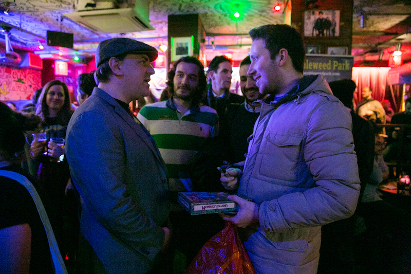
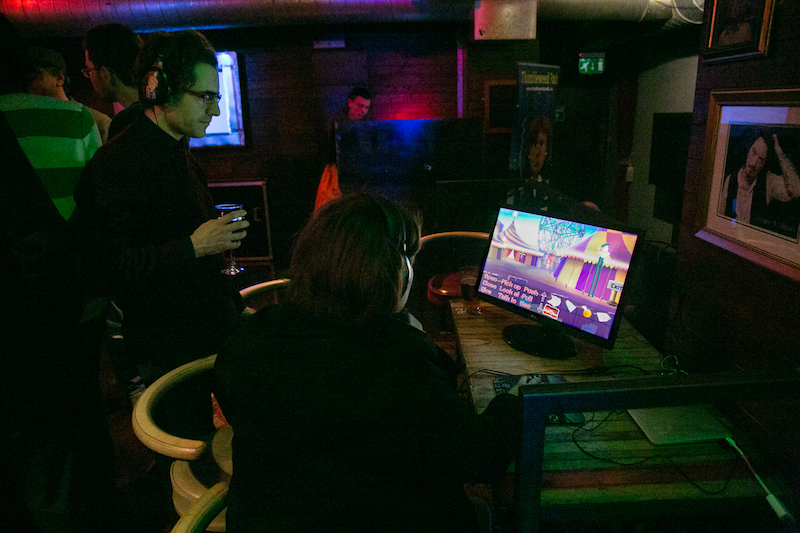

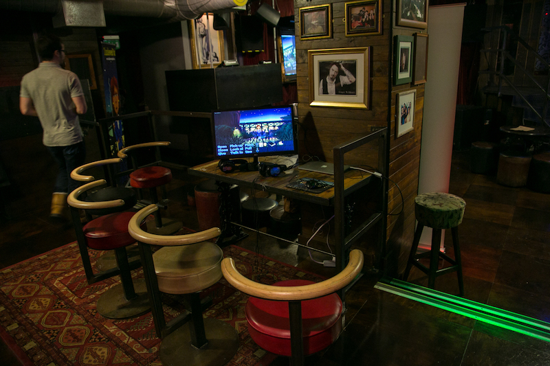
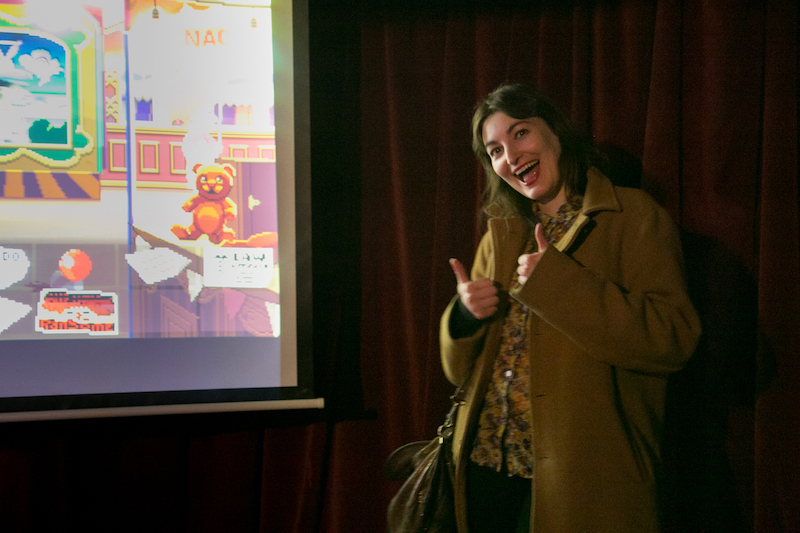


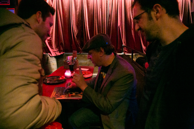
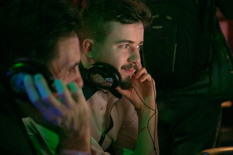

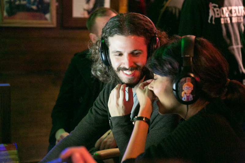
David, Gary and I will be recording a podcast on Monday. We've been busy working on this amazing point and click adventure game. Maybe you've heard of it. It's called Thimbleweed Park. Please buy 10 copies.

Wish I could have join the London event...
For TP2 maybe :-)
When can we buy one copy of this franticly point and click adventure game is Thimbleweed Park ? FYI, I am open to test it now :)
Are the French sound track finish for French market ?
I am dreaming all days to play to this new amazing P'ndC...
Bye
Vincent-
Trading the trading cards with other fans was fun (see Jenn's photo on twitter)!
The game looks stunning- although I tried to avoid spoilers so I did not play much of it and I looked away when certain areas were displayed on the large screen. It turms out to be more and more difficult to avoid spoilers, also some review articles that have been released in the last couple of days give away quite some puzzle related information so I tend to only scan through them.
I was most excited about the shaders: Ransome opens a door, and a beam of light illuminates his face - so amazing to see!
But all in all it was a great chance to see the actual game - the demo was really cool: Someone was playing it on a big projector for everyone to see and when he was able solve a certain puzzle (which turned out to be a pretty cool joke) the entire audience applauded. That was really awesome. :)
Also it was a great chance to see Ron and Jen in person. Thanks again. :)
Nonetheless I am amazed how much attention went into the events, the cards, the organisation and of course the presentation of the demo. Also interesting how the game appeared on the radar of many sites and youtubers. The presence of the designer is just something one cannot replace even with all the power of the internet.
Just hoping you accidentally hit the release button over the next week or so. That'd be pretty sweet!
I already have my cards framed and on the wall =)
Really enjoyed the demo, can't wait for the full game.
Ron looks very huggable! :-)
Anyway... erm... I mean she's our new hope for adventure games in next half century... this may be an underexposed part of Thimbleweed Park: there are a lot of (relatively) young talents working together with the old masters. Let's hope they stay as likeable as they are now! (Making a new game every three years or so is a good start)
The Point is strong with her so it's a good thing she belongs to a new generation.
Played the demo and absolutely loved it. So much better and polished than I'd expected. It feels like it has captured the feeling of point and clickers from way back when, but with a fancy modern luster. It's hard to explain unless you play yourselves.
I'm immensely excited to play the game in full and cannot wait. Thanks again for everything and wish the team all the very best on the upcoming release of Thimbleweed Park.
But I have the feeling that somewhere two monkey corpses are hidden...
It is quite interesting to see how people react that are not die-hard adventure game fans that loved all the old Lucas Arts games. I read comments on one German forum (see link) where some people stated they were not interested because of the bad graphics and the outdated, bulky "try&error" interface, even though the story might be compelling. Although I tend to think "I know it better, it is not outdated at all", I wonder how people with this perception - which is probably based on memories of frustrating adventure game experiences, and the reading of review articles plus some screenshots, but not actual playtesting TWP - could be convinced to at least give the game a try?
I am aware that there is no publicly available preview. I wonder if you plan to release some sort of free tiny demo of the game, were people can experience the UI and all the modern aspects of the game themselves? Just asking because I am curious - of course there are tons of videos around, but watching a video where someone celebrates the renaissance fair is just so different from experiencing in person that the interface is not bulky at all and the graphics are really charming (esp. the interface). I guess I just have been living in my kickstarter-devblog-bubble where everyone already loves the concept of this game, and I just wonder how many people outside this community will actually decide to play it. The preview at the fan event was so mesmerizing - the UI, the graphics, the music, the story - although I had thought that I was kind of prepared, it was stunning.
I was a bit disappointed by some German press articles/reviews which did not really highlight that the game will be translated and interviews were lacking subtitles (or similar). I will play the English version anyway, but I see potential to even more highlight that the game is localized. Maybe a press kit which includes some screenshots of the localized UI could help to promote the translated versions? Also, by the way, will the Xbox/console UI be an (optional) part of all versions?
Thank you again for the Berlin fan event, Jenn and Ron. It was fantastic that you took the time.
Good catch with the translated screen shots, we'll be adding those now.
From my personal experience, talking with friends and acquaintances who usually (or even occasionally) play games nowadays, I can group four categories of people:
1) "ol... err... experienced adventure game players": they want TWP. Everyone. Of course, they loved at last one Lucasfilm adventure game of the past.
2) "old people who never wanted to play an adventure game": Doom, GTA, Cannon Fodder, Turrican were their favourite games. They are not interested in TWP, even after having watched a funny trailer of the game.
3) Millennials who likes to try every sort of new game (like me, at their ages): 80% enjoyed the trailer, most of them are attracted by Ransome because of his swearing. The remaining 20% says that the game is too challenging, there is too much to think and too less to shoot.
4) Millennials who are stick to certain categories of games (soccer or shoot-em-up): they seem indifferent at the trailer. No reaction, no smiles. Probably they don't know what is it, but they are not interested to discover it, too.
What to do? As for me, with millennials (mostly tweens) I will share with them my positive feelings about TWP, week after week, until they will be convinced to purchase the game.
For category 2, I think there is no much to do.
About the price of the game: please note, category 4 usually as their parents to purchase one game each 3-4 months, because the price is high (50 or 60 euros, we are talking about FIFA, COD or UNCHARTED).
"Choose [the price] wisely" (cit.)
This reminds me of an anecdote by David Fox. Rescue on Fractalus originally had no fire button, but when George Lucas playtested the game, he ordered him to add one. :-D
Watch here: https://youtu.be/T23NYPxPpHY?t=19m22s
Maybe they simply don't know.
P.S.: there is a circus, there is a shoot-a-duck game... I hadn't the chance to, but maybe Ransome can shoot at the ducks!
By the way, back in the 90s, I had a friend who found adventure games to be boring, even though Sam & Max and DOTT were his first PC games at all. But, for whatever reason he liked to play Wak-A-Rat in Sam & Max. When we met, he used to suggest to play Wak-A-Rat more often than he suggested to play Sam & Max. Well, Sam & Max left me cold as well, but I don't know what he liked about Wak-A-Rat. Over the years I gave up trying to convince him of what makes adventure games fun, even though he also owned DOTT, which, in my opinion, was a great game. We broke tie years ago because we didn't get along. He was depressive and he seemed to dislike most of his games. However, some people will never get to like adventure games, but fortunately they seem to be a minority.
It didn't affect ratings.
Max did. :-)
I remember playing Wolfenstein 3D when it first came out... I played it for about 15-20 minutes, then I was like, "this is boring, you just go around shooting stuff, there is no real interaction with anything in this world... who would want to play a game like this?"
Lots of people, as it turns out.
Well, it would have been great, if there was a reasonable way to play a classic point & click adventure (such as TWP) on multiplayer. It would have been a promising market niche, if such a mode got promoted sufficiently.
Although it's probably more niche than market...
http://www.gamasutra.com/view/news/276548/Source_code_for_Lucasfilm_Games_80s_MMO_Habitat_released.php
Of course, it would be the first point & click game of its kind and designing it would be a big challenge. Also, I'm not sure how it would have to be done, but for exactly this reason it would probably be a revolutionary game. So, why not?
Unfortunately, such a project would necessitate a high budget, because you would need a server infrastructure, if you didn't want to restrict it to LAN. Also, internet security would be an important aspect.
You all are probably right about the importance of the mobile versions and also their marketing. I was not really aware of the fame of mobile gaming, and adventure games seem to be a well working genre for those platforms. I also recall Brooke Condolora mentioning on twitter that the iOS sales of Burly Men At Sea were quite significant compared to the Steam sales. Mobile platforms all the way! I am really curious how the final mobile UI of TWP will look and feel. I can imagine that some innovative adaptions to the interface (tapping, maybe some XBox-style hotspot interaction?) can really make the game feel natively designed for those devices.
But it is, in fact, a "retro fan game." That was the entire point of making a 1987-ish style video game. The concern then is, will a younger audience (or those who really don't have the fascination with the genre) connect with it?
There is no shame in embracing the fact that the game was made by 1980s adventure gamer designers for 1980s adventure gamers. You just need to find a way to convey that this is a good thing and that the game may have a lot to offer to anybody else as well. Arguing that the game is some modern masterpiece which considers modern world's sensibilities and invites modern world players, will only get you summarily dismissed as soon as someone takes a look at the graphics style. Yes, it may be a shallow first impression, but it is the most important impression that matters.
-dZ.
But ... at first finish the Game in this Version. I'm looking forward to a Update function with german sound in the Future ;) We Germans will help you
Cheers,
Herr S.
I've thought of Berlin when hearing a lot of "Isch" but now I realise it should have been "Ick"!
(I really have to replay StS 1&2 soon, it's been a long time! But now I'm not sure anymore which language to choose :-)
I re-played both games recently and I was somehow amazed how different my adventure game perception changed nowadays compared to what it was 20 years ago. I still found the music and character animations of StS quite spectacular, but I have read and experienced so much about good vs bad puzzle design, dependency charts, linear stories and anticlimatic endings that I tend to evaluate those aspects a lot more during playing than I did in the past. I am also spoiled with horizontal scrolling & parallaxing, and sometimes the background in StS feel quite static, like walkable images. However it is still a fun game to play, especially the first part imo; also the setting is cool. - I wonder what kind of setting a future Terrible Toybox adventure game might have, if there will be one.
Regarding puzzles: as soon as I play the game and visit the places I will remember most of the puzzles (I think I have played Disworld the second time without a walkthrough, which is quite an achievement if you know the game!).
This means it's quite hard for me to reevaluate puzzles of games I've already solved some time ago...
From screenshots I've recently seen of StS I must say it still looks so gorgeous!
I wish the German Hi-Fi patch were available already. SimSaw got in contact with Adventuresoft years ago and are allowed to release the patch. I remastered everything, except for two scenes where the original recordings are lost. SimSaw wants to rerecord the missing scenes, but I have no idea when this happens, if ever.
MojoTouch is a licensee and he was interested in the remastered voice acting for the Android version. Unfortunately, he wasn't willing to pay us, thus that version has no remastered voice acting either.
Of course, our PC patch is still planned to be a free fan patch for non-commercial use.
Also keep in mind that this will be German only. Any of the original English recordings are believed to be lost too.
Personally I'm fine with German only :-)
Especially grateful to Jenn for being so friendly and welcoming. She helped make the event as enjoyable and fun as it was.
Looking forward to Thimbleweed Park even more now!
I know this must've been a common feeling across the people who attended, but I really feel that MI somehow shaped my life, what I do for a living and the type of games I enjoy; and meeting Ron and being able to physically say "thank you" felt like a big life achievement.
Also, met a few really interesting people that made my night :-) As someone mentioned I was really surprised at how welcoming and open the team was. So looking forward to explore the game from home!
Second part: https://m.youtube.com/watch?v=lr18KsVWOoE
Be careful, they don't play the preview but portions of the actual game in casual mode, and there are quite some perviously unseen rooms, dialogues, puzzles in the video. SPOILER alert! I stopped watching it after a while. (Ray leaves the first location at 7:35, if you have seen the very first spoiler-alert preview video that Ron posted here quite some time ago - it is a bit similar until 12:35, then there are new locations & the newspaper location at 14:27. They browse the phonebook at 17:15 and call one number. Ransome flashback starts at 21:00)
On the other hand, when I played the public demo, I was so entrapped that I wanted to investigate every nook and cranny, and to push every pushable... things :-)
To watch is different than to play, that's all.
Gonna go watch the Gronkh one now!
https://www.youtube.com/watch?v=_MTgZsFKPmM
I guess it was removed because Mr. Milagros Aiken just copied it from the official channel
Oh what a nice (=evil) idea to let Ron sign that toilet paper this way.
I assume he spent the rest of the evening unrolling and rewinding the paper...
I still have the feeling Ron will leave the wrong way as default... there will be a lot of discussion at game release... :-)
http://bit.ly/2kJ8j4U
(Patented september 15th, 1891)
http://static4.businessinsider.com/image/550b2598ecad04cf649cedcd/124-year-old-patent-solves-the-over-versus-under-toilet-paper-roll-debate.jpg
https://youtu.be/KN_9M-6B8Zs
And a honest question, no offense meant and excuses to my wife and Mr Sandercock: Is Jenn so goodlooking in person as she appears in pictures?
<advertising>
I finished my Indiana Jeans game. I needed to say it.
</advertising>
Need some blog post about state of things!
http://it.ign.com/thimbleweed-park-pc/121629/preview/thimbleweed-park-e-un-gioco-punta-e-clicca-open-world
By the way, can't wait to see the extra-armour powerups and giga-ammos. And the final level boss.
Still can't understand what a cursed clown has to do with it.
This means 2018-04-29 at the latest, yay!
As a backer , what game Version do i get and how many? I mean the PC version is crystal clear. But since i own a xbox one i also would like to play on console. Do i need to pay again for the xbox one game? Or how is that solved?
Cheers
Hooray!
Also would just like to share that my guy is the one that shared Monkey Island with me 2 years ago and sat beside me laughing while I bumbled about not knowing what to do. I actually managed to find the treasure without understanding the dance steps were directions. His jaw dropped at the improbability and of course I was hooked.
We are so excited for this release and are supporting you and your team 100% ! Take care! =)
It states "Cross-Platform and DRM-Free". No mention about Steam though.
It is listed under "Purchases", as "Thimbleweed Park (Tier 1) December 12, 2014 $25.00"
And clicking on it opens a page reading:
This page is claimed by you.
Thanks for purchasing Thimbleweed Park (Tier 1)!
When available, you'll be able to get all your digital content listed below right here on your download page!
Your purchase of Thimbleweed Park (Tier 1) gets you:
Thimbleweed Park, Cross-Platform and DRM-Free
Does it mean that we will be able to download the game once and archive it at home, so that we would still have the game even if the online store didn't exist any more one day?
Well, I think that a real fan is going to buy the boxed version of TWP anyway once it get's released, isn't she/he?
2. In one hundred years I can fire a VM up and install the game e.g. using the installer from GOG. This may work with DRM-free Steam games too, but I have to archive it myself and hope there is no special additional configuration necessary. And that it really doesn't need a connected Steam account etc. to run.
Crackers do us a favour, allowing us to preserve games for history. I'm sure there are a lot of current generation games which will be lost forever because they require a server part which will never be released when the servers are shutdown (e.g. see https://en.wikipedia.org/wiki/Darkspore).
Though, a DRM free game can also rely on a server, can't it? For example, a few months ago, we discussed with Ron about analytics (e.g. for the achievements), which TWP is going to send to a server ( https://blog.thimbleweedpark.com/final_phonebook_import ).
Of course you can have online or multiplayer components relying on servers in DRM-free games. But the rest of the game needs to work regardless or it's DRM.
Here is a list: http://pcgamingwiki.com/wiki/The_Big_List_of_DRM-Free_Games_on_Steam
Some consider Steam itself DRM since (on Windows) you have to install a Windows service running with superuser rights just to download a game. Even when games itself are DRM-free this may not be acceptable for some people.
I personally don't buy games on Steam anymore because I can't be bothered anymore with checking if those games are broken by design or not.
GOG FTW!
When the Steam version is the only reliable option, I'll certainly wait until I get the game really cheap, while I would have spent significantly more on GOG or Humble Bundle, when they offer it DRM free.
But if an update gets very late or even never released on other distribution platforms it sucks.
I've also seen so called "DRM-Free Editions" of games (even on GOG!), e.g. a game being stripped of the level editor; no (local) highscore being shown after a race (because they completely removed all the leaderboard related stuff) etc.
Is there a release date yet? I can't wait to play this game. Although I will gladly wait for you to finish it and do it right. Well, at least a little bit. I don't want to wait too long. But I rather wait than to get a half-finished game. (For just a little while, I don't like waiting). So, finish it already so that I don't have to wait. But make sure it's done before releasing it, we'll wait (if only for a bit). Just don't make me wait too long.
Anyway, you know what I mean.
-dZ.
...I guess I should provide my own version of it...
It's all FAKE-NEWS!
About TWP savegame files: will be possible to save them in the cloud, or they will be saved locally only?
My concern is that I wish to play TWP on two machines. Maybe I can use an "account" or something that can identify me...
...or the easy other option is to purchase another copy of TWP, of course.
8 more left!
E.g. XBox cloud or Steam cloud or iCloud. There is no interoperability between these different platforms.
The save game format itself should be compatible though.
This means on PC and maybe mobile platforms it should also be possible to use your own sync mechanism to keep the save game folders in sync (e.g. using DropBox etc.).
There was some discussion regarding custom cloud saves on this blog post: https://blog.thimbleweedpark.com/thimble_phone
You are a really Seeker Master, mr. Nor Treblig!!
Yeah yeah, I have two PCs, one at home and one portable, both with TinySoft Losedows™, I could use my Dropbox account to sync the TWP savegame between them.
Thank you!
Podcast and deliver!
I'm not going to edit it today, I'll do it tomorrow.
Read the above sentence tomorrow, thank you.
https://blog.thimbleweedpark.com/ui_in_action
Amazing how the interface and the graphics evolved ...
"The discomforting atmosphere and the strange characters make you curious. Something sinister is happening in this half-deserted town. You want to find out what -- even though the command via action verbs may not be up to date."
Sorry, but: asshats... (but maybe they only meant the UI representation and not the concept itself)
They ought to have written: "Not least because" instead of "even though".
We like the UI in Thimbleweed Park because we grow up with this interface. But it is not a modern UI interface. I.e. it doesn't work intuitive.
I completely disagree. Based on our playtesting, it's initial confusing, but once they get it (10 mins), it's 100% intuitive. All the options are right on the screen. There is this concept in design called "out of sight, out of mind". By showing all the verbs and inventory, your options are always in front of you. It is a leap for some players to get over, but I don't find it unintuitive.
Then it's not intuitive. ;-) A good UI isn't confusing, even in the first 10 minutes - which is a very long time, btw. I guess the most players that are "new" to adventure games will give up within this time. Today the "normal" gamer wants to start the game and just play.
In my(!) opinion a good rule of thumb is: If you need to explain the UI (or a manual), the UI is not intuitive.
Disclaimer: I like the verb interface due to the reasons you and Nor mentioned! So I'm on your side. :)
I bet 500 dollars with you that this is not true. :)
Let's assume we have the coin interface and no manual. The player starts the game and sees the cursor. He is familiar with this thing from windows/macOS/whatever. So he moves the cursor around. If he moves over an object, the game highlights the object (i.e. like in TWP with a text above the cursor). The player knows this concept too - i.e. from his browser. The player is curious and clicks and voila - all possible actions will pop up. At this moment the player knows how to play the game - and it took less than 10 minutes. :)
I'll bet you $1000 it is true, because I've watched it. For someone that plays game regularly, the verb and coin interface is figure out in less than a minute. For people who don't play a lot of games, the coin interface is just as confusing as the verb interface.
Ok, I agree and raise to $1000. If I lose, you get the $1000 from me, if you lose you don't have to pay.
"because I've watched it."
When and where? Have you done these tests? Under which conditions? With experienced players? (btw: does anybody knows if there are some research papers about this?)
"For someone that plays game regularly, the verb and coin interface is figure out in less than a minute."
That's true. But these players are willing to learn complex interfaces and they are more familiar with complex interfaces. It's like: If you know Microsoft Windows you are able to learn the macOS UI. But macOS hasn't a very intuitive UI (ask my mom :)). So only a group of experienced players isn't enough to classify a UI as intuitive.
(If you are interested in, we could talk about this topic via email.)
They've made many more playtests and also they've seen the game played by press and on conventions.
They've seen it played with mouse and controller (e.g. on XBox events) so they should now have an idea how it resonates.
But they've never really (at least as we know of) tried/prototyped any other interfaces than this visible verb list (except special controller controls). Reason seems to be because Ron wants it that way and this also was a premise of the Kickstarter.
i.e. they don't have comparisons to e.g. a coin interfaces.
Btw. when the new style was introduced there was some discussion here: https://blog.thimbleweedpark.com/stateofthegame3
(e.g. search for wheel)
Yes, and that is why I ask the questions above (in my post from Feb 18, 2017 at 18:18). I would like to know, if Ron has tried the coin interface in an older project or if he simply doesn't like the interface. If you test just one interface, you know only that this interface is working but not if there is another interface that is more intuitive. :)
I'm willing to write a short prototype adventure game with the verb interface, the coin interface and the sierra interface for A/B tests. (If Ron is interested in such a test and/or someone else supports me.)
And again the disclaimer: I don't like the coin interface!
Yes, I would like to know that too. If there are plans to reuse the engine in another project, it would be the best to put most of the UI code in scripts.
I don't think your "private" discussion with Ron is productive. Maybe it would have been productive in the first phases of development.
Now the game is ready, and one of its objective was to be "a new classic point and click adventure - with verbs". Period.
And not a "new classic point and click adventure - with a coin menu".
So what's the point in discussing this NOW? It's just a criticism to what it's done.
Ron Gilbert revolutioned the adventure game industry with the concept of the verb-based UI.
We are here beacuse of that. There's plenty of adventures with a coin (or, worst af all, a mouse-scrolling-icon sistem). But we don't want those.
is like saying, ie, "I don't share the choice of Sid Meier who made Civilization VI a strategy game based on turns. It would have been better a real time game". Or maybe "I don't like the realism and hardness of flight simulator X. I'd prefer cartoon physics, and lots of shiny stars, hearts and candies I can collect in the clouds to make a lot of score!"
It's like destroying the spirit of the game.
So, that's why this discussion is sterile. We are discussing about nothing.
And, if you want, I can give you my personal opinion on UIs:
understanding the verbs UI is simply grammar. You learned it at school. If you take more than 5 minutes to get it, you should go back to primary school again.
Maybe a native digital, who started using an iPad before learning how to read, could find the coin more suitable.
Anyway, I'll play TWP as I played all my Lucas adventures: mostly choosing actions with my keyboard.
Ciao.
https://imgs.xkcd.com/comics/security.png
Btw. I do think the UI TWP is much more intuitive than other kinds of UIs, e.g. hidden in menus/coins, needing special gestures etc. WYSIWYG!
I think the main problem with TWPs interface is the looks which maybe some (younger?) audience wouldn't appreciate so much than us old farts.
No, the representation and the concept are interrelated. They form together the UI.
In point and click adventures you could use the verb interface where you have to click the verb and then to click at the object. If you use the coin interface, you have to click first on the object, then the game gives you serveral actions to perform. That's a completely other interaction with the game (and not only another representation).
The coin interface is much more intuitive, because I don't have to explain to the player that he/she has to click on one verb. Instead the player just has the cursor. He/she has just to click at an object and then the game gives the player the possible options.
I do not say that the coin interface is better. It's different, but more intuitive.
And remeber: We know the verb interface from our childhood. We are familiar with it. So *we* find it intuitive.
Also there is one misunderstanding: With "concept of verbs like in TWP" I meant having *a lot of verbs* to choose from. This can be implemented like it is in the current interface, using a coin interface or different way.
The purpose is to make the player think more what he want to do instead of randomly clicking on everything which is more feasible with one-verb (e.g. look/use in one action) or two-verb interfaces. (e.g. separate look and use actions)
If you look at DOTT Remastered: There is no real difference between the original interface and the coin interface, that's what I meant with different UI representation only (although the use is slightly different as you said).
(btw. there is one difference with the DOTT coin interface: it is context sensitive, i.e. it only shows "useful" verbs. But I don't like this particular implementation: I hate it when such "intelligent" menus change the position of commands! [muscle memory!])
My initial reaction to the coin interface in Full Throttle "punch/slap, kill, kick?? Allright!"
Still either way, I had no problem figuring it out.
On the other hand if you have an attention span of less than 10 minutes and/or cannot be persuaded to *read* some text in the form of a verb interface... well then maybe P&C adventure games just aren't your thing (you=modern game player, not you Someone). And neither are books. Hell, these books are even less intuitive, there is no "turn page" at the end - I was like stuck for like 5 minutes trying to figure out how to continue. For real. And where are the graphics in these books - the cover looked awesome, but there is only letters and words inside? What, I have to imagine what is being described? What a retarded form of self-proclaimed art is that? Surely that won't survive my time on earth! (modern game player picks up smartphone and pays some micro-transactions to feed his 30 second hunger for accomplishment)
Anyway, if said modern player does buy a copy and decide to drop it after 10 minutes over the UI... his/her loss. Sure, there will be some trolls posting reviews on Steam/Gog/... but they will be drowned by the love from the fans (tricking even more players into buying the game bwahahaha!)
Seriously: give the casual players and everyone who did not grow up playing these games some credit too! My kids love to play them as well, even if they suck at it and I need to restrain myself from helping them out and just help with the translating.
In the bottom corners are numbers, e.g. bottom left "2", bottom right "3".
Any reasonable person should figure out this belongs to a sequence and will look for "4".
If you needed 5 minutes to figure it out with all those hints given there is no one to blame except yourself!!
:-)
"oh, and I would also like a balloon with TURN here"
With concept I meant actually having verbs (like, plural!).
Do you have any specific modern concepts in mind?
I know, they are not "modern" but they came up after the LucasArts games and are used in todays adventure games. Players expect these "simplefied" UIs and that was meant in the article.
If you like a "modern" UI with verbs, have a look at Larry 7. They mixed the verb interface with the coin interface and the textadventure interface. :)
All hail hotkeys!
Today there are many players who are playing a game for only a few minutes. And if they aren't able to control the game or are able to figure out what to do, they quit the game. Telltale is very successful with "adventure games" that are very simple to control. And Daedalic has simplified the UI in "Silence" intentionally to get more customers.
They've still made and are making some nice story-based "games", but they are more like movies. (Movies with QTE, ugh.)
Have you seen this blog post about alternative TWP control schemes? https://blog.thimbleweedpark.com/controllers
@Nor: I agree completely with you. The modern Telltale games are more like an interactive movie. But in the press and on steam they were mentioned and sold as adventure games. And the most (younger) players will imagine these games when thinking of "adventure games".
I've read the blog posts and I'm curious how good the Xbox controller will actually work. I'm a little bit sceptical, but I trust Ron. :) The best platform(s) for adventure games are beside the PC (in my opinion) Tablets and Smartphones because you can point with the finger on something. :)
What I often don't like with touch-only controls are the implementation of secondary actions. E.g. with mouse you often do a right click as shortcut for 'look at' or even much more (scrolling through inventory with mouse wheel for example).
Regarding 'adventure games': AFAIK this started much earlier! FPS which hasn't shooting as their main objective were already called 'adventure games' by some. There is something true in that of course, but it's not what we would ever call an adventure game :-)
That's why we often say 'point'n'click adventure game' to be more specific, but it's getting more and more complicated now: point'n'touch adventure game? controller-controlled-2D-non-platforming adventure game?
There are bad people who want you to use the failing coin interfaces. Sad.
There is only 'move' but you could use the arrow to differentiate between 'push' and 'pull'.
(you normally don't see 'push' and 'pull' there at the same time since it's context sensitive)
Thank you for those links! I still prefer verbs, because you can directly read what they mean. Furthermore, I dislike case sensitive interfaces in adventure games, because they take you by the hand. It's more fun to have to figure out yourself which verbs work on the particular item and which don't, especially if a useless combination leads to a joke!
I especially don't like the context sensitivity in DOTT Remastered since the position of the verbs change.
What I like about icon verbs are that you can combine open/close so you can add other verbs (like 'wear' in StS) instead (well, you could do it with text too by changing the verb depending on the selected object).
http://store.steampowered.com//app/569860
;)
http://i.imgur.com/jNpjzYe.jpg
Event was amazing, thank you so much guys, loved playing through the demo!
PPS
CALL ME 7483 xxx
(But my wife does, that's by she looks so ashamed of me in the photo)
Better be at home when I'll call!
Yes that's my landline, visible in any good reputable phonebook ;)
Let us talk via phone!
Rather i'll say the Broken Sword I engine is a work of genius, which is still at top of my preferences for a point and click interface, but it's another style and another story.
I compare verb coin to automatic trasmission in car and classic interface to manual transmission, you feel the difference :) ...
I think your analogy is flawed since verb grid and verb coin are in the end more or less the same.
It's like the difference between between a traditional manual transmission and a sequential manual transmission. There are differences but in the end you have to shift manually.
An automatic transmission would be more like a single-click interface which automatically selects the appropriate verb (i.e. the action which the game designer had in mind).
but of course verb coin would be my second choice :)
Yes, if I remember correctly Broken Sword would be an automatic transmission. Two verbs: action (use/pickup/talk/...) and look at.
Broken Age is another example and even more extreme: one-click (single verb) interface but still a classic point'n'click adventure (although some may disagree), no pixel graphics but complete with dialog trees, inventory etc. (hey, even multiple characters like MM, DOTT, TWP).
I loved Lighthouse! It's a Myst-like game from Sierra and finally one where you cannot lose (easily). Similar to Zak McKracken it took me some time to realise its ingenuity. I've always thought I've hit dead ends but I was just too stupid :-)